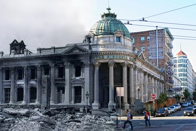
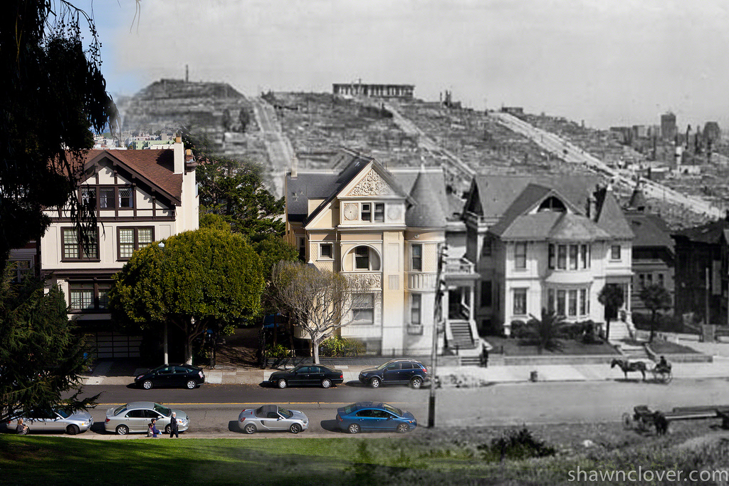
Shawn Clover Merges Past and Present in Earthquake Blend Photos
Manipulating time is a theme photographers have used for decades with techniques like time-lapse, stop-motion and long-exposure photography. But one photographer caught our eye with a project that manipulates time with a very unique approach. Shawn Clover found a creative way to use Photoshop to tell the story of how San Francisco has recovered from the city’s 1906 earthquake.
https://blog.adobe.com/media_936111ea1fe2b0c035da8beab89484f536ae75f4.gif
Clover put a twist on the traditional “before and after” format by taking his own present-day images and merging them with early post-earthquake photographs using Photoshop tools. We were inspired by Shawn’s unique use of Photoshop and got a chance to ask him a few questions about how this project came to life.
_Tell us about yourself!
_Shawn: I’m a San Francisco native. In addition to photography, I’m into flying four-seater airplanes, bike racing, Muay Thai boxing, urban exploration, travel, science, and tech.
_When did you start using Photoshop?
_Shawn: 1995. It was version 4.0 I believe, long before the CS version numbering system.
What sparked your interest in the 1906 San Francisco Earthquake? How did you get the idea to merge the old 1906 pictures with the current day photos?Shawn: I was reading the book “San Francisco is Burning” by Dennis Smith and began thinking about doing some before-and-after photos with a twist.
https://blog.adobe.com/media_8513c653f022d8b46ee9e20ce338c8c593b305cd.gif
What was the process like to create these images?Shawn: The basic technique is to start with the ‘before’ photo and find the approximate spot where it was taken. I then take lots of shots at slightly different spots and focal lengths while comparing on my viewfinder vs. the original. When I get back into Lightroom I can browse through all of them and better choose which photo is closest to the original. I put that one in Photoshop as a smart object and drop the original photo as another layer. Then I put the original’s opacity to about 50% so I can see my original below it and then resize/rotate/drag it to get it close to matching my photo. From there I usually need to do some vertical perspective adjustments to my photo since most photos from 1906 were properly shifted in the lens (or I use my own tilt/shift lens on site). Once I get everything lined up perfectly, I simply add a layer mask and use a soft brush with a low opacity to paint a hole through the original image to reveal elements of mine underneath.
How did you capture photos from the same perspective in the modern day pictures as the 1906 photos?Shawn: I numbered each 1906 photo and mapped them all out on a Google Map layer with a 1-3 rating for how good I thought each might be. After getting all the photos plotted, I would walk around the city hitting as many locations as possible. Probably three out of four photos ended up being unusable because the original photographer stood in a place where a building now stands or a tree blocks the view. I found in some instances the photographer was standing on a pile of rubble to take some of the original photos. I use a tilt/shift lens for some and vertical perspective adjustments in Photoshop for others to match the meticulously lens-shifted photos from the 1906 photographers. (Back then, shifting the photo was as common as focusing so that buildings don’t lean inward when pointing the camera up–something most people forget these days.) At each site I would take dozens of photos at slightly different focal lengths and perspectives in hopes of getting one perfect one.
https://blog.adobe.com/media_d9a72e15f34367b9215bdf45a1d258df774fd5fe.gif
What was the hardest part about completing this project?Shawn: Just finding the motivation and time to do it. I published the first set in 2010 and it got a bit of a response. The latest batch I posted went completely viral and hit the front page of dozens of major websites. My website traffic went up over 10,000% overnight and I’ve got many people asking me for prints and a book now, so I’ve got some motivation to do a part 3.
Which image is your favorite?Shawn: The photo (note: this link leads to an image that some may find offensive) in the 2010 set of the dead horses is my favorite. It’s also the one that has resulted in the most hate mail because some people seem to be very sensitive about horses. But it was the reality of the time.
Thanks to Shawn for answering our questions and inspiring fellow Photoshop users to create new ways to tell their stories! Check out Shawn’s full project on his website in two parts: Part 1, Part 2.