Responsive Web Design and Web Analytics
http://blogs.adobe.com/digitalmarketing/wp-content/uploads/2012/11/responsive-design-hero.png
Over the last year or so Responsive Web Design (RWD) has gained sizable attention within the web world. With the rising tide of smartphones and tablets and the vast variety of screen sizes these devices represent, companies are looking for easier and more effective ways of providing their content across multiple screens. Although RWD does have its implementation challenges, by and large it is seen as the panacea to the multi-screen headache. Interestingly enough, when listing out the practical challenges of instituting RWD on a large scale, very few have mentioned the impact of RWD on web analytics. In this post I will discuss this problem and some best practices in implementing analytics on web sites using RWD.
The Basics – RWD Layouts
Before diving into the analytic challenges of RWD sites, lets take a step back and get a better flavor for the different types of RWD layouts and how they differ.
In general, there are three types: Basic Fluid Layout, Adaptive Layout, Responsive Layout. If you’re on a desktop or laptop computer, look at the web site examples below and adjust the window screen-size width and see the subsequent impact on displayed content.
- Basic Fluid Layout
Content continually flows or adjusts in a word-wrap fashion as screen width is increased or reduced. There are no “distinct” differences in content presentation. Web Site Example - Adaptive Layout
There are predefined sizes where different layouts are triggered. These are called break points. Typically there are three or four breakpoints to accommodate desktop, tablet and mobile screen sizes. Web Site Example - Responsive Layout
This is a hybrid of Basic Fluid Layout and Adaptive Layout. There are predefined break points, however in between these break points content will flow to expand or contract. Web Site Example
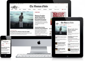
Currently, most RWD web sites use Responsive Layout since it offers a best-of-both-world experience. Content snaps into the appropriate approximate position for a device type (e.g. Tablet) and then fine-tuned adjustments are made for the exact screen size on a particular device (e.g. iPad Mini: 1024×768 | Nexus 7: 1280×800).
Impact of RWD on Web Analytics
Think about your reaction when you are typing on a keyboard without looking at your hands nor the words being typed-out when you suddenly realize that your fingers are misaligned on the home keys (“asdf” and “jkl;”)? All your carefully crafted words or code appear as cryptic gobbly-goop. This happens because your central point of reference (i.e. the placement of your hands) is misaligned. The same thing happens when we are examining web analytic data from our RWD web site but haven’t accounted for what particular RWD experience was provided to a given user. Just like one-size web content won’t fit all screen-sizes, the same “one-size” approach to web analytics on RWD sites won’t yield accurate insights into user experience and the downstream impact on conversion or engagement. For example, if you’re looking at the aggregate data on a conversion funnel for a RWD site and entry to that funnel was a button on the home landing page, you could easily miss that certain device screen-sizes don’t correctly show or place the button. Fortunately, it is relatively easy to account for a few important RWD data elements, as I will discuss next.
Analytic RWD Best Practices
There are three dimensions that should be tracked for RWD web sites (assuming a Responsive Layout is being used):
- Rendered Experience according to set break points (e.g. Smartphone, Tablet, Desktop)
- Screen Size for the window or viewport (e.g. 1024×768)
- Orientation (e.g. Portrait vs. Landscape).
For simplicity set these variables in SiteCatalyst to eVars on each request (props can be used in addition to eVars, if needed).
Although it’s beyond the scope of this post to go into details on how to capture these three dimensions, for simplicity I’ll show a brief JavaScript s_code example.
//Rendered Experiences (with specific break points) if (document.documentElement.clientWidth >= 320 && document.documentElement.clientWidth = 768 && document.documentElement.clientWidth = 1224) { s.eVar26="Desktop"; }//Screen Size s.eVar27=document.documentElement.clientWidth + 'x' + document.documentElement.clientHeight;//Orientation switch(window.orientation) { case -90: case 90: s.eVar28="Landscape"; break; default: s.eVar28="Portrait"; break; }//NOTE: Please adjust selected eVars as well as specific break points to match your current needs.
It should be noted that RWD web sites typically use Media Queries within CSS to detect and transform the layout of web pages. A challenge lies in that there are no well established means for JavaScript to communicate with Media Queries (although there are a few emerging approaches on how to bridge this gap). For the sake of simplicity and brevity, I’ve leveraged the DOM in the above code example to approximate what is done with Media Queries to detect screen sizes.
Some may be wondering why we need to capture screen size when that information is available out-of-the-box within SiteCatalyst reports. There are some cases where the screen size that’s shown in reporting (derived via the user-agent) and what the actual screen size is are different. For example, the iPad Mini and iPad2 will both appear as 1024×768 within out-of-the-box reports even though the iPad2 actually has a screen size of 2048×1536. The reason for this difference in this particular example is that Apple uses the exact same user-agent on these two devices.
Reporting Example
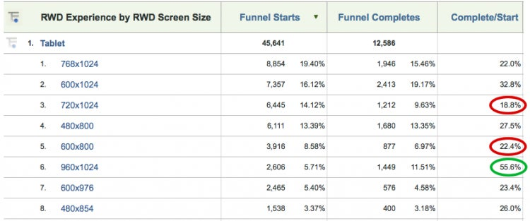
To illustrate the type of analysis that can be done with these RWD dimensions, let’s look at funnel conversion for a Tablet rendered experience and sub-relate screen size (we easily could have looked at orientation instead).
http://blogs.adobe.com/digitalmarketing/wp-content/uploads/2012/11/NewImageResponsiveDesign.png
Looking at the Complete / Start conversion ratio, we can quickly see where things are going great (960×1024) and not so great (720×1024, 600×800) within the Tablet RWD experience. With this information I would go through the funnel on the respective devices (if not possible, then simulate RWD experience on a desktop web browser) and look for clues on why a difference exists and what could be done to improve conversion. However, keep in mind there could be other factors at play (e.g. bezel size) for a particular device that positively or negatively impact conversion that may not be tied directly to RWD.
Although the primary purpose of this post is to examine the impact of RWD on analytics and solutions to overcome these challenges, the previous reporting example illustrates the power of analytics on RWD. Whether quickly spotting problem areas or finding screen sizes that outperform the rest, analytics is a valuable feedback tool in doing RWD optimization.
Additional Considerations
Below are additional items you may want to consider with RWD and mobile optimization.
Full Site “Fail” Events
Although not directly related to RWD, often on mobile optimized sites exists a “Full Site” link where the user is taken to the desktop experience. If you haven’t already, an event should be captured when this link is touched upon. In reality, such an action by the user should be considered a “mobile-optimization-fail” event. If the mobile user can’t find or do what he or she is ultimately wanting on your optimized site, you as a web analyst should be aware of such actions. By having this metric within your reports along with the context of what the user was doing up until they touched on the full site link (and even better what he/she did afterwards), you can potentially find areas of improvement that will reduce the likelihood of users abandoning your mobile optimized ship.
Big Screen Sizes
Since the purpose of my blog is to focus on mobile web analytics and optimization, I focus on smaller screens (compared to desktop) as it relates to RWD. However, in reality RWD can equally accommodate “real big” screens and not just small ones. Whether in living rooms on Ultra HD (aka 4K) displays (3840×2160) or new Retina displays by Apple (2880×1800), there is a lot of valuable real-estate that can be utilized (and measured) that shouldn’t be left as extra-wide margins.
Pixel Density
Although not included as a base-line RWD dimension as discussed previously, pixel density is a growing area of importance than can impact user experience (e.g. touch targets) and conversion. You may want to include this dimension if the web experience you have crafted warrants it.