Sneak Peek at SiteCatalyst’s UI Update
https://blog.adobe.com/media_b712c53efcc7566641c9f91880217481e3f300d1.gifOn Thursday, July 18th the SiteCatalyst user interface will be updated to be consistent with the new Digital Marketing UI. If you were at one of this year’s Adobe Summit events, you will have already seen this new design in some of the main-stage demos. In addition, if you’re a SiteCatalyst admin user you should have received an email on the UI changes on June 27th. Realistically, not everyone can free up time (or budget) to go to Summit, and it is very easy to miss an email from Adobe. There’s a good chance some SiteCatalyst users have no idea this update is coming and will get a surprise when they log into SiteCatalyst next Friday.
Surprises aren’t always fun and change can be unsettling—small or large. I realized this when I recently visited a client in New York. In passing I mentioned that the SiteCatalyst interface was scheduled to be updated this July. After seeing the blood drain from his face and a hint of panic enter into his voice, I decided to jump into the beta environment to show him the updated UI. Once he saw the minor nature of the changes, any initial concerns he had were put to rest. I thought it would be helpful to provide everyone with a sneak peek of what’s coming through the following short video (5:17 minutes).
//www.youtube.com/embed/OVg3nRtYZ7U?list=PL—Krn5r55ZarbtCLGOlGKDtHKPnHC9De
In summary, the main changes to the SiteCatalyst UI are as follows:
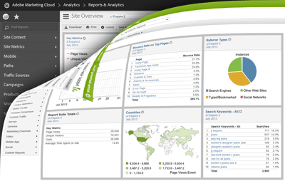
- Goodbye Omniture green (sniff, sniff). The familiar green navigation menu is updated with a darker, black color. While the color change is minor, I like the clean, no-nonsense look-and-feel it gives the navigation menu. The darker color appears to frame the charts and data better than the green/light gray color scheme did. I’ll let you be the judge if you agree with me.
- Adobe Analytics re-branding. Besides the color difference, all of the analytics-related products are now being re-positioned as capabilities of the Adobe Analytics solution. A key difference here is the SiteCatalyst name is replaced by its new capability name: Reports & Analytics. Other former products/capabilities will look familiar ( Data warehouse, Report builder) or very different (Genesis = Data connectors, Discover = Ad hoc analysis). If you click on Adobe Marketing Cloud at the top left corner, you’ll see the capability dropdown and sub-menus listed as they were in the old interface.
- Toggle between reports and favorites. Nothing really changes with the main left-hand report menu structure, and it will operate the same as before. However, the top-navigation has changed, and you now toggle from the reports to the favorites section (dashboards, bookmarks, alerts, etc.) in the left navigation using the two icons shown in the video.
- Admin console is now Admin tools. If you’re an admin user, you probably spend a fair amount of time in the Admin console. It has been renamed (brace yourself) Admin tools and can be found in Favorites area or under Reports & Analytics sub-menu from the top-left dropdown.
- Consolidated, streamlined help section. If you were familiar with the old help section, you may have found it difficult to find answers between the fragmented knowledge base and technical reference areas. Now the two systems have been combined (and curated) to provide a unified, searchable source for all your SiteCatalyst questions.
You may be wondering if you can ease into this new UI and delay its adoption until after July 18th. Unless you’re still using version 14, all clients on SiteCatalyst 15 will automatically receive this new UI once it has been fully rolled out. In this particular case, the UI enhancements were determined to be relatively minor in nature so a separate SiteCatalyst version wasn’t warranted. We’re confident the new UI will not disrupt your SiteCatalyst usage, and the new design will quickly grow on you (as it has on me).
Rest in peace RGB 112.161.0. You had a good, long run.