The results are in: Adobe 2013 Mobile Consumer Survey

Have you ever spotted a great mobile ad and clicked through, only to be directed to a desktop website? Consumers have, and nothing is more annoying than 2pt font on an already small screen.
So we asked more than 3,000 mobile users in Europe and North America about how they use their mobile devices to surf the web and what they want most from their mobile experiences. Our results show that mobile devices have changed the way consumers interact with businesses and digital marketers must understand how consumers use their devices in order to succeed. It’s time to get on the mobile bandwagon — a singular mobile strategy is no longer good enough.
For consumers who own both a smartphone and tablet, the primary device for browsing the web is still the smartphone (77%). Nonetheless, tablets are making strong headway as a primary device, up from 12% in 2012 to 23% in 2013.
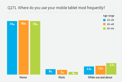
Consumers said 80% of tablet use happens at home, and this is likely why tablet users spend more at online retailers than smartphone users.
https://blog.adobe.com/media_0bf4deebe32d9986f2b2497e1527da64516acaaa.gif
These stats are great, but what do they mean for your mobile strategy? The top recommendation from consumers for mobile websites is “improve ease of use.”
Here are our top tips to keep mobile consumers happy and increase conversions:
- Reduce the number of touch events to conversion: conversion rates are directly impacted by streamlined paths to purchase. Fewer steps (two or three) to check-out will keep your mobile conversions high
- Design for mobile interactions: mobile visitors won’t have a mouse to click with, so ensure there is a focus on touch-driven controls like swipe, pinch or zoom, and use larger buttons to give users a more pleasant experience.
- Optimise for speed: a one second delay in the loading of a mobile page equals a 7% loss in conversion (according to Aberdeen Group). Integrate graphics that automatically adjust for device size, network and platform to keep loading speeds high.
- Make searching easy: smartphone users are not browsers. They visit an m‑commerce site with high intent and are likely to search first. Optimise your search for mobile and include handy features like spelling auto correct and auto suggestions.
Download the full Adobe 2013 Mobile Consumer Survey results.