Latency Analysis: A Data Workbench analyst’s go-to visualization
One of my favorite, powerful analysis tools in Data Workbench is the Latency visualization. Many clients, however, are not aware of this visualization technique or they’re unsure how to interpret findings from this analysis method. In this blog post I hope to help you get more comfortable with using the Latency visualization and give you some specific use cases you can start applying today.
The Latency table is a visualization in Data Workbench, one of the features in Adobe Analytics Premium, allowing you to examine aggregate visitor or customer behavior before and after a specific event occurred. The analyst selects the event to create the visualization.
Here’s an example:
Your dataset in Data Workbench includes rows of online and in store event data for all customers who have had interactions in both channels. In the days after a customer buys a TV you want to understand what pages they are viewing or products they are buying.
Let’s first look at how latency is created and then how to interpret it at the visitor level.
Once you set an event within the latency table you are now looking at customers who performed that event. In our example of the customer buying a TV, you would select the TV from a product table that signifies it was purchased, and then select “Set Event” action in the Latency visualization. You are then seeing those customers behavior prior to and after the selected event, a TV purchase. You can add metrics for the counts of times when they looked at TV stands, or when they bought HDMI cables for the TV, and see where those events fall in time in relation to when they bought their TV. One thing to call out is that if a customer has performed the event you selected in the latency table multiple times across their lifetime, each of those different instances of the event will show up on day zero in the latency table.
Latency tables have particular application for tracking activity related to a campaign or to a particular customer order in which you are looking to associate with a time correlation.
Below is an example of a latency table to help illustrate exactly what is happening when you set an event and how the other data is displayed within the table.
Here are four different customers who purchased a TV from your company.

http://blogs.adobe.com/digitalmarketing/wp-content/uploads/2013/10/4Customer11.png
The latency visualization allows us to normalize the data and look at the events which occurred in relation to the day the user purchased a TV:

http://blogs.adobe.com/digitalmarketing/wp-content/uploads/2013/10/4Customer21.png
The power of doing analysis in latency tables is the ability to see how many days after a customer purchases a TV you should expect to see an order of a TV stand or HDMI cable. If you have a targeting tool, like Adobe Target, you would be able to tailor your message in an email or banner to customers who are close to or past this expected order date based on your data in the latency analysis.
Sample Use Cases for Latency
Let’s build upon the use case that I mentioned above that is looking at customers who purchase TV’s. In the step by step instructions below we will look at how to set the event in the Latency visualization, add metrics to the Latency table and save the Latency table to be able to view it as a graph. Let’s walk through the above use case here.
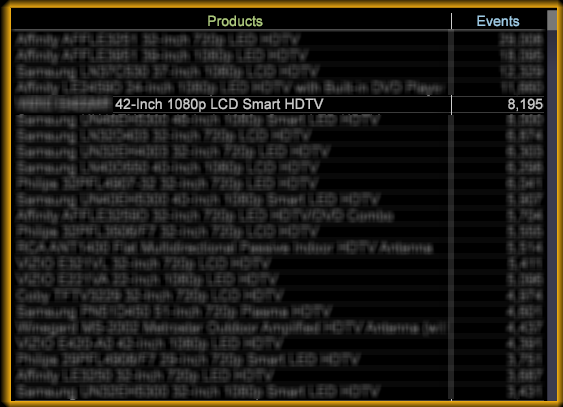
Step 1: Select the TV from the products table that will identify that the TV has been purchased.
https://blog.adobe.com/media_d0c56ae05a3ff10be2a3cd11a4090285e202895c.gif
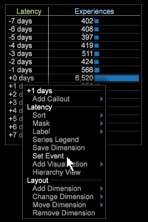
Step 2: With this selection made, set the event in the Latency table (remember you can set multiple events throughout an analysis)
https://blog.adobe.com/media_0c31236668d2e13ffbd83cf1b510b7d48a015287.gif
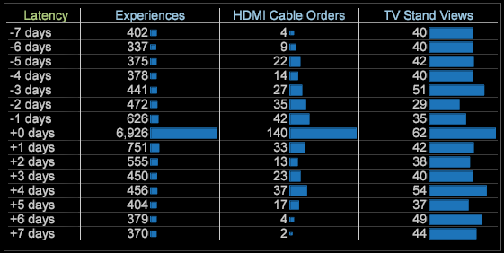
Step 3: Now you are able to see what is happening with customers before and after they purchased a TV from your company.
https://blog.adobe.com/media_aca0b2afaed45473a8c5896b01244880c9694c7c.gif
Interpreting the data latency table:
First, remember that +0 days element in the table is dynamic based on each specific customer. If you look at the chart above with the four different customers, once you set the event all the different campaign interactions go to day zero.
Second, when you are interpreting metrics from the latency table you should read it by saying, “2 days after the event happens there are 13 HDMI Cable orders.” We can see from the Data Workbench visualization above that +4 days after the event, we have the second highest number of TV Stand views.
To get more detailed analysis we recommend creating custom metrics in your latency table. For example, creating an order metric for a related product to show how many customers are buying products together.
Another great next step is to save the Latency table as a dimension. This way you will be able to better understand the time series and how it relates to your event. Here are the steps to save a Latency table as a graph:
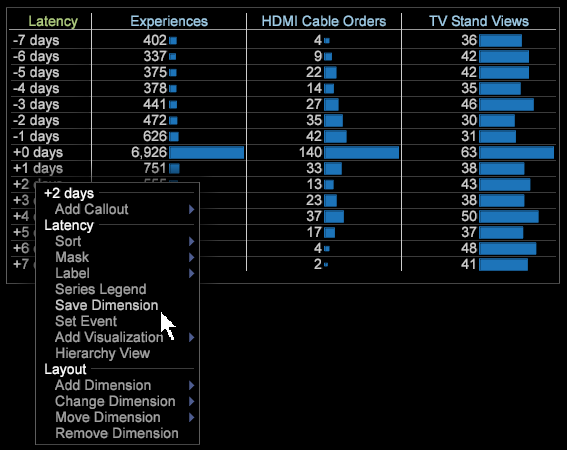
Step 1: Right click on the column under the word “latency” in the Latency visualization.
https://blog.adobe.com/media_930ed014a86863ebf3ec641c91c5c106825ee6f8.gif
Step 2: Save the dimension in your Data Workbench user folder.
https://blog.adobe.com/media_e16eaf5ae43a33c89c867c6f8fe64b7f1a3dd278.gif
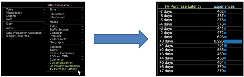
Step 3: You will then open up the Latency table as a dimension from the table menu structure in Data Workbench.
https://blog.adobe.com/media_f4a5413cb9dc51037bb9a65bb1274e28856cd998.gif
Step 4: Once you open the Latency dimension you can right click in the column under the dimension name and select Add Visualization then select Graph.
https://blog.adobe.com/media_78f2a8ecdb0f872bae7801a7110744e11d1afd20.gif
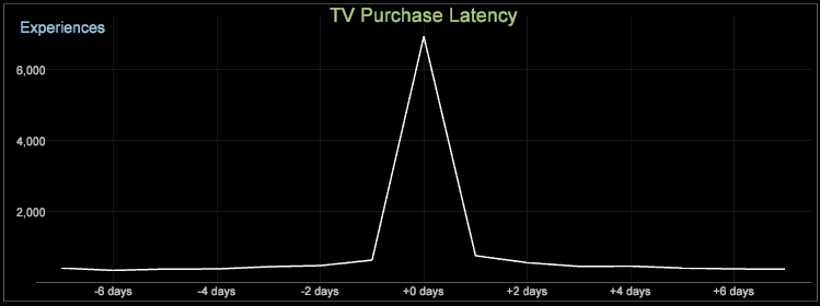
Step 5: You will now be able to see the Latency table in a graph format. You can use the same functionality of this graph just like other graphs in Data Workbench.
https://blog.adobe.com/media_9f6aee61017f207c6b9a243c6abb62cf2c5297d7.gif
If we take the example we have been working with throughout this blog we can see that if you add a series to the graph of different customer segments: Online Only, Offline Only, and Multichannel Customers, you will see where the real power of making the Latency dimension into a graph can be.

http://blogs.adobe.com/digitalmarketing/wp-content/uploads/2013/10/LatencySeries11.png
The key takeaway from looking at Latency this way would be that Multichannel customers are the group that are purchasing the most HDMI Cables, while Online Customers are purchasing the TV. At the “+4 days” after the TV purchase there is a spike in Multichannel HDMI Cable orders.
The value you can gain from doing a latency analysis is the ability to better understand what your customers are doing leading up to a certain event as well as after an event. A lot of our clients find value in analyzing different campaigns, shopping cart abandonment, placing an order, or account registration using latency analysis.
Like I mentioned in the beginning of this post, latency analysis is one of the powerful visualizations in Data Workbench. If you have any questions or comments on how to do a certain analysis please feel free to leave them below or reach out to me on Twitter at @adaste.