Welcome to the New Adobe Analytics Navigation
Navigation. It’s an often-underappreciated element of great product design, and for good reason: when done well, navigation is such a seamless, integral part of the user experience that you hardly notice it.
Any analytics application with enough flexibility to serve wide-ranging business needs, especially as more and more users access the data, is going to offer a lot of options for retrieving that data and turning it into insights. These options could be manifest as a variety of reports, a large set of dimensions and metrics, varied visualization options, a smattering of data sources, etc. Until now, these choices have meant that analytics tools were difficult to navigate—especially for new users and those less “fluent in data”—in order to find answers to difficult questions.
This is why I’m excited to announce the new navigation now available in Adobe Analytics. Designed using data (both quantitative and qualitative), and from the perspective of our end users, this navigation takes a different approach to data and report access than anything we’ve done before. I’ve been using it for about a month now; I love it, and I think you will, too.
Adobe Analytics gets personal
Because enterprise digital analytics needs vary so widely from team to team—and, in fact, from individual to individual—shouldn’t your navigation vary to meet those needs? We think so, which is why the new Adobe Analytics navigation includes three personalized elements at the top level. Our data suggests that, once these elements are fully personalized, many users will only rarely need to use the full report menu again.
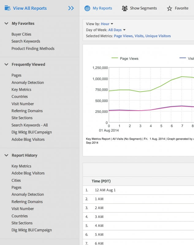
First, a new section called Favorites. You can think of a favorite like a bookmark. It’s designed to put reports that you want to access quickly right there at the top level for easy retrieval no matter where you are in the tool. Every report and dashboard in Reports & Analytics is available to be marked as a favorite, and all favorites display on this list. To mark a report as a favorite, simply click the “Favorite” icon in the report header, name the favorite, and voila—it will appear instantly on your list.

If you later want to remove a favorite, just click the “x” next to it in the navigation.
Next, Frequently Viewed. This is exactly what it sounds like: for each user, this list will show the reports and dashboards viewed most often over the past (rolling) 90 days. The elements of the tool to which you return regularly will bubble up to the top of the list making them easier to find. We’ve been capturing this data for all users in Adobe Analytics since August 2014, so you if you haven’t logged in since August you may not have any selections in this list yet, but you will as soon as you start running reports.
Finally, Recently Viewed. As you move through a train of thought in your analysis, it can be helpful to leap back a few steps after going down one path so that you can embark on another. This list shows the 10 reports and dashboards that you have viewed most recently, so that you can easily retrace your steps and create a “project path” through Adobe Analytics.
Each of these sections works on a per-report suite basis. This means that for each report suite you will have a separate set of favorite, frequently viewed, and recently viewed reports. While you cannot currently control these sections of the navigation on a user group level, this is something we are considering for a future release.
A better way to find insights
While we believe that personalization goes a long way toward creating an inviting analytics experience for various roles and personae at your organization, for more advanced users or those just getting up and running with Adobe Analytics there will remain a desire to use the full set of navigation options—the dozens or hundreds of possible reports, dimensions, metrics, etc. Of course this is still available to you, under “View All Reports” at the top of the navigation.
Given the powerful flexibility of Adobe Analytics, you may have dozens or hundreds of report options here. That’s why we chose a “miller column” approach, similar to the preferred navigation method in Apple’s OS X. Note that the search field, which many of you have adopted lately, is available in this view. Your previous menu structure is all here, including any customizations you’ve done. You can also access bookmarks and dashboards from this menu. In short, if it provides data, you can find it here. You can click through your menu structure with complete visibility into the full set of reports and dashboards available to you so that you can always find what the right report the first time.

We’ve introduced a number of keyboard shortcuts to make it even easier to navigate your menus. The forward-slash (“/”) key will open the miller column view from anywhere in the tool, and will drop you into the search field. From there, you can use arrow keys to move down into the columns and through the directory of reports. Hitting Enter will launch the highlighted report.
The search field has been improved as well. Not only does it use “fuzzy” search functionality—which means that it works around typos and misspellings to return the desired results—but it now provides “breadcrumbs” to show you exactly where each report in your search results is located. This can be critical to selecting the right report, since you may have a Fall-out Report for a few different dimensions. With breadcrumbs, you can be sure you are getting the version that will answer your question, every time.
Navigating outside of Reports & Analytics
All of this is great if you are running reports directly in Reports & Analytics, but what about launching Ad Hoc Analysis, or building a Data Warehouse report? What about the Admin Console?
Everything that is outside of Reports & Analytics is available by clicking the “hamburger” in the upper left. This will expand a left rail that includes all of the tools in Adobe Analytics, including the Admin Console. Here you can, for example, download Report Builder and manage your segments. This does mean that Admin Console pages will no longer show up in search results in the Reports & Analytics navigation, but fortunately the set of Admin Console pages is small enough that it is navigable easily without search.
Learning from you
Lastly, it would be foolish to pretend that our push for a more intuitive navigation experience in this release had nothing to do with the feedback we heard from you following our release in May 2014. You loved segment management, segment stacking, and the new segment builder, but you did not love the “sliding” navigation. That change was always intended to be a transition toward this new navigation; the input we got from you and your peers made it clear you wanted us to prioritize and expedite the additional improvements that we had been planning, which is exactly what we did.
One of the sneaky-cool elements of this new navigation that came directly from your feedback is the “guided tour” that all users will see upon first login following this update. You told us that you wanted better contextual training to help your users learn Adobe Analytics, and we delivered. In seven steps, this initial walkthrough takes the user step-by-step through the various elements of the navigation for the sake of clarity and training. This blog post is almost redundant because we know that your users will be able to learn most of what I covered here directly in their workflow, without having to go read a blog.

I thought that our manager of user experience design for Adobe Analytics, Ryan Cobourn, explained the process and the outcome perfectly. He said,
When we observed our customers using their various analytics tools, we found that the navigations were failing them because the common hierarchical structures only accounted for a small percentage of user’s needs. Watching customers interact with data and insights, we found that most have a handful of common (or favorite) reports that they regularly check, and that they needed better search tools to explore reports outside of their favorites. Those insights drove our approach to solving the navigation problem because we wanted to help our users make sense of all of their data and access it efficiently so that they can measurably impact their business. We’re very proud of the result, and our testers have loved it.
I agree completely. We are very excited about the final product of the feedback, design, and development that went into this new navigation. Personally, I’m proud of how close we were to many of you during this process, relying on your insights as well as extensive testing with you to help us create something that we believe will make it easier than it ever has been for your users to access data and derive insights. So I guess I would sum it all up by saying, simply: thanks.
Of course, we are always open to more input and additional improvement, so—as always—please do not hesitate to share that feedback with us through the Adobe forums, through your account team, through Twitter, or through the Idea Exchange. See you around!