NEW FrameMaker User’s Guide: Sliced, Diced, and Enhanced
[An update from Nandini Gupta and Peter G.A. Barraud] — Over the years, many of you from the FrameMaker community shared rich feedback on the content and structure of the FrameMaker user’s guide. We’ve been listening and we’ve spent several busy months acting on the feedback to create an improved user’s guide that meets your content requirements better.
So, what exactly has changed? As we analyzed your feedback, some key themes emerged:
-
Content organization: FrameMaker is a powerful product packed with rich functionality. However, not all users use all of its functionality all the time. While improving the guide, we made a conscious attempt to minimize scattering of information and keep content around related features together. For example, information about using structured authoring features forms two neat chapters in the new user’s guide. This information was spread across several chapters in the earlier user’s guide. You may see an example in the HTML5 online version below:
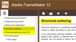
https://blogsimages.adobe.com/techcomm/files/2014/12/01-Struct-Author.jpg -
Workflow-based approach: The new user’s guide makes it easier for you to _just _get things done. We’ve tried to step into your shoes and figure out what information you’d need and in what order. That you’d shared useful feedback over the years made our job a lot easier. So, whether it’s managing graphics or single-sourcing content, we walk you through relevant concepts and tasks in an order congruent with FrameMaker workflows. With apologies to Coleridge, might we say, the best content in the best order?https://blog.adobe.com/media_504e103cdd340cf3288bb6123394434f47d24697.gif
-
**Responsive content experience: ‘**Content experience’ is two words—’content’ and ‘experience’. We know you’re connected 24/7 and that you access instructional content on your devices. On your desktop, the new FrameMaker user’s guide opens in a little content viewer app of its own (see YELLOW HIGHLIGHT portion of screen capture below.) When you access the content on a smaller screen, it is displayed in a responsive layout, ensuring a seamless content experience.
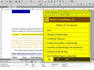
https://blogsimages.adobe.com/techcomm/files/2014/12/03-new-FM-HELP.jpg -
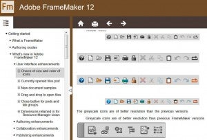
https://blogsimages.adobe.com/techcomm/files/2014/12/04-ILLOS-VISUAL.jpg
Visual treatment: Wherever possible, we’ve tried to pull down the wall of words that traditional documentation is. So, as you glance through the new user’s guide, expect to see visuals and illustrations that help demystify a complex concept or task. Not sure how you can publish across multiple channels? Well, see it for yourself. -
Discoverability: You turn to the user’s guide trying to find answers to questions that are blocking your everyday work. That’s why we kept titles in the new user’s guide crisp and the content search-friendly. So, whether you search on Adobe.com or Google, you can expect to find a useful Help article that helps you get back to your work as quickly as possible.
-
Resource ecosystem: We want the new user’s guide to be more than just your first stop for information on everything FrameMaker. We want it to be also the launchpad that propels you to other, often advanced, sources of information on the web. Hop right over to the appendix at the end to view a list of select FrameMaker resources. We promise to keep the list updated as more resources become available.
What we place in your hands today is just the version one of the improved user’s guide. Your feedback has helped us get it to this stage, and your feedback will be pivotal as we try to refine it even further. Keep the wishlists coming; we’re making a careful note of them.
And now that we’ve said enough, here are the links to the new guide:
HTML: http://adobe.ly/1Dokcld
Happy reading!
Nandini Gupata, Senior Manager Content and Community, Core Technologies and Products
Peter G.A. Barraud, Senior Content and Community Lead