Your Questions Answered: How do I create a horizontal, center-aligned CSS menu in Dreamweaver?
We have received a number of requests from Dreamweaver users about creating menus, and we’re here to help! In this ‘Your Questions Answered’ post we’re tackling the basics of creating a menu in Dreamweaver. We’ll get more advanced in later posts, exploring how to create drop down menus and responsive menus, but for now let’s get started with a solid foundation to build off of.
If you are new to Dreamweaver, see our previous ‘Your Questions Answered’ post which walks you through setting up a site in Dreamweaver. Once you have a site set-up, you’re ready to rock this tutorial.
Let’s get coding!
Create a new page in Dreamweaver
- Select File > New
- Choose the default option (HTML), and click Create.
- Select File > Save As and save the file as menu.html
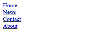
Create an unordered list in the body of the HTML page
Your code should look something like this:
__
__
__
__
__
Depending on the view that you are in, you should be able to see an unordered list in the Design View or Live view. Notice that each item in the list is associated with an tag. You specify the destination for each item in the tag. For example, when you click Home, the browser opens the home.html page.
We have not yet created the destination pages. So, clicking the links now will not lead you anywhere.
https://blog.adobe.com/media_e72c9422ea597e6f86793cfbbccb1ec9a1153ac3.gif
Remove the bullets from the list
You do not want bullets in your CSS menu, but never fear. We we will be using CSS to take care of this! After you are done with the code, click the Design view. The bullets in the list should disappear leaving you with a clean list.
Just below the “tag, create the style tags:
Insert this piece of CSS code in between the style tags.
ul {
list-style-type: none;
margin: 0;
padding: 0;
}
list-style-type:none: removes the bullets from the ordered list.
Setting margins and the padding to 0 overrides any browser default settings.
Specify a width for each of the list items
If we do not specify a width for the list items, they will take up a default width. To specify the width, we will be specifying a style for the “tag associated with each item in that list.
Below is the CSS code for the ul tag. Insert this piece of code:
a {
display: block;
width: 60px;
}
display:block: This makes the whole area around the link clickable, not just the text.
By specifying the width at 60px, we are overriding any default width settings of the browser.
You will not notice any major change in the design view except for a border around each item in the list.
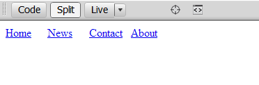
Lining up the menu items
Since we are creating a horizontal menu, we want to line up the menu items next to each other. To do this, we have to first remove the line break that is associated with each item. While you don’t see the line break in the code, each block element is associated with a line break before and after the item.
To do this, use:
li {
display: inline;
}
Good, now the line breaks are gone. You won’t see anything happening in your Design view, but that’s okay. By default, each of the items take up the entire width of the browser. When we float them to the left, we tell each of those items to move to the left and make space for the next item in the list to move up and take up the empty space on the right.
li {
display: inline;
float:left;
}
You should now have the menu items lined up next to each other. Perfect.
https://blog.adobe.com/media_28cbc0ad19479bf3a61e33d0f752644cf0171cc6.gif
Styling the menu items
The menu is in place now, but it has no color and you don’t see anything happening when you move over each of the menu items. Let’s fix that!
Defining the style for normal and visited states
When browsing the Internet, you have likely seen instances where the color of menu items changes after you have clicked on and visited the page associated with the menu item link. It is a visual indicator letting you know that you have made at least one visit to that page previously.
While that is a good idea for normal links, it’s not a great option for menus. We do not want our menu changing color after a user visits a page. So, we are going to disallow that change.
An “tag or tag associated with links has four states:
a:link – a normal, unvisited linka:visited – a link the user has visiteda:hover – a link when the user mouses over ita:active – a link the moment it is clicked
Delete this piece of code:
a {
display: block;
width: 60px;
}
Now enter this code in between your style tags:
a:link, a:visited {
display: block;
width: 120px;
font-weight: bold;
color: #FFFFFF;
background-color: #98bf21;
text-align: center;
padding: 4px;
text-decoration: none;
text-transform: uppercase;
}
Now, the style for the normal and visited states of the menu have been defined. Look in your design view. You should see something like this:
https://blog.adobe.com/media_6ad91ca791e879d935e42ecc1b13076885712106.gif
Defining the style for the hover and active states
Let’s keep things simple. We don’t want two different things happening when the user moves the mouse over the link and when they try to click it. We want the same style for both actions. All we will do is change the background color for these states.
Changing the background color lets the user know the menu item that is being clicked.
a:hover, a:active {
background-color: #7A991A;
}
Preview your menu in a browser
You should be able to see the effects when you move your mouse over each of the menu items. However, because those pages do not exist, nothing actually happens when you click on those links. You will have to create each of those pages and add some content to them to see the menu in action.
Centering the menu
To center the menu, we will associate an ID with the
- tag, and then style the ID.
In the body, your code should look something like this:
Now that the association has been taken care of, let’s stylize the nav ID. We will use pretty much the same trick that we used to center a web page in a browser.
#nav{
width:750px;
margin:0 auto;
}
With this code we have defined a width for the container, set the top and bottom margins to 0, and the left and right margins to auto. This clears the space to the left and right of the margin allowing the browser to calculate the margin.
Not sure if you got everything right? Take a look at a completed source file.
Until next time, happy coding!