New Dreamweaver CC Starter Templates Make Responsive Design a Snap!

One of the great new features in the October 2014 release of Adobe Dreamweaver CC 2014 is the addition of five starter templates: About page, Blog post, eCommerce, Email, and Portfolio. Each of these templates provides a responsive structure to build a new web page that will look great whether it is opened on a mobile device, a tablet, or a PC. The About page, Blog post, and eCommerce templates are built with media queries. The Email template is built with tables, and the Portfolio template is built with Fluid Grids. This is a very positive step toward simplifying the process for those less comfortable with building a responsive design from scratch.
You can create a new page based on one of the Starter Templates by using either the File menu or the Welcome Screen. Although the screens are different, the results will be the same.
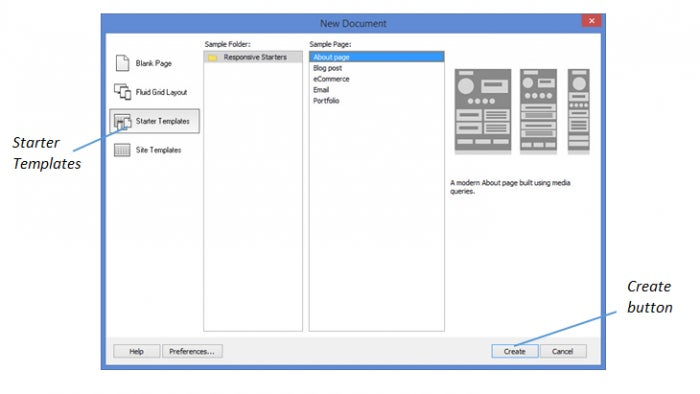
Use the File menu to create a new page based on a Starter Template
- Select File on the Menu bar, then select New.
- Select Starter Templates, select a Starter Template name in the Sample Page column, then select Create.
-
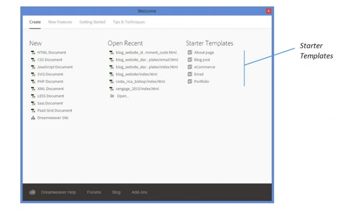
Use the Welcome Screen to create a page based on a Starter Template
- Select Help, then select Welcome to display the Welcome Screen, if necessary.
- Select a Starter Template name from the Starter Templates column.
-
After selecting either option above, continue with the following steps:
-
Enter a file name into the File name text box, then select Save.
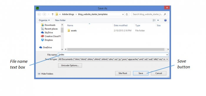
- Select Copy in the Copy Dependent Files dialog box.

The Copy Dependent Files dialog box closes and all dependent files are copied to the website root folder. With the About page template, a style sheet named aboutPageStyle.css is copied, along with two images: profile photo.png and social.png. The other Starter Templates will have different dependent files listed that relate to their placeholder page content and styles.
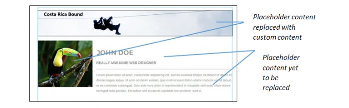
At this point, you begin replacing the placeholder content with your own content. As you replace content, you will also want to modify the selectors in the style sheet that are used to style the content.
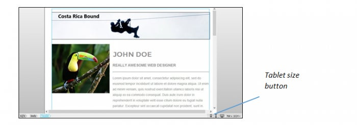
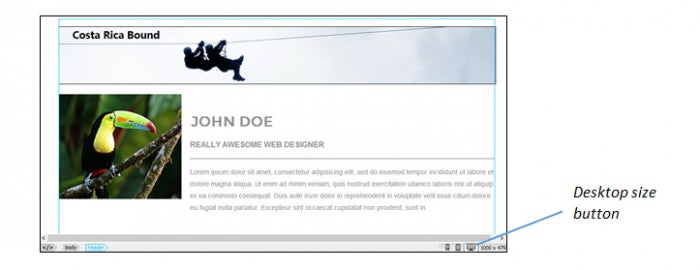
As you test your pages, use the three Size buttons on the status bar to see how the page elements will display on a mobile device, tablet, and desktop.
Mobile size

Tablet size
Desktop size
Once you build one page using a Starter Template, you can use that page as a template for creating and building the rest of the pages in your site. You may decide to add more selectors to your style sheet as you add content unique to new pages, but the bulk of the page styling will be done! Not only will you save a tremendous amount of time, but your page designs will flow together nicely with a consistent look and feel across the site.
Until next time, happy coding!