An Introduction To Graphical Effects in CSS
Over the past couple of years, CSS has gotten a set of new properties that allow us to create quite advanced graphical effects right in the browsers, using a few lines of code, and without having to resort to graphics editors to achieve those effects. If you are like me, then that sounds like music to your ears. I don’t do well in graphics editors and would choose a code path over a graphical editor path any day. CSS now allows us to do more graphical work right in our text editors.
Examples of graphical effects that we can create using CSS today include textured text effects, photo effects like color editing/tweaking, photo and element blending that also enable us to blend elements with other elements, clipping content to arbitrary shapes, and more. You can even wrap content to arbitrary shapes with CSS too!
CSS has gone a long way, and in this article I want to give you an overview of the CSS features that allow us to create such graphical effects—namely blend modes and filter effects.
Color Blending with CSS Blend Modes
If you’re a designer who frequently fires up a graphics editor such as Photoshop or Illustrator, then you’ve inevitably come across blending modes at some point or the other during your work, since blending is one of the most frequently used effects in graphic and print design. Blending operations, also known as blend modes provide us with a fine level of color blending control that enables us to perform operations such as inverting colours, mixing them, highlighting them, and more.
Different blend modes, when used, yield different effects. And a blend mode is used to specify how an element, known as the “source” will blend with its backdrop—also known as the “destination”.
In CSS, the element’s backdrop is the content behind the element and is what the element is composited with. Compositing is the fancy term for the process of combining an graphic element with its backdrop.
When you blend two elements in CSS with each other, only the areas where these elements overlap will be affected by the blend mode you choose because, as you can imagine, only those areas are where these two elements can be blended.
Before the CSS Compositing and Blending specification was introduced, CSS already offered us one way of compositing elements known as simple alpha compositing. This is what the opacity property is for. By changing an element’s opacity, the browser makes it translucent so that the colours of its backdrop can show through.
Today, two main properties exist in the CSS compositing and blending specification that enable us to blend elements with other elements and an element’s background images by specifying one of 16 available blend modes. These two properties are: background-blend-mode and mix-blend-mode.
Blending Background Images Using The background-blend-mode Property
The background-blend-mode property, as its name suggests, is used to specify a blend mode for an element’s background layer. A background layer can be an image, or the background color.
The background-blend-mode property is used to specify the blend mode for each background layer.
If the element has more than one background image, you can specify multiple blend modes—each blend mode will be used for a background image such that the first blend mode in the list corresponds to the first background image in the list of background images, and so on.
For example:
background-image: url(first-image.png), url(second-image.png);
background-color: orange;
background-blend-mode: screen, multiply;
The second-image.png background will blend with the background color using the multiply mode, and then the first-image.png background will blend with the second image and the background color using the screen blend mode. (Reminder: the first background image in the list is the one on top, and the ones following it are beneath it.)
The background images will only blend with each other—they will not blend with any content that lies underneath the element itself.
There are 16 blend modes available in CSS: normal (which is the default blend mode and means that no blending is applied), multiply, screen, overlay, darken, lighten, color-dodge, color-burn, hard-light, soft-light, difference, exclusion, hue, saturation, color and luminosity. (For the sake of brevity, I will refrain from going into technical detail about each of these modes, and will recommend this article instead to learn all about them.)
These blend modes will modify the colours of a background image resulting in a different effect for each mode.
The hardest part comes when picking a blend mode to achieve a specific effect is knowing which mode to pick. It is very hard—if not impossible—to predict the result of applying a certain blend mode to an image.
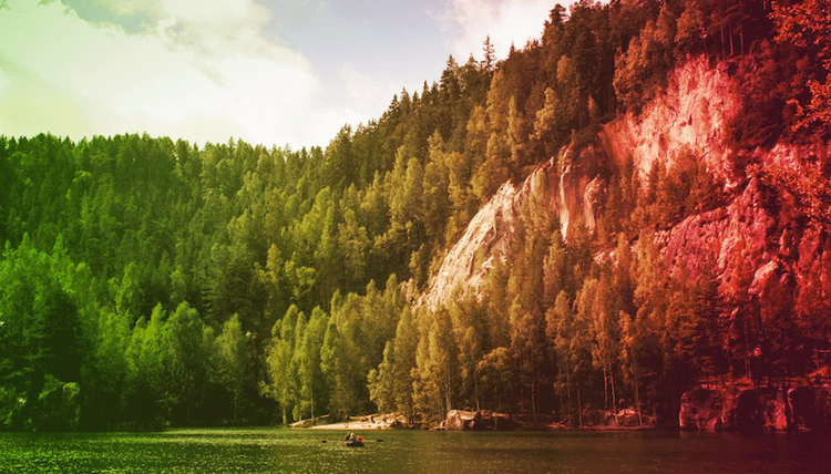
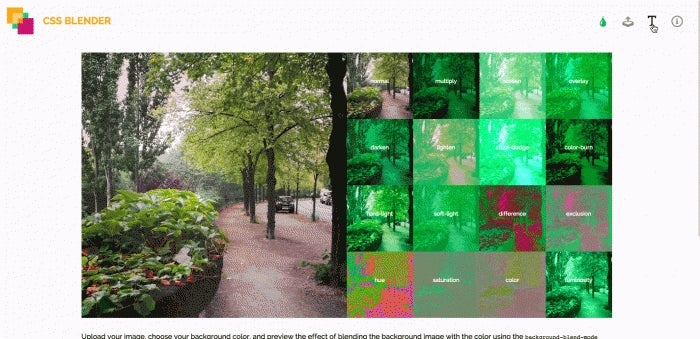
The following image shows a set of results achieved when applying the above mentioned blend modes to an image. The image is being blended with a red background color. The order of blending operations from the top left corner of the image is the same as the order mentioned in the list above.
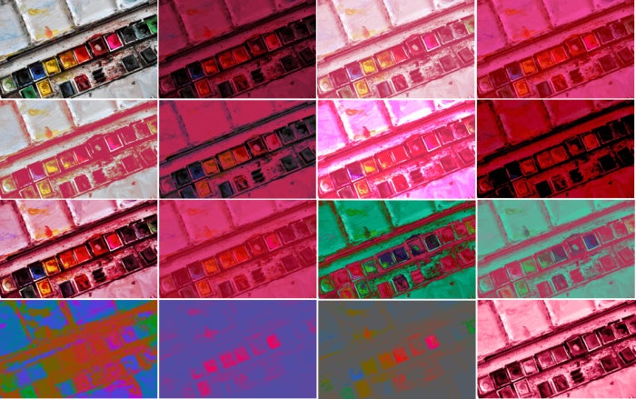
Usually, the way to choose a blend mode is by trial and error. Apply the blend modes to your image and settle for the one that achieves the effect you’re after.
Some blend modes, however, yield expected results and you can memorise those and use them whenever you need. For example, the luminosity mode allows you to create monotone images (bottom right corner)—this is a handy tip to keep in mind for when you’re after creating that big header image with a white heading on top which became very trendy during the past year.
As part of an article I wrote a while back, I created an interactive demo which allows you to upload your own image and preview the different blend modes on it. You can play with the demo here.
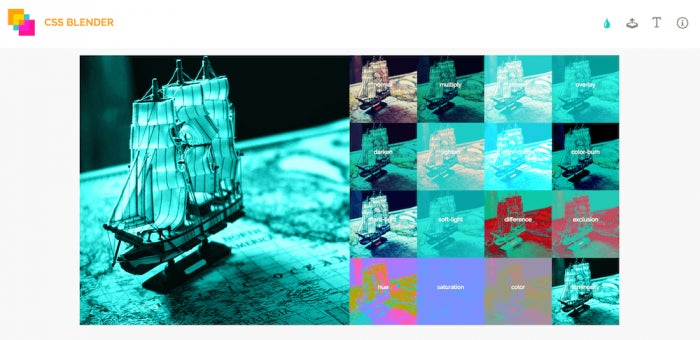
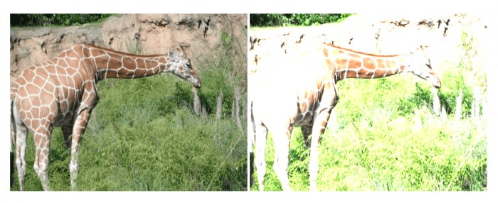
Blending background images is great and you can achieve some really neat effects using this property. The following image shows an example of blending an element’s background image with a linear gradient image also used as a second background image on the element. This image is taken from this live demo from the Codrops CSS Reference.
More creative effects can be created when you get to blend an element with other elements on the page. This is useful for when the images you’re blending need to be foreground images—not background images, and when you want to blend a piece of text, for example, with the image behind it. This is where the mix-blend-mode property comes in.
Blending Elements with Their Backdrop using mix-blend-mode
Probably one of the most useful and practical use cases for mixing elements is mixing a piece of text with some image behind it. And this is where the interesting effects come in. Think fixed headers blending with the content as the page scrolls down, or text blended with an image in the background, or text blending with other text, etc. Using the mix-blend-mode property you can do exactly that.
Just like background-blend-mode, the property accepts one of the 16 blend mode values available. Again, to see this in action, you can refer to the interactive demo mentioned earlier.
The following screen recording shows how you can add a piece of text and then blend it with an image of your choice using one of the different blend modes.
An example blending a piece of text with a background image behind it could look like the following. Assuming the piece of text is contained in a wrapper that has a background image applied to it, we could have something like:
This is a blended heading
.wrapper {
     background-image: url(path/to/image.jpg);
   background-size: cover;
    /* … */
}
h1 {
    mix-blend-mode: multiply;
     /* other styles here */
}
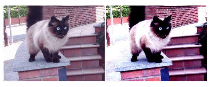
You can also blend text with other text, allowing you to achieve nice colourful text overlapping effects like the one shown in the top right corner of the following image. All of the effects shown in this image can be achieved using different CSS blend modes.

Using negative margins or relative positioning, you can shift the position of one word so that it overlaps with the word next to it, and then apply a mix-blend-mode to the word to blend it with the other word. The possibilities are endless.
Blending Notes
Sometimes, you may not want to blend an image or an element with its backdrop, or you only want to blend a group of elements together but prevent these elements from blending with other content behind them. This is where stacking contexts come in play and, using a property called isolation, you can isolate a group of elements so that they only blend with each other and don’t blend with other content on the page.
By creating a stacking context on an element, you can isolate the content of that element and prevent them from blending with the backdrop of that element. However, you can still apply a blend mode to the entire context to blend it with its backdrop.
Moreover, If you are using the background-blend-mode property, the isolation property is not needed since background layers must not blend with the content that is behind the element, instead they must act as if they are rendered into an isolated group (the element itself), as specified in the specification. This is why the isolation property will have an effect when used with the mix-blend-mode property, but not with the background-blend-mode property.
You can learn more about the isolation property here.
Note that the mix-blend-mode property also allows you to mix or blend SVG elements too.
Browser Support
CSS blend modes support is getting better by the day. You can keep an eye on browser compatibility for the background-blend-mode property here; support for mix-blend-mode can be found here.
Whether or not a property has full browser support, you can always start using it as part of a progressively enhancing workflow. These blend modes can be used to enhance your page designs, while falling back to non-blended alternatives in non-supporting browsers. By using a feature today, you’ll help push it forward and your design will eventually look right in other browsers as they support these features. So don’t let a limited browser support stop you from having fun with these properties today!
Image Adjustments with CSS Filter Effects
A filter effect is a graphical operation that is applied to an image as it is drawn into the document. It can be described as an operation that passes an image through a filter and then renders the output of that image on the screen.
One way to think of them is like a filter placed on the front of a camera lens. What you’re seeing through the lens is the outside world modified by the effect of the filter. What you see on the screen is the content modified by the filters applied to it.
To apply a filter to an image using CSS, you use the filter property defined in the CSS Filter Effects specification.
Filter effects include, for example, blur effects, drop shadows, and colour shifting and manipulation like saturating/desaturating colours, among others.
There are ten primitive filter effects in CSS, and a filter is applied to an element by passing a filter function to the filter property.
The ten filter functions are:
▪ blur()
▪ brightness()
▪ contrast()
▪ grayscale()
▪ hue-rotate()
▪ invert()
▪ opacity()
▪ saturate()
▪ sepia()
▪ drop-shadow()
▪ url()
Each of these functions is used to manipulate the image’s pixels and colours, and each function takes a parameter value that specifies the degree or intensity of the filter applied.
Conceptually, any parts of the element are effected by filter operations. This includes any content, background, borders, text decoration, outline and visible scrolling mechanism of the element to which the filter is applied, and those of its descendants.
The blur() function
The blur() function is used to blur an element by applying a Gaussian Blur to that element. It takes a length value as a parameter; this value needs to be a positive number and cannot be set in percentages. The larger the value the more blurred the element will be. A value of zero will leave the element unchanged.
What’s interesting is that since the parameter of the blur() function is a length value, this means that you can use any possible length unit, like em and rem.
The following are examples of valid blur() values:
blur(.5em);
blur(7px);
blur(0);
filter: blur(); /* equivalent to blur(0); */
The following image shows the result of applying a 10px blur to an image:
The brightness() function
The brightness() function is used to manipulate the image brightness. It is used to make the image look more or less bright. It adjusts an image’s colours between completely black (zero brightness) and the original image colours (100% brightness). A value of zero will render the image completely black. A value more than 100% will increase the image brightness.
You can also specify the amount of brightness using a number instead of a percentage such that a percentage value of 65%, for example, would be expressed as 0.65 instead.
For example, the following are all valid brightness() values:
brightness(150%);
brightness(0);
brightness(0.7);
brightness(0.01);
brightness(200%);
brightness(10%);
The following image shows the result of applying a 200% brightness to an image:
The contrast() function
The contrast() function adjusts the contrast of the image. That is, it adjusts the difference between the darkest and lightest parts of the image.
The function is similar to the brightness() function in that, just like brightness(), a value of zero will render an image completely black. As the value increases towards 100%, the difference in darkness changes until you see the original image at 100%. Values beyond 100% will increase the difference between light and dark areas even more. If no value is passed to the contrast() function, it defaults to 100% and the image is not changed.
contrast() also takes the same values as brightness(), so the following are all valid examples:
contrast(150%);
contrast(0);
contrast(0.7);
contrast(0.01);
contrast(200%);
contrast(10%);
And the following image shows the result of applying a 200% contrast to an image:
The grayscale() function
The grayscale() function converts the image into a shade of grey.
The value is also a percentage or a decimal number equivalent to that percentage. However, the percentage values need be between 0 and 100%. Any value greater than 100% will be clamped to 100%. 0% leaves the image unchanged while 100% makes it completely grey. The higher you go from zero to 100% the more the image loses its colours and becomes grey.
The following are all examples of valid greyscale() values:
filter: grayscale(); /* defaults to grayscale(100%) */
filter: grayscale(1); /* same as grayscale(100%) */
filter: grayscale(36%);
filter: grayscale(0.28);
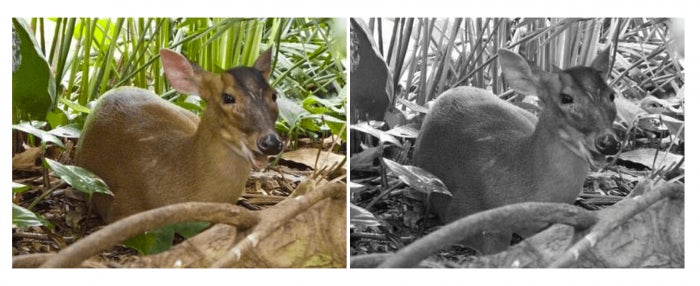
The following image shows the result of applying a 100% grayscale to an image:
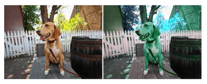
The hue-rotate() function
The hue-rotate() filter function rotates the colours of an image by an angle that is to be passed to the function as a parameter.
A simpler way to understand this would be to imagine a color wheel. Every color on the color wheel has an angle at which it is positioned. If you start at one point (color) at the circle and then move along the circle by a certain angle, you end up at another point with another color.
What the hue-rotate() function does is it selects each color of the input image, rotates it by the angle value passed to it, and then outputs the image with the input colors replaced with new colors. All the colors in the image are shifted in the same way to produce new colors.
A value of zero renders the image unchanged. The maximum angle of rotation is 360 degrees. If the value for the angle is not provided, it defaults to the value 0deg and the image is not changed.
The following image shows the result of applying a 120deg hue rotation to an image:
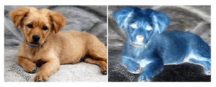
The invert() function
The invert() function inverts the colours of an image. It takes a value between 0 and 100% such that the higher you go from zero to 100% the more the image will look inverted. A value of 100% is completely inverted—all the colours are flipped so that the image looks like a photo negative (like the ones generated for old non-digital cameras). Any value over 100% will be clamped back to 100%. A value of 0% leaves the input unchanged.
Note that if you don’t pass a value to the invert() function, it defaults to 100% and the image is completely inverted. And the percentage values can also be represented as decimal numbers as well.
The following are examples of valid invert() values:
invert(); /* equivalent to invert(100%) */
invert(0.24);
invert(60%);
The following image shows the result of inverting an image’s colours completely using a 100% default value:
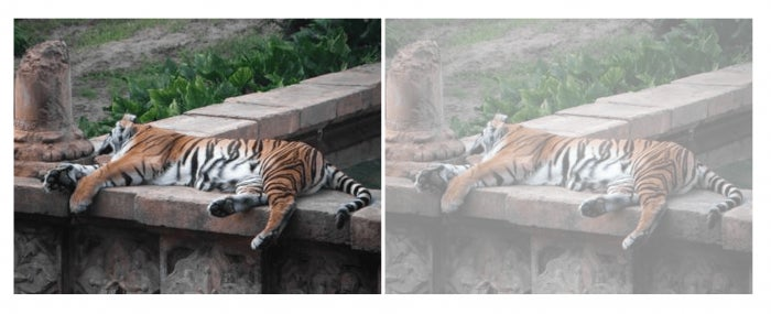
The opacity() function
The opacity() function is similar in functionality to the CSS opacity property. It accepts values between 0 and 1 or its equivalent 100%. 100% means the image or element is fully opaque, and as you go down from 100% to zero, the element becomes more and more translucent until it becomes completely transparent at zero, and then the content on the page that lies behind it—if any—will show through it. Even if you pass in a value greater than 1, the browser will clamp it down to 1/100%. Negative values are not allowed.
The following image shows the result of applying a 0.5 opacity value to an image:
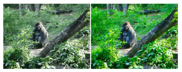
The saturate() function
The saturate() function saturates the colours of the image making it look more vivid. It takes a value between zero and 100% or the value’s equivalent decimal number. A value of 100% leaves the image’s colours unchanged. The value of zero completely desaturates the image while a higher value saturates the image more, and values greater than 100% will super-saturate the image. Negative values are also not allowed.
Saturating images is particularly useful for when the image’s colours are looking dull and you want to give them a more lively appearance.
The following example shows the result of applying a 250% saturation value to an image:
The sepia() function
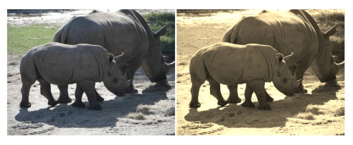
Ever heard of “the sepia effect”? You likely have—ißßt’s that effect that gives a vintage appearance to an image. The sepia() function gets its name from the fact that it adjusts an image by giving it a sepia tinge like in old photographs.
Just like previous functions, it takes a value (percentage or decimal) between 0 and 100%. The higher you go from zero the stronger the sepia effect. Values greater than 100% will be clamped to 100%.
The following is the result of applying a 100% sepia tone to an image:
The drop-shadow() function
The box-shadow CSS property allows us to apply a box shadow to an element. This means that even if you have a non-rectangular element or a non-rectangular image (like a PNG), the shadow applied to that element is going to be rectangular as if the element is a rectangular box. This, in many scenarios, is an unwanted results.
For example, suppose you have the following PNG image of a star. Since it’s a PNG, it is made up of some fully transparent areas, and the star is the only opaque area. When you want to apply a drop shadow to the image, you’ll likely want to achieve the following result:

Using box-shadow, you’d end up with something like this instead:

This looks ugly.
The drop-shadow() filter function allows us to achieve the previous result.
The drop-shadow() function takes a value similar to the value accepted by the box-shadow property, except that the drop-shadow() function’s shadow does not include a spread radius like the box-shadow‘s does, and the inset keyword is also not allowed in the drop-shadow() function. I’ll assume you’re familiar with the values of the box-shadow property. If not, please refer to this entry in the Codrops CSS Reference for a list of possible values and detailed explanation and examples of each.
To apply a drop shadow using drop-shadow(), you pass in the value of the shadow you want and simply apply it to your image. For example:
.png-img {
    filter: drop-shadow(10px 10px 3px rgba(0,0,0,0.3));
}
The url() function
The url() function allows you to use a filter defined in an SVG document and apply it to your element. Instead of using one of the above 10 filters, you can define your own filter in SVG and then apply it to the element by referencing the filter’s ID in the url() function. For example:
/* filter from an external SVG file */
filter: url(myFilters.xml#effect);
/* or filter defined in the main page */
url(#myFilter);
The following is an example of a blur filter defined in SVG:
Referencing that filter in CSS and applying it to an element would apply a Gaussian blur filter to that element.
Since SVG filters are a big and wide topic, we won’t be getting into the details of them in this article.
Live Demo!
Because CSS Filters are not supported in all browsers, I showed screenshots of the effects in all of the previous examples. That being said, you can still play with the filter values in the following live demo:
See the Pen 7405c808441c8021bb6bc59baef72441 by Sara Soueidan (@SaraSoueidan) on CodePen.
Just like with CSS blend modes, you can use CSS filters to enhance your pages, so you don’t need to wait for full browser support to start playing with and taking advantage of this cool CSS feature.
Multiple filters
You can apply multiple filters to an image or element. When you apply multiple filters to an element, the order in which you apply those filters matters and changes the final output of that element. If you apply multiple filters, these filters should be space-separated. For example:
filter: sepia(1) brightness(150%) contrast(0.5);
Animating filters
Filters can also be animated, this allows you to create some really creative effects. An example of multiple filters being animated on an image is the following image fading effect by Lucas Bebber:
See the Pen Pretty Fade by Lucas Bebber (@lbebber) on CodePen.
Lucas’s work is extraordinary, so you might want to check his Codepen profile out for more beautiful experiments that are sure to spark your creativity.. and curiosity.
Order Of Graphical Operations
In addition to blending and filters, an element could also be clipped and/or masked. If you apply more than one graphical operation to an element, the browser needs to decide which operation to apply first, and depending on the order, the end result would be different.
There is one specified order of operations in CSS according to the specification: first any filter effect is applied, then any clipping, masking, blending and compositing.
Inspiration
Not long ago, Dudley Storey created a neat experiment using CSS blend modes and clipping paths to create a 3D Glasses effect.
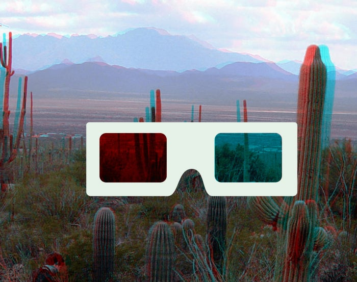
You can check his demo and tutorial out here.
Final Words
CSS Blend Modes and Filters are only two of the features that CSS proves us with to create graphical effects on the web. Other effects also exist that bridge the gap between print design and web design, giving us—web developers and designers—more control and better tools for designing in the browser, without having to resort to graphics editors to achieve such simple—yet powerful and impressive—effects.
If you’d like to learn more about other CSS graphics features, make sure to leave a comment below requesting a followup article.
I hope you found this article useful. Thank you for reading!
