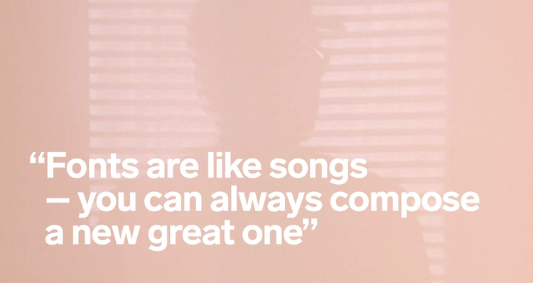
Göran Söderström: “Fonts are like songs – you can always compose a new great one”
For me font designing is comparable to composing music. Even though millions of songs already have been composed, you can always compose a new tune. The font business is also working the same way as the music business: you create a new type. Sell it from your artist page or via big font services that work like record labels.
“It is an extremely strong passion for me to design typefaces. For me, font designing is comparable to composing music. Even though millions of songs already have been composed, you can always compose a new tune. The font business is also working the same way as the music business: you create a new type. Sell it from your artist page or via big font services that work like record labels. I would call myself an ‘indie type designer’ because, just like indie musicians, I also sell my fonts from my own website, like indie bands do”, says leading Nordic font designer Göran Söderström.
One of Göran’s latest typefaces was released in June 2015. Lab Grotesque is a collaboration with Stockholm Design Lab.
A typography specialist, Göran Söderström is the founder of the type design studio Letters from Sweden and has been designing typefaces since 2006. He is self taught and has published his work through Psy/Ops, Fountain and FontFont before starting up his own foundry.
Göran Söderström has designed custom typefaces for Tele2, MTG, Acne Studios, C&A, Zeta, Posten Frimärken, ATG, Expressen, ICA, SEB and others. His commercial typefaces are used by the likes of Red Bull, Apple, SVT, The New Republic, Pitchfork Music Festival, Helsingborgs Dagblad and Rodeo Magazine. One of Göran’s typefaces has even been carved in stone.
On Wednesday, 17 June, he’ll be running a workshop at the Creative Cloud Creative Meet Up in Copenhagen. All attendees at the event are invited to visit his workshop to do a collaborative, unique typeface, working together with a creative mind who is also represented on Adobe Typekit with the font FF Dagny.
The attendees start out drawing fonts on paper according to a brief. Then they have to vectorise their font suggestions using the free mobile app Adobe Shape for smartphones. Göran Söderström will then pick out the best then build the font on his computer, using Illustrator CC and Glyphs, similar to what he has previous done as an external lecturer at Nordic design schools.
Start from scratch!

Göran Söderström, Letters from Sweden.
Göran Söderström has an important message to everyone who’s interested in typography and trying to create a great font:
Always draw the font from scratch and try to make an authentic typeface. Unfortunately too many designers get inspired by already existing fonts and build on them. Don’t do that. The result will never be good enough.
That doesn’t mean the Nordic typography scene doesn’t inspire him. Quite on the contrary:
The Nordic font scene is really developing. If you look back just a few years ago, we didn’t have many great font designers up here compared to Holland and Germany. But now, the Nordic font scene is vivid and sparkling. More and more young Scandinavians are designing fantastic fonts. It is the beginning of a new era for Nordic fonts.
In 2014 he designed the custom typeface for Tele2, the Swedish telecom company.
Besides the font workshop Göran Söderström will be running, expect five great keynotes on design, our Creative Jam and much more in our Creative Cloud Creative Meet Up in Copenhagen. If you can’t attend, remember that you can follow the event either via the eyes of our designer toy Walter or through the official live streaming.
Also, make sure to watch Göran Söderström speaking about typography and font design in Adobe Nordic’s Ask A Pro video session from 2014.