Build Responsive Websites with Built-in Bootstrap Templates in Dreamweaver

Learn how to use Dreamweaver’s built-in templates to create responsive content
Dreamweaver now has several Starter Templates to give you a jump start toward creating web pages that will look great on any size device. These templates are divided into two categories: Bootstrap Templates and Responsive Starters. This tutorial will show you how to create a page based on a Bootstrap Template.
What do I need?
Download the following files: botswana_sunset.psd
Step 1 of 8
Create a new page from a Bootstrap template
You see the Welcome Screen each time you open Dreamweaver. If you don’t see it, check your preferences and verify that the option Show Welcome Screen is checked, or close any open files and select Help > Welcome. You can use either the Welcome Screen or the File menu to create a new page. Before you create a new page, however, it’s a good idea to create a folder to store the new page and its related files, such as images or cascading style sheet files; then to define a site using this folder as the site folder.
Use your File management program to create a new folder. I named my folder botswana.
Select Dreamweaver Site in the New Column on the Create Welcome Screen, then define a new site using the folder you just created as the Local Site Folder. I named my site Botswana.
Next, on the Welcome Screen, select the Create tab, then select Bootstrap-Agency under the Starter Templates column.

http://blogs.adobe.com/creativecloud/files/2015/07/bootstrap-1.jpg
Replace the default File name with index.html.
Next, select Copy in the Copy Dependent Files dialog box to copy the dependent files necessary for this design into your site. These files include a style sheet, fonts, images, and JavaScripts.
Step 2 of 8
View the files that were copied to the Files panel
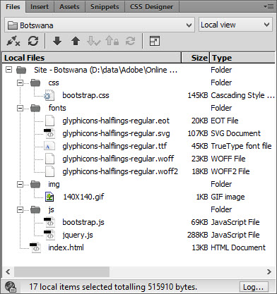
Let’s take a look at the files that were copied into the local site folder. Open the Files panel and expand each of the four subfolders that were created.
You see a bootstrap.css file in the css folder; five files used to format the fonts on the page in the fonts folder; four image files in the img folder; and two JavaScript files in the js folder. The index page has 245 lines of code. The bulk of the code for the content placement and design is in the bootstrap.css file, which has over 6,500 lines of code!
https://blog.adobe.com/media_bc90bc43bbdd1fa9cd1773903c3e7b12c11154a6.gif
Step 3 of 8
Add a page title and page content
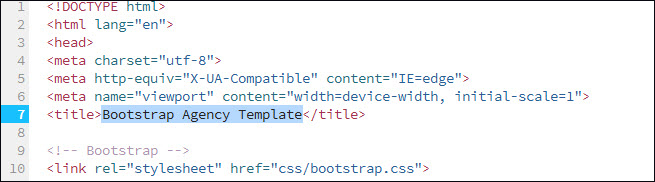
One of the simplest, but sometimes overlooked tasks for creating a web page is to add a page title. A page title, which is different from a page filename, appears on the browser page tab when a page is open in a browser. A page title is part of the Meta data for the HTML file, and is used by search engines to help users locate your site. If you don’t assign a page title, the default page title will appear in the browser page tab. An unassigned page title not only reflects poorly on the page designer, but diminishes the chances of search engines indexing the page. The default page title for this index page is Bootstrap Agency Template.
Go to Code view or Split view, then replace the title Bootstrap Agency Template with Welcome to Botswana!
https://blog.adobe.com/media_ddb1535ac05c3ff0aae40f9167b44decd191395c.gif
Step 4 of 8
Add an image using the Extract panel and Live View
A relatively new Dreamweaver panel is the Extract panel. The Extract panel is a powerful tool that can extract, or selectively copy images, text, or styles from a Photoshop file, then add or apply them to a page open in Live View in Dreamweaver. For instance, you can copy an image on a specific layer in a Photoshop file and place it in an HTML div tag or other page container. Or you can copy selected text and place it, along with its styles, on your page. You can even design an entire layout in Photoshop, then extract the layout to create a new page.
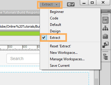
Select the Workspace switcher, then select Extract. This workspace divides the Dreamweaver workspace into the Extract panel and the Document window.
https://blog.adobe.com/media_d2ffd5d98229f18401fbb7ca74491624496973b6.gif
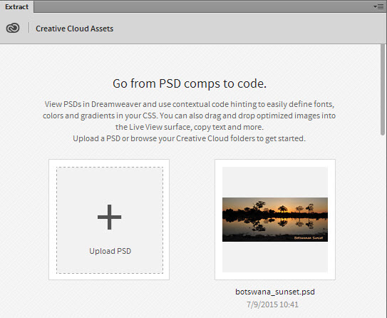
Select Upload PSD in the Extract panel, then browse to and select the file botswana_sunset.psd. After the file is uploaded into the Extract panel, it is available to use to add content on a page.
https://blog.adobe.com/media_229756a949ca8c0de8c0aa295e095de0c2bcdb98.gif
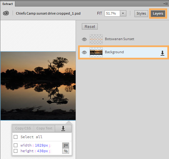
Select the image thumbnail to open it in the Extract panel, select the Layers button in the Extract panel, then select the Background layer.
https://blog.adobe.com/media_54332e65e980039ae1a4a6d9c7c5899bce333faf.gif
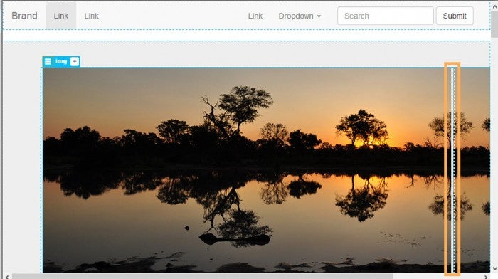
Change to Live View if necessary, then drag the background layer from the Extract panel to the div under the set of links at the top of the page until you see the > tag, press and hold over the > tag until you see the DOM panel, slide the pointer down until it points to the div class=”row”, drop the image, then press [Enter] to accept the default image name.
http://blogs.adobe.com/creativecloud/files/2015/07/bootstrap-7.jpg
https://blog.adobe.com/media_6c8aec0e2bb1f63f860b8bf5b9597f69d1082377.gif
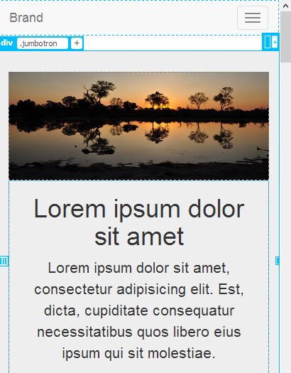
The image now fills the div class=“row”, but a breakpoint appears indicating where the image will not fit on smaller screen sizes. To automatically resize the image to fully appear on all size devices, create a style with a width property to resize the image responsively.
http://blogs.adobe.com/creativecloud/files/2015/07/bootstrap-9.jpg
Select the menu to the left of the img tag in Element Quick view, then the add alt and title text Sunset over the Moremi Game Preserve.
https://blog.adobe.com/media_ac6007054e8e058cce810f996fabe2e6ef62c564.gif
You can close the Extract panel now to free up workspace.
Step 5 of 8
Modify a style with the CSS Designer panel
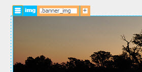
Select the banner image, select Add Class/ID (the plus sign) in Element Quick view over the top left corner of the image, then type .banner_img in the class text box.
https://blog.adobe.com/media_db2a19bb87e95936003debe2389c58ba65e915a4.gif
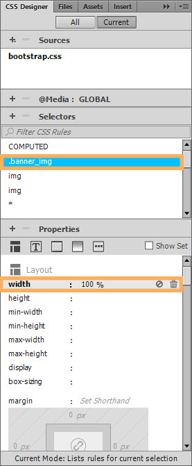
Open CSS Designer, select .banner_img in the Selectors pane, then set the Layout width to 100%. If you don’t see the .banner_img selector, be sure your CSS Designer panel is in Current mode with the Show Set checkbox deselected in the Properties pane.
https://blog.adobe.com/media_19c6af40d051ec9afd9dd14cdc127c61f06dc9bb.gif
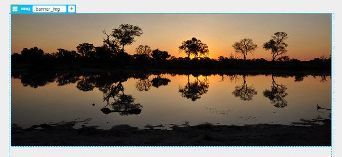
After setting the width to 100%, the image will expand to the full width in the div container in any size device.
http://blogs.adobe.com/creativecloud/files/2015/07/bootstrap-13.jpg
Step 6 of 8
Preview a page with the Window Size menu
Close the Extract panel and save all files.
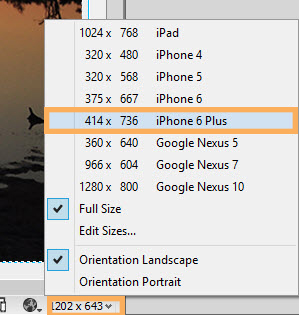
Select the Window Size menu on the right side of the Status bar, then select iPhone 6 Plus. Notice that you have the choice of viewing the page in either Landscape or Portrait orientation.
https://blog.adobe.com/media_9d6c458ee5596f6586af29a44bfe229b8678c79e.gif
The page content, including the image, resizes to the iPhone 6 Plus Landscape orientation size.
https://blog.adobe.com/media_4e41d38a74c2782ad336e4b382fd159e22058c01.gif
Experiment with selecting other screen sizes to verify that the page content conforms to each selected size, then return to Full Size.
Step 7 of 8
Preview a page with the Visual Media Queries bar
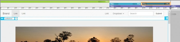
The Visual Media Queries bar is another way to check your page design in different media sizes. The Visual Media Queries bar is under the Document toolbar. It visually represents the media sizes that are defined in your bootstrap css file.
Select one of the media queries on the Visual Media Queries bar and notice how the page resizes to fit the width of the selected device.
http://blogs.adobe.com/creativecloud/files/2015/07/bootstrap-16.jpg
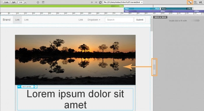
The Scrubber is a tool you can use in conjunction with the Visual Media Queries bar. Slowly drag the scrubber toward the center of the page to see how the page “breaks” or rearranges content to adjust to a new screen width.
http://blogs.adobe.com/creativecloud/files/2015/07/bootstrap-17.jpg
Step 8 of 8
Preview a page on a mobile device with Device Preview
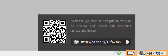
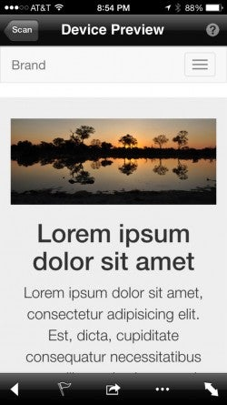
Device Preview is a new feature with Dreamweaver 16. Device Preview is an easy way to preview a page on the actual device size you are testing, rather than using a simulated size within Dreamweaver or manipulating the page size in a browser window. This is an extremely cool feature! All devices you are testing must be on the same network that Dreamweaver is using for the feature to work correctly.
Select Device Preview on the right side of the Status bar, then when the QR code displays for the index page, scan the QR code with your mobile device with an app such as Microsoft Tag. The index page will scan into your mobile device so you can see how it looks live on a mobile device.
https://blog.adobe.com/media_6a802772d94c29c89b839902548e5f371fa010a4.gif
The page below was scanned using an iPhone6 Plus.
http://blogs.adobe.com/creativecloud/files/2015/07/bootstrap-19.jpg
Summary
This tutorial introduced the new responsive Bootstrap templates in Dreamweaver. We created a new page based on the Agency template, then used the Extract panel to upload a Photoshop file and extract an image to add to the new page. We then added a class style to the image to format the image to display responsively at 100% width on any size device. The next steps would be to replace each placeholder item with new content and adjust default styles or add new styles to fine tune the positioning of all page elements. As you work, it is important to view the work in progress using such tools as the Window size menu, the Visual Queries bar, and the Device Preview.