Danish designer Michael Flarup: “ A great app icon is a visual anchor for your product”
App icons are not logos. While they certainly share branding-like qualities, they’re under a lot of different restrictions. It’s an important distinction for the designer to make: logos are scalable vector pieces of branding designed for letterheads and billboards. Icons are most often raster-based outputs customised to look good within a square canvas, at specific sizes and in specific contexts.
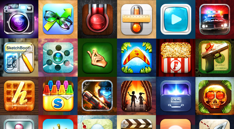
What makes a good app icon?
A beautiful, identifiable and memorable app icon can have a huge impact on the popularity and success of an app, but how exactly do you make a ‘good’ app icon? What does that even mean?
The right person to answer these questions is Michael Flarup: Danish designer, international keynote speaker, founder of legendary product building company Robocat, one-man studio Pixel Resort and many side projects like App Icon Wars, App Icon Template and the conference Forge Cph. Michael was also the host at our extremely popular Creative Cloud Meet Up which took place in Copenhagen on June 17th 2015.
According to Michael, “the first thing you need to understand when setting out to create your icon is what exactly an app icon is and what job it has to perform. An app icon is a visual anchor for your product. You can think of it as a tiny piece of branding that not only needs to look attractive and stand out, but ideally also communicate the core essence of your application”.
He also thinks the word ‘logo’ is thrown around carelessly these days:
App icons are not logos. While they certainly share branding-like qualities, they’re under a lot of different restrictions. It’s an important distinction for the designer to make: logos are scalable vector pieces of branding designed for letterheads and billboards. Icons are most often raster-based outputs customised to look good within a square canvas, at specific sizes and in specific contexts. The approach, the tools, the job, and therefore the criteria, for success are different.
From a practical standpoint, making an app icon means creating a set of PNG files in multiple sizes that needs to be bundled with your app– ranging from smaller sizes like 29 x 29px to 1024 x 1024px.
“This set of carefully crafted designs will be used in the many contexts of the OS where users encounter your application – including the App Store or Google Play, their settings menu, search results and your home screen. App icons can essentially be made in any application capable of producing raster files – like Photoshop and Illustrator,” explains Michael.
App icon design best practices
In the video below, Michael talks in detail about best practices when designing app icons and how to create memorable, relevant and unique icons for mobile platforms – it is a must view video for all interested in app icon design!
As mentioned earlier, Michael is also the man behind App Icon Template – a site which started as a free Photoshop resource and aims to make life easier for app icon designers everywhere. More than 580,000 PSD-templates have already been downloaded from the site and are helping designers all over the World get off the ground quickly when creating app icons.
”I’ve tried to create a series of templates, tutorial videos and blog posts with the overarching goal of empowering designers, developers and everyone in between to more easily and with greater confidence create awesome products” tells Michael Flarup.
Michael Flarup – app icon extraordinaire