Create a Responsive Website from Scratch with Dreamweaver CC

Responsive websites, optimized for different screens, are an absolute must. Over half the number of everyday visitors come from devices other than a desktop computer. To reach your market—any market—you need responsive design. In this tutorial, I’ll show you how to create a responsive website from the ground up using the new device-savvy power tools in Dreamweaver CC 2015.
Exploring new document options
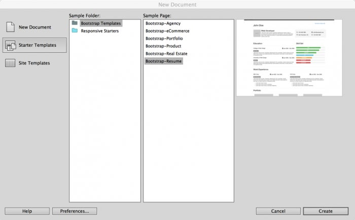
Dreamweaver CC 2015 includes a host of new document options to jumpstart your work, whether you’re a responsive site beginner or a Bootstrap master. For a quick sense of what’s possible, open the New Document dialog (File > New) and choose the Starter Templates category. In the Bootstrap Templates folder, you’ll find a nice array of responsive layouts for different types of sites and web pages, from Agency to Resume.
http://blogs.adobe.com/creativecloud/files/2015/07/starter-templates.png
But if your design is set, Dreamweaver can lay the perfect responsive foundation and hand you all the tools you’ll need to bring your comp to reality:
- Choose File > New.
- In the New Documents dialog, select the New Document > HTML category.
- Select the Bootstrap tab.
Use the None tab when you want to build a standard HTML page without the Bootstrap framework. - Choose Create new.
Dreamweaver will copy a number of assets, including JavaScript and CSS files, to the site. For a multi-page site, this is a one-time operation and you would choose the Use existing option for additional pages. - Deselect Include a pre-built layout.
The pre-built layout is a terrific way to explore Bootstrap in general and Dreamweaver’s new responsive feature set in particular. Be sure to give it a spin some time! - Click Create.
Dreamweaver will notify you of the assets being added and you’ll see them shortly in the Files panel. I always recommend saving your new file right away so you can resolve any links to included files. Once you do that, switch to Code view; you’ll see a link to bootstrap.css in the new css folder up in the area and
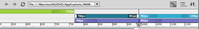
Working with the responsive UI Dreamweaver CC 2015 brings a new visual, interactive flair to responsive page design. Media queries are an integral part of modern responsive websites; they provide a series of breakpoints that allow CSS adjustments to accommodate a wide range of screens. Dreamweaver’s new Visual Media Queries toolbar is an eye-catching interface that not only represents the various minimum and maximum width, but you can also use it to quickly resize Dreamweaver’s document window and view the resulting layout:
https://blog.adobe.com/media_64e9ab74ab45b26e0aedd57acc8df0c483e38401.gif
- Notice the multi-colored bars atop the document window:
-
- Green bars indicate media queries with max-width parameters;
- Purple bars are for min-width media queries; and
- Blue bars represent media queries with both min-width and max-width values.
-
-
- Click the green media query bar once to resize the document window to the max-width of 767 pixels.
- Click the purple bar farthest to the right to snap the screen to min-width of 992px.
- Click the left-most blue bar once to move the screen slightly to the max-width of 991px; click it again to resize it to the min-width of 768px. The blue media query bars toggle between their two parameters.
- To quickly restore the document window to the fully available width, double-click the large gray area to its right.
- You’re not limited to resizing the screen to the media query breakpoints. Drag the scrubber handle—found on the middle-right of the document window—to any width. Once we have some content on our page, you’ll be able to see how the responsive layout reacts smoothly to any screen width.
- You can also use the scrubber to establish a new media query: you’re not limited to the Bootstrap defaults. Let’s say we want to specifically address smaller screen widths with a maximum of 379 pixels:
- Drag the scrubber to a width of 379 pixels. Dreamweaver displays the current dimensions in a pop-up just below the ruler.
- Click Add New Media Query (the plus symbol inside the inverted triangle on the ruler). The next step depends on whether you want to a min-width based query or one based on a max-width; Dreamweaver presents both options, one green and the other purple.
- Click the green bar to the left of the dividing line. In the pop-up dialog that appears, adjust the max-width value if necessary. You can also supply a min-width value to create a media query with both parameters.
- Set the CSS Source to create a new CSS file and click OK.
- Browse to your desired location and name your stylesheet. https://blog.adobe.com/media_c63f9682b5ffc4a88e2c9ea01c459f56010b6949.gif
- https://blog.adobe.com/media_c63f9682b5ffc4a88e2c9ea01c459f56010b6949.gif
- https://blog.adobe.com/media_c63f9682b5ffc4a88e2c9ea01c459f56010b6949.gif
-
https://blog.adobe.com/media_c63f9682b5ffc4a88e2c9ea01c459f56010b6949.gif
-
-
-
- https://blog.adobe.com/media_c63f9682b5ffc4a88e2c9ea01c459f56010b6949.gif
- https://blog.adobe.com/media_c63f9682b5ffc4a88e2c9ea01c459f56010b6949.gif
- In the Insert panel, switch to the Bootstrap Components category.
- Choose Container. A
- with the class of .container is inserted as noted in the heads-up display.
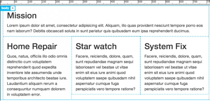
- Click Add Class/ID to further identify the division. I’ll enter #mission as this container will hold my mission statement area. We have a container, now let’s add a row and then columns. With Dreamweaver, you can do that in one step.
- From the Insert panel, choose Grid Row with column.
- In the Insert row with columns dialog, choose Nest to place the code within the container and change the number of columns to add to 1. Click OK. You can have as many columns as desired; my mission statement will span the page, so I just need the one.
- With the new column selected, nest content from the Insert panel. For example, from the HTML category, select Heading: H2 and then double-click the placeholder text to modify. https://blog.adobe.com/media_827092117ce63356dc89e17ba389ae5c832d6e55.gif
- https://blog.adobe.com/media_827092117ce63356dc89e17ba389ae5c832d6e55.gif
- https://blog.adobe.com/media_827092117ce63356dc89e17ba389ae5c832d6e55.gif
- https://blog.adobe.com/media_827092117ce63356dc89e17ba389ae5c832d6e55.gif
- https://blog.adobe.com/media_827092117ce63356dc89e17ba389ae5c832d6e55.gif
- https://blog.adobe.com/media_827092117ce63356dc89e17ba389ae5c832d6e55.gif
- https://blog.adobe.com/media_827092117ce63356dc89e17ba389ae5c832d6e55.gif
- Now I have one row with a single column and a second row with three columns, all with just headings and basic text. Filling out a comp with content—even placeholder content—can be a real chore. Luckily, it’s a chore that just got a whole lot easier with Dreamweaver’s new Emmet integration. Emmet is, essentially, a macro engine based on abbreviations. Let’s use it to whip up some lorem ipsum content:
-
-
- Switch to Code view.
- Under the first h2 heading, delete the current placeholder paragraph.
- Enter p*4>lorem and then press Tab. Emmet uses CSS syntax for it’s abbreviations. This snippet is saying, “generate a
- tag 4 times with lorem ipsum as child content.” Pressing Tab tells Emmet to “go!”
- Leave one of the generated paragraphs and drag the others under each of the other headings.
-
Switch to Live view to review the results.
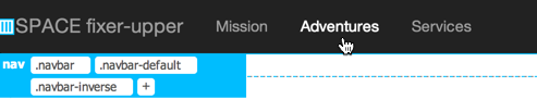
Handling navigation Navigation can be really tricky in responsive sites. You want something that is easy to use, flexible, and robust but still capable of adapting to any size screen—even transforming to a full sized menu on smaller displays. Dreamweaver’s new Bootstrap nav bar fits the bill and is one-click simple to install:1. - Select the #mission container.- From the Bootstrap Components category of the Insert bar, chose Navbar > Inverted Navbar. There are a number of options here: the basic navbar scrolls with the rest of the page; navbar fixed to top and bottom do just that; and inverted navbar uses a black background with white and light gray type.
- From the positioning options, choose Before.
- The inserted nav bar is full-featured with a host of elements:
-
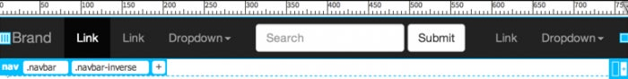
- A brand placeholder which can be replaced with either text or logo image.
- An active link that show the current page.
- Additional standard links.
- A dropdown menu with a robust sub-menu.
- A search field.
- A right-aligned navigation section with its own link and dropdown menu.
- You can customize the navbar in either Live or Code views. I find removing unneeded elements (here, like the dropdown lists and search fields) very easy to do in Live view: just select and delete. You’ll need to double-click any placeholder link to relabel and then use the Property inspector or heads-up display to add an href.
- https://blog.adobe.com/media_88d71e366cae54eef13f6aacedbdcb853b3b01d6.gif
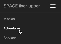
- Want to see a really cool built-in feature? Choose one of the narrow media queries. The document window will move to the new screen width and the navigation items will be replaced by a now universally-recognized 3-bar menu symbol. Click that—even in Live view—to see the expanded, easy to use navigation menu.
- https://blog.adobe.com/media_9157fbcd5f02b4723b9371c41c43d03fe960c666.gif
Integrating Bootstrap components Naturally, web pages do not survive on navigation and basic content alone. With the Bootstrap components supported in Dreamweaver CC, you have a multi-hued palette to draw from.
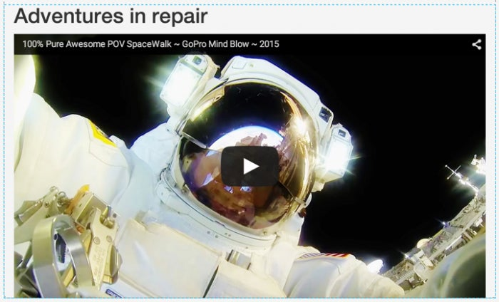
- Let’s say you wanted to open your page with a splash, a really big splash, a Jumbotron-sized splash. The .jumbotron class in Bootstrap is designed to span the screen width, regardless of the device. Let’s add one to our page:
- Select the #mission container.
- From the Bootstrap Components category of the Insert panel, choose Jumbotron.
-

- The default jumbotron element is composed of a heading, text and a “Learn more” button. I’ll replace the heading with my own text and throw in a .text-centered class for the h1 tag. (Notice the handy code hints that pop-up to help you get the class name right.) Next, I’ll delete the other placeholder content and put in an image—but not just any image, a responsive image that changes size with the screen width:
- [- Select the
# tag.- From the Bootstrap Components category of the Insert panel, choose Responsive Image: Default.](http://blogs.adobe.com/creativecloud/files/2015/07/jumbotron-1.png)
-

- The .img-responsive class is responsible for dynamically resizing the image.
- Video can also be added to a responsive design. Just choose Responsive Video Embed from the Insert panel. An example video is inserted. Change the src attribute to point to your own video source. I’d recommend putting the video in a container to keep it distinct from the rest of your content.
-
- At the other end of the design spectrum, Bootstrap also makes it easy to integrate graphic symbols that, responsively enough, scale beautifully. A full library of Glyphicons is supported:
- Select the heading or other page element you want the icon to appear next to.
- From the Bootstrap Components category of the Insert panel, choose Glyphicons: Home.
-
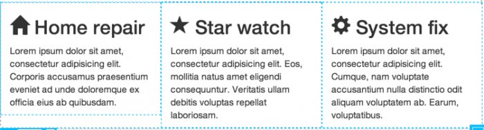
- Dreamweaver makes it one-click easy to add any one of 5 different Glyphicons. You can, however, access all of the over 200 available by adding it’s class to a span tag. In addition to the Dreamweaver supplied .glyphicon-home, I’ve incorporated .glyphicon-star and .glyphicon-cog. A handy cheat sheet showing all the symbols and their associated classes can be found here.