Create Text Filling with Water Effect
In this post, I’ll show you how to make a ‘text filling with liquid’ effect. It can be used for preloaders, titles and such, but overall it’s a neat study of SVG effects in general.
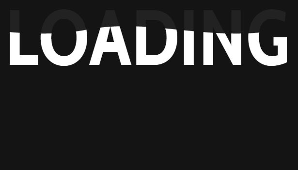
See the Pen SVG Text Filling with Water (with JS) by Lucas Bebber (@lbebber) on CodePen.
Behind The Effect
Before we delve into the code, let’s take a look at how the effect works. First, we need to make the wavy water effect. This can be accomplished by making a wavy graphic…

http://blogs.adobe.com/creativecloud/files/2015/08/wave-alone.png
…that can be repeated seamlessly…

http://blogs.adobe.com/creativecloud/files/2015/08/wave-loop.png
…and then animating it scrolling infinitely sideways …

http://blogs.adobe.com/creativecloud/files/2015/08/wave-anim-scroll.gif
Cover the left and right sides of the red rectangle with your hands to better see the effect
…while increasing its height.
See the Pen doadze by Lucas Bebber (@lbebber) on CodePen.
Increasing the height of the image, instead of simply moving it up, adds a nice detail to the effect, making the water look more turbulent as it fills up its container.
After that, all we need to do is to mask out this animation with our text and we’re done.
See the Pen CSS Text filling with water by Lucas Bebber (@lbebber) on CodePen.
Now let’s see in which ways we can do that with code.
CSS
Doing this with CSS would be pretty simple, if not for one problem: to use text as mask, we require the property background-clip:text, which unfortunately is only available in Webkit browsers. We could get around it by using an image with the text knocked out, but that brings its own problems, with the text not being selectable, making it harder to edit, potentially illegible, etc. Because of that, I won’t get deeper into the CSS version, but you can see it working here:
See the Pen CSS Text filling with water by Lucas Bebber (@lbebber) on CodePen.
SVG
Another option is to use SVG. Sara Soueidan has written a great article about text effects on this blog that is worth a read. There, she explains SVG masks and how they work.
The difference here is that instead of using a graphic to mask the text, since we are going to animate the graphic inside the text, we will use the text as a mask to our water graphic.
This is how we create our mask:
defs>
  text id="text" font-size="100">YOUR TEXT HEREtext>

  mask id="text-mask">
    use x="0" y="0" xlink:href="#text" fill="#ffffff"/>
  mask>
defs>
The text is inside the tag because we will use it multiple times, as a mask and as a background. By doing that, we just have to keep it in one place in the code, and use the tag whenever we want to, ahem, use the text, by referring to its id through the xlink:href attribute.
Note that, when using the text for the mask, we’re setting its fill attribute to white (#FFFFFF). This is because of the way SVG masks work: white makes the content behind it visible, black hides it, and any shade inbetween makes it transparent accordingly.
The water graphic can be pre-made, repeated and exported whole, or, to make it more dynamic, you can use SVG patterns, so it can repeat on its own and accommodate texts of any size. SVG patterns can be confusing, and it’s a topic that merits an article of its own, but here’s how I used the pattern for this demo:
  ...

  id="water" width=".25" height="1.1" patternContentUnits="objectBoundingBox">
    fill="#fff" d="..."/>
  class="water-fill" fill="url(#water)" mask="url(#text-mask)" x="0" y="0" width="1600" height="120"/>
Note that the “‘s fill attribute points to the #water pattern. Also notice the mask attribute pointing to the mask we made previously.
If you want to use any other type of element for the wave graphic, like path elements, instead of patterns, all you have to set is its mask attribute.
So this is what we have by now:
See the Pen waNyQv by Lucas Bebber (@lbebber) on CodePen.
Pretty cool so far. Now onto animating…
Animating
Again, we could make it simple by using CSS, but we run into browser problems; many browsers don’t allow changing some SVG-only properties, like x and y, by CSS. More browsers allow positioning SVG elements by using transform:translate(x,y), but that doesn’t work in our case because that moves the mask together with the object. If your browser supports SVG positioning by CSS (Chrome does), you can see the animation working here:
See the Pen SVG Text Filling with Water by Lucas Bebber (@lbebber) on CodePen.
The CSS animation here is pretty simple:
@keyframes wave {
  0% {
    x: -400px;
  }
  100% {
    x: 0;
  }
}

@keyframes fill-up {
  0% {
    height: 0;
    y: 130px;
  }
  100% {
    height: 160px;
    y: -30px;
  }
}

.water-fill{
  ...
  animation: wave 0.7s infinite linear, fill-up 10s infinite ease-out alternate;
}
Here we are running two animations simultaneously: one called wave that makes it look like it’s scrolling rightwards infinitely (note that the distance it travels is the width of one tile of the wave, the looping is set to infinite, and the easing is set to linear), and one called fill-up that increases the height.
The solution to our browser support problem is to animate using JavaScript. One upside to that is if you were going to make a progress-based preloader with this effect, you would have to use JS anyway, so we will be halfway through already!
You can use any JS animation library of your choice, like Transit or Velocity.js. In this example I’m going to use GSAP/TweenMax.
Animating with GSAP
Here’s a nice introduction to GSAP, in case you’ve never used it before.
We are going to apply the same principles we used in the CSS animation to our JS version:
  // Select the element
  var fill=document.querySelector(".water-fill");

  // "Wave" animation
  TweenMax.fromTo(fill,0.8,{
    // Set the "from" position
    attr:{
      x:-400
    }
  },
  {
    // Set the "to" position
    attr:{
      x:0,
    },
    // Repeat infinitely
    repeat:-1,
    // Linear easing
    ease:Linear.easeNone
  });


  // "Fill up" animation
  TweenMax.fromTo(fill,10,{
    // From
    attr:{
      y:120,
      height:0
    },
  },{
    // To
    attr:{
      y:-20,
      height:140
    },
    repeat:-1,
    // Reverse animation on loop
    yoyo:true,
    ease:Linear.easeNone
  });
Lastly, we can optionally add a dimmed out copy of the text as a background, to make it legible before it has finished filling up. To do that, we will re-use the text we made previously:
x="0" y="0" xlink:href="#text" fill="#222"/>
And with that our effect is done:
See the Pen SVG Text Filling with Water (with JS) by Lucas Bebber (@lbebber) on CodePen.
Hope this has been interesting and useful to you!
