CSS vs. SVG: Shapes and Arbitrarily-Shaped UI Components
In the first two articles of this series, we compared CSS and SVG techniques for creating graphical text effects and ways to style (and animate) HTML checkboxes and radio buttons, respectively. In this article, we are going to go over techniques for creating arbitrarily-shaped UI components using CSS properties and SVG’s capabilities, and a mix of both!
Specifically, we will be talking about how to create circular menus, as these are the perfect example of usable non-rectangular UI elements.
Let’s dig in.
We’ll start with an overview of what CSS is capable and incapable of in terms of creating non-rectangular geometric shapes…
The Shapes of CSS
Everything in HTML and CSS is a rectangle. Every element is governed by a rectangular box model. Images and text are all rectangular and the text flows in rectangular areas.
A couple of years ago, a new specification called CSS Shapes was introduced, which enables us to specify non-rectangular shapes (like circles, ellipses and polygons) and have text flow in or wrap around these shapes, thus breaking the rectangular flow limitations and bringing web design closer to what is possible in print design.
CSS Shapes (the specification) however does not enable us to create elements that look and are rendered as arbitrary shapes—it only affects the flow of content around an element, and a future module might enable changing content flow inside an element as well. But even though the content flows inside or around these elements in non-rectangular areas, the elements themselves are still rendered rectangular, unless you take further steps to change that. We will talk about how to do this in an upcoming section.
Geometric Shapes
The other type of CSS shapes — not to be confused with the CSS Shapes mentioned above — is the geometric shapes created using different CSS properties that were not intended for such creative creations.
Using properties like box-shadow, border-radius and other border properties with a few HTML elements or pseudo-elements, you can render different geometric shapes on a page. But these shapes are not real shapes. That is, you will get the visual appearance of the shapes you want, but the shapes themselves are practically fake shapes created by mixing different “atomic” elements which are rectangular or circular, and positioning them in a way such that the end shape is achieved.
For example, using the CSS border-* properties, you can create a triangular shape pointing in one of the four main directions by simply adding a border to an element, and then collapsing the element’s height and width, and finally hiding the resulting triangles that you don’t want by giving them a transparent color. The following animated image shows this in action:
Thus, by taking two simple steps in CSS, you can create triangular shapes using nothing but a few lines of CSS, and then you can pick whichever triangle you want and remove the remaining ones by giving them a transparent color. So, if you want a triangle pointing up, you keep the border-bottom property value and change the color of the remaining border-* properties to transparent.
You can play with the above example here. Hover over the div to see it collapse and the triangles form.
Using the border-radius property, for example, you can create a heart shape by using the two pseudo-elements of an empty div. Each pseudo-element is rounded on one side but not the other, and then they are positioned so that they overlap and make up the shape heart. The best way to visualise this is to play with the code in the following live demo. If you change the position of the pseudo-elements (the left property for each one), you will be able to separate them and see what is happening. The best way to learn something is to break it.
See the Pen Adobe CSS vs SVG – Arbitrary Shapes by Sara Soueidan (@SaraSoueidan) on CodePen.
Many complex shapes can be created using these CSS properties in combination with others. There is a long compilation of different shapes created using CSS only on CSS-Tricks. Check them out and play with the code for each one if you are interested in learning how they are made. One particular example I want to shed some light on in this section is a five-points star shape. To create a star shape using CSS, you require the following code (as seen on the CSS-Tricks page):
#star-five {
   margin: 50px 0;
   position: relative;
   display: block;
   color: red;
   width: 0px;
   height: 0px;
   border-right: 100px solid transparent;
   border-bottom: 70px  solid red;
   border-left: 100px solid transparent;
   transform: rotate(35deg);
}
#star-five:before {
   border-bottom: 80px solid red;
   border-left: 30px solid transparent;
   border-right: 30px solid transparent;
   position: absolute;
   height: 0;
   width: 0;
   top: -45px;
   left: -65px;
   display: block;
   content: '';
   transform: rotate(-35deg);

}
#star-five:after {
   position: absolute;
   display: block;
   color: red;
   top: 3px;
   left: -105px;
   width: 0px;
   height: 0px;
   border-right: 100px solid transparent;
   border-bottom: 70px solid red;
   border-left: 100px solid transparent;
   transform: rotate(-70deg);
   content: '';
}
That’s quite a lot of code for a simple shape, isn’t it? In addition to border properties and pseudo-elements and a lot of absolute positioning, you also need to use CSS Transforms to complete the look. As creative as these shapes are — especially since they are created using CSS properties that were not intended for such use cases, these shapes are neither practical nor reliable or flexible. They are not even real shapes — the semantics are absent and the shapes are not interpreted as such by screen readers. For example, the heart shape created above will not be recognised as a heart shape by a screen reader. The div used to create it does not say anything about its shape at all. If you simply want a small triangle to serve as a speech bubble tip, then using a CSS triangle would make sense for the most part; however, if you want more complex shapes and you want these shapes to be flexible and accessible, then CSS is definitely not the best tool to achieve that. All of the shapes created using CSS trickery are merely empty elements that have limited if any practical use cases, and are created using CSS properties that do not define any shapes, but merely help visualise them. As such, I want to shed the light on more practical examples that can be achieved using CSS. Particularly, let’s look at how we can create a circular menu using two different CSS approaches, before we get into the way to do that using SVG. You’ll be able to see the pros and cons of each technique as we discuss it.
Building Circular Menus with CSS #1: Using clip-path
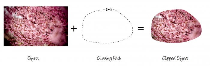
In CSS, elements can be “cut” or clipped into different shapes using the CSS clip-path property. Clipping is a graphical operation that allows you to fully or partially hide portions of an element. The clipped element can be any container or graphics element. The portions of the element that are shown or hidden are determined by a clipping path.
The clip-path property is the new and improved version of the clip property, and its replacement. The latter enabled us to clip elements to only show a portion of their content. But the only function that the clip property supported is the rect() function, which means that a rectangular element could only be clipped to a rectangular shape. Albeit deprecated, this property still works in all browsers, including old ones back to IE6 and earlier. If you are interested, you can learn all about it in this article. The clip-path property allows us to clip elements to non-rectangular shapes defined using shape functions. There are four basic shape functions defined in CSS: circle(), ellipse(), inset() and polygon(). Each shape is defined by and drawn/applied to an element using a set of points. The following are examples of valid clip-path declarations using these shapes:
clip-path: polygon(15px 99px, 30px 87px, 65px 99px, 85px 55px, 122px 57px, 184px 73px, 198px 105px, 199px 150px, 145px 159px, 155px 139px, 126px 120px, 112px 138px, 80px 128px, 39px 126px, 24px 104px);
clip-path: circle(70% at 0% 50%) padding-box;
clip-path: inset(10px 20px 30px 40px round 10px) margin-box;
clip-path: ellipse(farthest-side closest-side at 25% 25%);
These shapes can be used to clip any HTML element to the shape we want. The most interesting of these functions is the polygon function because it is the one that gives us the most options. There are many, many polygonal shapes, but circles and ellipses and inset rectangles are not much more than what they are. The clip-path property also accepts a reference to an SVG element to define the shape that would be used to clip the element it is applied to, giving us the ability to use more shapes, overcoming the restriction of the shapes allowed by polygon(). For example, using complex shapes that include arcs is not possible using CSS basic shape functions, but is easily possible using SVG paths referenced in clip-path.
.element {
    /* … */
    clip-path: url(#svgClipPathID);
}
The exact syntax and usage of this property and these shape functions is out of the scope of this article, but should you be interested in more, you can learn all about them here and here. The following is a live demo showing the clip-path property in action. The two elements are clipped using a CSS polygon() function and a CSS clip path reference:
See the Pen Adobe clip-path examples by Sara Soueidan (@SaraSoueidan) on CodePen.
Changing an element’s shape using clip-path is, in practice, changing the shape of its viewport—the area which defines what parts of the element will be visible/rendered. The element itself is still practically a rectangle—only the amount of it that is painted & visible through the viewport is changed, but the position of the element in the page flow is still very much governed and affected by its default rectangular shape.
With that in mind, the clip-path property can be used to create non-rectangular components; and circular menus are a great example of that.
Indeed, creating circular menus using clip-path is as simple as:
- Position all rectangular list items on top of each other
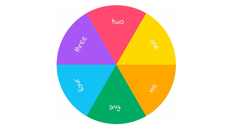
- Clip the items to the shape of a sector. The angle for the sector depends on the number of items you want your menu to have. For example, for a full circular menu with six items, each angle would be 60 degrees.
- Rotate the items as necessary so that the clipped regions are positioned in a way that they form the full circular shape.
The following image shows this process in action. Notice how the elements are positioned in the same initial place, on top of each other, then each of them is clipped and then rotated as necessary.
Position (full square), clip (to sector shape), rotate (when needed). Repeat.
Since the polygon() function does not enable us to create an arc between two points, we need to reference an SVG shape and use it as a clipping path in clip-path. A sector shape that would be applied to the items as shown in the above image looks like this:
and is referenced in the CSS like this:
.menu li {
  position: absolute;
  top: 0;
  left: 0;
  width: 100%;
  height: 100%;
  clip-path: url(#sector);
}
And all the items are then rotated by their respective angles:
.one {
  background-color: #A5E2F3;
  transform: rotate(0deg);
}

.two {
  background-color: #86d8ef;
  transform: rotate(-60deg);
}

.three {
  background-color: #66ceeb;
  transform: rotate(-120deg);
}

.four {
  background-color: #47c4e6;
  transform: rotate(-180deg);
}

.five {
  background-color: #27b9e2;
  transform: rotate(-240deg);
}

.six {
  background-color: #1ba4cb;
 transform: rotate(-300deg);
}
This is all it takes to create a circular menu using CSS clip paths.
That said, this technique is not bulletproof yet because there are some nasty browser bugs in webkit and blink based browsers that make this menu practically unusable today. I recommend you read more about this and learn about the details of creating this menu in this article I wrote over at CSS-Tricks.
Building Circular Menus with CSS #2: Using CSS Transforms
There is another way to create a circular menu in CSS using CSS transforms.
This technique is hacky and way more complicated than it should be, but let’s take a look at how it works anyway so you get a clearer idea of the possibilities you have so you can make a more informed decision as to which technique to choose, and which to avoid. (Hint: Avoid this one.)
Before CSS basic shape functions and clip paths were introduced, the only way to bend the rectangular appearance of an element possible was using a skew transformation.
By skewing an element, you change its shape from a rectangle to a parallelogram. This establishes the first step which creates the angle you want for each item as you skew it.
Again, you calculate the value of the angle based on the number of items you want for your menu. The elements are first positioned absolutely on top of each other. Then, using some elementary math, you calculate the value of the skew angle for the transform: skew() function and apply it to all of the items.
Next, you rotate the items, one by one, such that they don’t overlap anymore and their angles make up the complete circular shape, similar to the way the clipping technique worked above.
But at this point, each element is still a parallelogram. So, in order to “cut” the parallelogram in half and get the arc shape opposite to the angle, the items are wrapped in a container, the container is rounded using border-radius, and then it is used to clip off the excess parts of the items that overflow it.
Again, the best way to visualise it is to see it in action. The following is an animated image showing these steps:
The process of creating a circular menu using CSS skew transforms and overflow to fake a sector shape on the menu items is anything but intuitive.
One important caveat here is that when the list items of the navigation menu are skewed, so is the content inside of them (the anchor tags wrapping the content), so this content is distorted and becomes unreadable. In order to fix that, you need to “unskew” the anchors by applying an opposite skew transformation to them. So, you see, it’s not very intuitive.
Adding content to the innards of the items is also not simple, and is almost impossible if you want to add images, for example, instead of icons. The content that works best for this example is an icon.
The above animated image is a recording of an interactive demo I created for a tutorial over at Codrops that explains the steps for creating this menu thoroughly. Check the article out for more.
This technique is too complicated, not to mention that any change in the angle and position will require a lot of calculation to adjust all the items accordingly. If you use Sass, then you can make the math calculations simpler by using a loop and some variables, but this is still too much trouble to create a not-so-flexible circular menu using CSS, don’t you think?
If you’re going to use CSS to create a circular menu, I highly recommend against this technique—use the clip-path technique mentioned in the previous section or use SVG.
Next, we’ll explore how to create this circular menu using SVG, but first, let’s get an overview of how basic shapes are created in SVG compared to those created using CSS.
Shapes in SVG
SVG is XML. Elements in SVG are marked up using elements similar to HTML elements, but are more flexible and powerful for creating shapes because, after all, SVG is all about creating shapes and images, and it comes equipped with a set of semantic, meaningful elements that allow you to create virtually any shape you want, while also still being accessible.
Geometric Shapes
There are six main basic shape elements in SVG: , , , , and . They are conveniently named so that their names are self-explanatory.
Some of these shapes are defined by a set of points—such as the polyline and polygon shapes, and some of them can be defined by width and height and position values, such as the rectangle element, and some of them require a position and radii values (circle and ellipse).
There is also another element: “, which enables us to draw arbitrary path shapes, providing us with the drawing flexibility that is missing in CSS.
Creating shapes using these elements in SVG is simple, and the best part is that you can sometimes simply draw these shapes—literally—in a graphics editor such as Adobe Illustrator, and then export the code for those shapes as SVG.
The following live demo shows these shapes in action:
See the Pen 2b3d2361509993f9195552ff815a49d3 by Sara Soueidan (@SaraSoueidan) on CodePen.
The one shape I want to shed a light on here is the star shape created using the “element. Remember how long the code was to create this shape using CSS? With SVG, the code looks like this:
Now, which one looks better? I think we will agree that this one does, won’t we? Not only are SVG shapes created simpler than CSS shapes are, but they have several other advantages over CSS shapes:
-
- SVG shapes are real content (actual elements drawn on screen, instead of empty
divs with no content, which leads to..)
- SVG shapes are real content (actual elements drawn on screen, instead of empty
- SVG shapes are accessible (by screen readers).
- SVG shapes are semantic (element names and attributes).
- SVG shapes can be edited using graphics editors, while CSS shapes can’t.
- SVG shapes have powerful attributes that give you finer control over the end result (stroke, fill, stroke-width, etc.).
So, if you want to create geometric shapes for use on your web pages, definitely use SVG for that. Before we move on, let’s take a look at how SVG “s might look like:
See the Pen Adobe SVG Example by Sara Soueidan (@SaraSoueidan) on CodePen.
The above demo contains two paths—the grey one and the pink one.
The grey path looks like a polyline and you could have drawn that shape using a indeed; any of the simple shapes in SVG can also be recreated using the element.
SVG paths come with a set of commands that enable you to draw pretty much any shape you want. These commands include line commands (both relative and absolute) and arc commands (also relative and absolute), as well as a command that enables you to move your drawing cursor (so to speak) anywhere you want on the canvas to start drawing, and a command that enables you to close any path by connecting the last of its points with its first, quadratic curve commands, etc.
These commands are expressed as letters in the SVG path’s d attribute: the data defining the path. Commands include: M, l, L, A, z, among others. You can find a list of all paths and their explanations in the SVG specification.
Any of these shapes (simple or path) can be used as UI components. For example, wrapping any of the above shapes in an “tag allows you to use that element/shape as a link on your page.
By using the line and arc commands of the SVG path, we are able to draw a sector shape for a circular menu using just a little bit of math…
Building Circular Menus with SVG
To create a circular menu in SVG we need to draw the sector shapes, using an SVG “element.
You can either do all the drawing in a graphics editor and then export the menu as SVG and use it, or you can hand-code the menu using the path commands and some maths.
To draw a sector shape, you need to:
- Move your “cursor” to wherever you want to start drawing.
- Draw a line from one point to the other (the base of the sector).
- Draw an arc whose length is determined based on the angle of the sector, which in turn depends on the number of items of the menu.
- Close the sector by drawing a line from the other end of the arc to the beginning point.
The following Codepen shows the drawing in action. Click on the button to play the demonstration:
See the Pen Building A Circular Menu With SVG — #1 by Sara Soueidan (@SaraSoueidan) on CodePen.
The sector shape needs three points that will be used with the path commands to get the above effect. To determine the position of these points, we need to first know how the items will be laid inside the circular menu. All items start out at the same position and are then rotated into their respective positions—similar to the way we did with the CSS clip path technique. Click the Play button in the following demo to see how the items are drawn and positioned.
See the Pen Building A Circular Menu With SVG #2 by Sara Soueidan (@SaraSoueidan) on CodePen.
By knowing how the items will behave and where they are positioned in the menu, we can determine the position of the three points to draw the sectors.
The first point is at the center of the menu. Depending on the menu’s height and width (which are equal because the menu is a circle), getting the coordinates of this point is simple. The X and Y of this point will be equal to half the width and height values.
The second point is at the edge of the menu, which means that it is halfway along the Y axis and positioned at menu-width along the X axis.
The third point used to draw the arc is a little trickier to determine, but it requires some basic math to do so. By knowing the number of items, you know the value of the angle of the sector. This angle is then used to calculate the X and Y values of the third point.
The calculations for the third point are outside the scope of this article. I have written a detailed article explaining how to calculate the third point coordinates as well as the commands necessary to draw the path and rotate it in a previous article, so check it out if you want to know more.
Wrap the for each item in a , and you’ve got yourself a circular menu using SVG.
A couple of notes are worth mentioning here:
- The CSS clip path technique requires the same calculations as the SVG technique. The only reason we didn’t have to do any in the previous section is that the path shape I used to clip the menu items was already available. However, you need to know exactly how to draw that path in order to apply it correctly to your items, be that in CSS or SVG.
- Using the SVG path in CSS requires an additional change to the coordinates of the points used. Instead of absolute point values, you need to use values in the range [0, 1] so that the browser is able to apply the shape to the element using its coordinate system, not that of the page’s. You can read all about that in the CSS-Tricks article.
- You always need to do some math before you draw a circular menu in CSS or SVG, so the two techniques have almost the same pros and cons.
- The SVG menu currently works in all browsers that support SVG, while support for the
clip-pathproperty isn’t the best at this time.
Since creating a circular menu in SVG requires quite some time to make all the calculations, I’ve created a tool a few months ago that allows you to customise a circular menu visually and then download the code for that menu ready to embed in your page. Check the tool out.
Summing Up
Creating non-rectangular UI components used to be practically impossible in CSS until the clip-path property came along to make it a lot easier to do so.
The CSS transforms technique I mentioned above to create the circular menu is anything but optimal, so I highly recommend against using it today. I hope that comparing it with the clip path technique gave you a clear overview of why it is not optimal and what better options we have today in both CSS and SVG.
We focused on circular menus, but the main concepts (creating shapes and using them in our UIs) are applicable to pretty much any other arbitrarily-shaped component.
SVG is built for creating non-rectangular shapes, and these shapes can easily be integrated into our designs today in more ways than we could list in one article.
As a matter of fact, the next article in this series (which will be the last one in this series), will show you how SVG’s shape flexibility enables us to improve a lot of our common UI components in many different ways, broadening the way we imagine integrating SVG in our designs today.
I hope you liked this article and found it useful. Thank you for reading.
