CSS vs SVG: The Final Round(up)

This is the last article in the series of article comparing common CSS techniques to their SVG counterparts. This article is a roundup of several CSS and SVG solutions, as opposed to being an article comparing one solution that can be achieved using either CSS and SVG. There are already a bunch of excellent articles out there that cover the details for each of these solutions, so we will get an overview of each solution and link to those articles for each section as we go. I highly recommend you check them all out.
Let’s start with what was one of the most controversial CSS vs SVG topics in the past year: icon systems.
Icon Fonts vs SVG Icons
I’ve personally used icon fonts only twice and neither was on a client project. They never felt intuitive to me, neither did their implementation.
Icons embedded using icon fonts are not semantic: an icon is an image or a figure and yet, with icon fonts, it is marked up using empty“
s or “s, and the content of the icon is created as “pseudo-content” in the style sheet.
Icon fonts are monochrome and can’t be multi-coloured—that is, unless you use a workaround which requires you to stack multiple elements of an icon on top of each other to separate the “shapes” making that icon up, and then color each shape individually to make up the complete icon. This solution, though clever, is overkill, in my opinion. But if this idea interested you, you can learn all about it in this article by Parker Bennett.
Icon fonts also have weird failures many browsers, have anti-aliasing issues resulting from the fact that browsers consider them as text and as such apply anti-aliasing to them, making them look not as sharp as you’d expect them to, and they can be frustrating to position.
Chris Coyier has written an excellent and thorough cagematch-style article over at CSS-Tricks that shows the pros and cons of each icon system (icon font vs SVG icons). You should definitely check it out.
Here are some of the advantage of SVG icons, summed up in a few points:
- SVGs are more semantic. An SVG is an image and the icon is thus marked up as one.
- SVG icons look crisp and clear on all screen resolutions.
- SVG icons provide you with more control over SVG icon styles (multi-color icons). Individual SVG shapes can be selected and styled using CSS. Sure, there are some limitations depending on the way you embed the SVG, but this is going to change in the future. (I wrote an article about that on Codrops.)
- SVG icons can be animated & interactive. Shape morphing (see coming section) and other kinds of complex animations are not even close to possible in icon fonts.
- You can provide PNG fallback for SVG. So those couple of browsers that don’t support it will always get something to fall back to.
- SVGs are generally consistent across browsers (unlike icon fonts).
- SVGs are easier to create, embed, and maintain.
- SVGs are accessible. SVG comes with set of accessibility elements that improve the accessibility of its content. You can learn more about them here.
There are several ways you can create an SVG icon system using SVG sprites, and browser support is getting much more reliable with many bugs being fixed for one or two of these techniques, so I highly recommend you read more about them and give them a try.
Charts, charts, charts!
These are one of the interesting UI elements that is getting even more interesting with the introduction of new technologies to create them. Let’s take a deeper look.
CSS Charts
CSS can be used to create simple charts that require more “regular” shapes such as rectangles and circles.
Since CSS is great at creating rectangular shapes, vertical (or horizontal) bar graphs are a great example of CSS-only charts.
Eric Meyer wrote about and demo’d the concept of creating vertical bar graphs using CSS long ago. In his article, he explains how to create bar charts using CSS to style and position elements of an HTML“
which is used to mark up the graph’s data. Eric’s technique is great because the data is marked up in a semantic way (tables are the perfect way to store data like that) and the data can be dynamic and manipulated using a server-side language like PHP, for example.
Robin Rendle forked Eric’s technique and created a new version of a bar graph using the same principles in an article he wrote over at CSS-Tricks. The following is an example of some markup making up the table, borrowed from Robin’s article:
Using CSS to position the table’s cells, you end up with something like this:
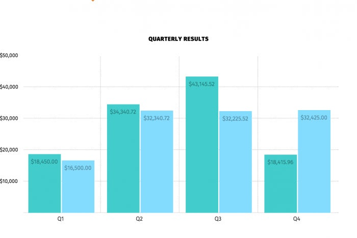
http://blogs.adobe.com/creativecloud/files/2015/09/bar-graph-css-tricks.png
A screenshot of the bar graph created by Robin in the CSS-Tricks article.
You can find the live demo for the bar graph here.
In his article, Robin also looks at how to create spark lines also using CSS, and also following the same principle and leveraging CSS’s natural ability to create and style rectangular elements. Check his article out for details.
Just like rectangles, there are ways to create circles in CSS, and therefore pie charts are also a kind of charts that can be created using CSS only.
Lea Verou is the master of CSS tricks (not the website), and she has come up with a clever way of creating two-colored pie charts by using pseudo-elements and CSS transforms. She explains how to do this in this great article she wrote over at Smashing Magazine.
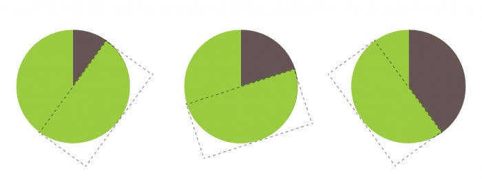
http://blogs.adobe.com/creativecloud/files/2015/09/pie-chart-lea-verou.png
Creating a pie chart using CSS pseudo-elements and transforms. The dotted rectangle represents the pseudo-element being rotated on the circular parent. (Screenshot from Lea’s article on Smashing Magazine.)
Lea’s technique enables you to create two-color pie charts as the one shown in the above example. However, adding more colours is not quite as simple.
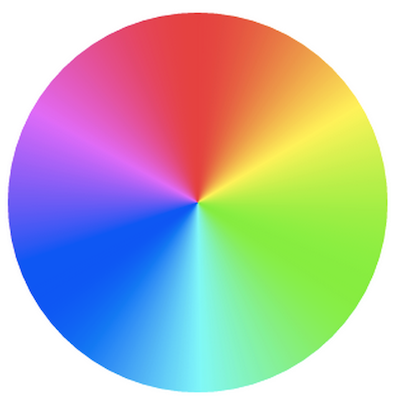
This is where conic gradients would fill in. An example of a conical gradient is shown in the following image borrowed from Lea’s introductory article:
https://blog.adobe.com/media_8c13b5bdd63e0ff7a648e857a6e0a0e7ca68cb3f.gif
An example of a conical gradient.
Using conical gradients, you can create as many pie “slices” as you want.
Furthermore, once the updated attr() function defined in CSS Values Level 3 is widely implemented, you will be able to control the percentage with a simple HTML attribute:
background: conic-gradient(#655 attr(data-value %), yellow green 0);
This also makes it incredibly easy to add a third color. For example, for a pie chart like the one shown on the pie chart above, we would just add two more color stops:
background: conic-gradient(deeppink 20%, #fb3 0, #fb3 30%, yellowgreen 0);
—Lea Verou
Even though conical gradients are not supported yet, Lea has created a polypill which allows you to start using them today, so definitely check it out if you’re interested in experimenting with them today.
Even though pure CSS line graphs using image sprites are also possible, I highly recommend against them because they’re neither accessible nor are a good way to represent data.
SVG Charts
When it comes to creating charts and data visualisations, SVG excels over other techniques, including CSS.
SVG charts and data visualisations are accessible and fully interactive. The very nature of shapes in SVG makes it a perfect candidate for visualisations that also require irregular shapes (think: maps).
HTML5 Canvas can also be used to create such visualisations, but the content of the canvas are not part of the DOM and are thus not accessible by screen readers. You would need to create a secondary content between the opening and closing “ tags to serve as fallback and as accessible content. You need to also take extra measures to map the content and interactivity between the contents of the canvas and the fallback, so that screen readers know which element is being interacted this. So an HTML5 Canvas would require double the amount of maintenance.
With SVG, you get semantics and accessibility as well as interactivity with javaScript out of the box.
Bar charts can easily be created using simple SVG shapes such as s and s. The numbers representing the data are also accessible since they are actual “, not an image of text.
However, you’re likely to not want to create these charts manually, especially if they are complex charts with lots of data and that need to be both dynamic and interactive. This is where frameworks like d3.js come in handy.
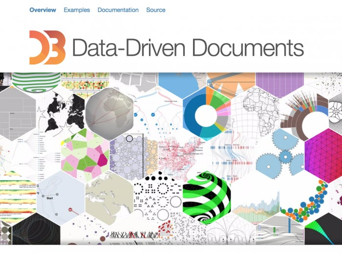
http://blogs.adobe.com/creativecloud/files/2015/09/d3.png
Image via D3.js homepage
D3 — short for D ata-D riven D ocuments — “is a JavaScript library for manipulating documents based on data. D3 helps you bring data to life using HTML, SVG, and CSS. D3’s emphasis on web standards gives you the full capabilities of modern browsers without tying yourself to a proprietary framework, combining powerful visualization components and a data-driven approach to DOM manipulation.” (D3.js homepage)
D3 is possibly the most popular data visualisation library out there, and there have been lots of articles and books written on how to use it. Here are a couple of useful resources:
- D3 tutorials by Scott Murray
- Interactive Data Visualization for the Web book, also by Scott Murray
When it comes to creating simple pie charts with SVG, you don’t need to use a library, especially if your pie chart is simple and static, not dynamic.
In her Smashing Magazine article, Lea compares the CSS technique for creating pie charts with a clever SVG technique she also came up with.
Using SVG strokes and stroke dashes, you can fake the pie “slices” using heavy/thick strokes on an SVG circle.
The following images borrowed from Lea’s article show the green circle and the “slices” which are actually a thick stroke on the circle, divided into dashes using the stroke and stroke-dasharray properties:
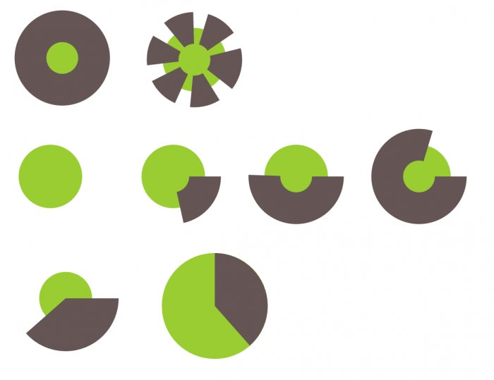
http://blogs.adobe.com/creativecloud/files/2015/09/svg-pie-chart.png
An SVG pie chart creating using a circle (green) and where the slices are created using (a) stroke(s) (brown). Screenshots from Lea’s article on Smashing Magazine.
Using some JavaScript, you can create these strokes dynamically, and you can create multiple slices by using multiple SVG elements and strokes too. You can find the script and explanation in Lea’s article.
Robin Rendle will also be writing an article about creating charts using SVG on CSS-Tricks, so keep an eye out for that as well.
Line charts, irregular shapes representing data, maps, etc. can all be created using SVG shapes. The nature of SVG as a document makes it a great candidate for data-driven visualisations. They are also great for infographics, too.
All that said, you might want to avoid using SVG and use HTML5 Canvas or webGL instead if your visualisations are very complex and require thousands of DOM nodes, for example, because, in that case, SVG does not perform as well as we’d hope—at least not yet. HTML5 Canvas performance beats that of SVG in scenarios like these, so you might find it a better alternative. Always test the performance of your app and make informed decisions accordingly.
Elastic UI Interactions
One area where CSS cannot even compare to SVG is creating irregular UI shapes and animating them. This is also possibly one of SVG’s most powerful features.
An example of this is the following slideshow created by Manoela Ilic on Codrops:
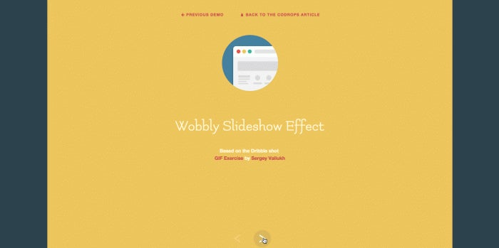
http://blogs.adobe.com/creativecloud/files/2015/09/wobbly-effect.gif
The slideshow uses an SVG path and animates that path from one shape to the other and then to another upon clicking the slideshow’s right and left buttons.
The following image borrowed from the Codrops tutorial shows the three path shapes that are used in the animation:
https://blog.adobe.com/media_498a251c9e1580caf46c92afa08775cd48abfa32.gif
Using JavaScript, you can define these path shapes:
// …
 // path definitions
    paths : {
        rect : ‘M33,0h41c0,0,0,9.871,0,29.871C74,49.871,74,60,74,60H32.666h-0.125H6c0,0,0-10,0-30S6,0,6,0H33’,
        curve : {
            right : ‘M33,0h41c0,0,5,9.871,5,29.871C79,49.871,74,60,74,60H32.666h-0.125H6c0,0,5-10,5-30S6,0,6,0H33’,
            left : ‘M33,0h41c0,0-5,9.871-5,29.871C69,49.871,74,60,74,60H32.666h-0.125H6c0,0-5-10-5-30S6,0,6,0H33’
        }
    }
//…
and then animate them using an animation library like Snap.svg, choosing which shape to animate to based on which direction the slideshow is animating in:
// change svg path on entering slide to "curved"
    var currItem = this.items[ this.curr ];
    currItem.querySelector('path').setAttribute( 'd', dir === 'right' ? pathCurvedLeft : pathCurvedRight );

    // morph svg path on entering slide to "rectangle"
    setTimeout(function() { currItem.path.stop().animate( { 'path' : pathRectangle }, speed * 3, mina.elastic ); }, speed * .5 );
Make sure you check the tutorial out for the complete JavaScript code. The above snippets show you how the path animation can be done by simply defining the paths and then animating from one to the other when the slideshow navigation buttons are clicked.
One might argue that the above effect might be possible using CSS. But, even though CSS clip paths come a little closer to creating irregular shapes in CSS (as we saw in the previous article), they still currently rely on SVG to create any complex shape that is beyond polygonal. So, the above path shape would not be possible to create in CSS without an SVG reference, for example, which means that SVG still gets the credit for such an effect.
That, and there are other kinds of elastic shape animations that are simply not possible in CSS. The following sidebar animation, also by Manoela, is an example:
https://blog.adobe.com/media_47b767929c70ae601b45cd93d8ade9dbcb7b126c.gif
The sidebar’s elastic effect requires you to draw a line and then animate the shape of that line on click as well. You can’t draw a line in CSS and then animate it to another shape—at least not yet.
The above demo and similar elastic effects can be found on Codrops, and there are also some examples available on Codepen for you to play with.
Other Animated UI Effects and Images
Although CSS has a set of filters that can be used to create certain effects, SVG’s built-in filters are more versatile and allow for much more complex effects that can be used to create very appealing UI effects.
Lucas Bebber has been leading the way in showing what kind of amazing effects can be achieved with SVG filters. Motion blur is an example shown in this figure borrowed from a tutorial he wrote over at Codrops:

http://blogs.adobe.com/creativecloud/files/2015/09/motion-blur-effect.gif
The Gooey Effect is also one of the most impressive SVG filter effects. The following live demo shows the effect in action:
See the Pen svg goo effect demonstration by Lucas Bebber (@lbebber) on CodePen.
Lucas has written a step-by-step article on CSS-Tricks explaining how this effect is created, as well as created a set of demos demonstrating different real-world use cases for this effect such as menus, pagination and even sound visualisers in an article over at Codrops.
These effects are merely a taste of what SVG is capable of and how it can make our UI interactions much more fun. I highly recommend checking Lucas’s profile on Codepen out for more creative SVG examples.
Wrapping Up
We’ve definitely not covered it all—I’m leaving some concepts to be discussed in how-to tutorials in the future, but I hope that this series gave you a clear idea of how SVG can be used to solve or improve solutions for some of our common design problems and/or requirements.
It is indeed true that sometimes, some design solutions can be improved using SVG rather than CSS. However, SVG was never meant as a replacement for CSS. SVG and CSS are a powerful combination that enables us to take our static, rectangular UIs into a completely new level.
I hope you enjoyed this series and found it useful.
Thank you for reading.
