Histography is a timeline of epic proportions. It starts with the Big Bang and covers 14 billion years of history. Created by Matan Stauber as his graduate project at Jerusalem’s Bezalel Academy of Arts and Design, Histography draws on data from Wikipedia to turn events in time into interactive dots linking to more information. Visitors can peruse history by decades; scan across billions of years; search themes such as music, politics, and disasters; or choose “feeling lucky” to learn something completely unexpected.
As a company dedicated to bridging content, data and creativity, Adobe was eager to talk with Stauber about his process and vision; balancing data and design; and the challenges of representing everything that’s ever happened.
For this project, you were wrangling a tremendous amount of data—all of the known events in history! What was it like creating a design and user experience that communicates this much information?
It was a challenging time, with many versions of Histography. It started as a 3D timeline and it changed a lot until I decided on this version. My original timeline was an actual timeline. And then there was another one where you had to zoom in between periods, but it was a challenging interaction because you had to zoom in a lot. It was too much effort.
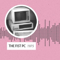
The idea was to create something that was very easy. I think when dealing with information design, it’s important to have different levels of meaning. The basic level in Historiography is the events themselves (World War I, the invention of the wheel, etc.). The next level is what happens when you show all of this data together and the insights you can generate from that. That was a big part of figuring out this project.
What was the biggest challenge in representing all of history?
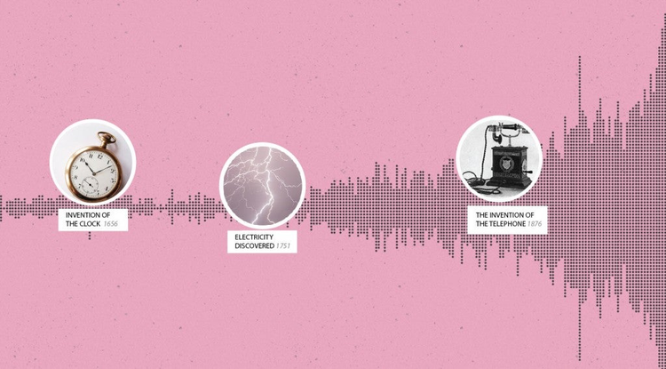
History from the Big Bang to today is about 14 billion years, so the last 500 years [when most of the events on Histography happened] are a tiny, tiny visible fraction. And when you do infographics and information design, it’s very difficult to highlight something so tiny. When I understood that challenge, I thought, “Oh, so this is why you don’t have 14-billion-year timelines of history!” But that challenge is the fun part.
You’ll notice that when you move through time on Histography, the years closer to the present will move a year at a time and then you move faster as you go further back in history, first by hundreds of thousands of years and then millions of years. The timeline moves in reaction to the number of events we know about in a given timeframe.
What did you want to achieve with Histography?
From the beginning, I knew I wanted to create a timeline of all of history, from the beginning (the Big Bang) to today. I didn’t know how or if it was even possible, but that was the project brief I gave myself. I also knew I wanted to create something that would make you want to explore, discover, and learn history—something that wouldn’t replace Wikipedia, but would offer a different experience.
When you arrived at the final design, how did you know it was right?
I think because, for the first time, it felt fun. Usually when the experience you are creating is enjoyable, you know you did something right. For a long time something felt wrong about the project. I had all kinds of interfaces, from a 3D timeline to a zoom in/out design, but none of them made you want to go back and use them again.
Tell us about the technical side of the project.
I started by sketching and then moved to the technical part to create it. There is a spider that crawls Wikipedia and finds events. Every historical event is a dot and there is a script that decides where a dot should be placed.
It was especially complex to show thousands of events at the same time without the system crashing or without it being very, very slow. That was one of the biggest technical challenges.
How have people responded to Histography?
It was created as an experiment, and I was surprised when I saw traffic because I didn’t imagine that. There were, in the last week, 200,000 people. I was shocked by that and I kept getting emails from people finding mistakes and saying things like, “This event was in a different time.” They’re not actually my mistakes because it’s based on Wikipedia, so I don’t have a lot to do about it. But it’s nice to get the emails. It means people are using Histography and exploring it
Where do you think someone should start if they want to develop simple, elegant design that can communicate a lot of information?
I think information design for the web can learn a lot from print. Print does not have clicks, mouse hovers, or animations, and I think that those limitations can generate very interesting designs. That’s where I suggest people should start.
What’s your advice for someone trying to integrate data and design?
Do something simple. Don’t try to do everything. Try to do something very specific and do it very well.