Best Practices for the UX of Navigation

Navigation is a make or break aspect of the user experience of a site. It is a way for users to find where they need to go, and navigation that is frustrating or unusable will lead to irritated users, high bounce rates and unfinished user flows.
As with everything in UX, context and audience will really determine how your design solution can best meet your users needs. As well as this, there are some key best practices to bear in mind when working on navigation design.
Navigation best practices
Good navigation relies on having very clear information architecture (IA) in place. IA is the structure or way that the site is organized. Part of great IA is about sorting content types into buckets which match the user’s mental models of how the site should work. Think about the types of things users might expect to see when landing on your site. Search analytics can help to identify what words they are using.
Keep it simple. The more complex and overwhelming the navigation, the harder it is going to be for users to find what they need. Navigation that goes many levels deep starts to become unusable. Getting to a well-structured information architecture will go a long way to sorting out the UX of your navigation.
http://blogs.adobe.com/dreamweaver/files/2015/12/nav-1.png
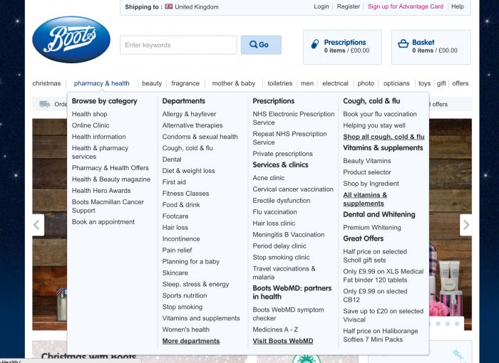
The Boots.com navigation is an example of an overwhelming amount of choices, with a complex IA using several different paradigms – category, departments, prescriptions and so on.
Labelling needs to be clear. Use open card sorts where users sort information and then come up with appropriate labels, or search analytics, to understand the types of terms that your audience is expecting. For the same reason, be careful if considering icon only navigation – this can be tempting to save space, but can ultimately be counter-productive if users don’t know what the icons mean.
http://blogs.adobe.com/dreamweaver/files/2015/12/nav-2.png
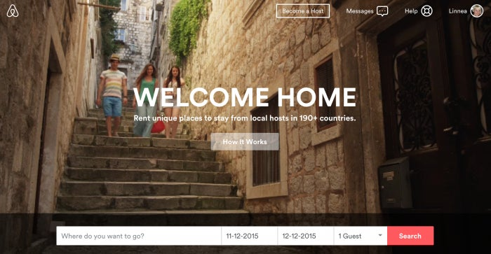
An effective use of clear labeling and simple navigation – airbnb.ca has a straightforward top level navigation which only goes one level deep.
Make sure that the styling of the navigation is appropriate – there should be enough contrast to differentiate it from the rest of the page. Tab style navigation was a popular choice for web 1.0 sites, because it was very clear where the user was and what parts were navigation. Today, web navigation styles are evolving, but it is still important to provide as many cues to users as possible and reduce cognitive load. The navigation should be immediately apparent when landing on a page.
http://blogs.adobe.com/dreamweaver/files/2015/12/nav-3.png
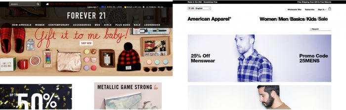
The higher contrast of the black overlay behind the Forever 21 navigation helps to create a more instantly recognizable nav compared to the American Apparel black text on white.
Navigation styling also includes thinking about location indicators – or how a user will know where they are. This is essentially the “you are here” pointer that we are used to seeing on physical maps. Users need to quickly orient themselves to know where they are and where they are going next.
http://blogs.adobe.com/dreamweaver/files/2015/12/nav-4.png
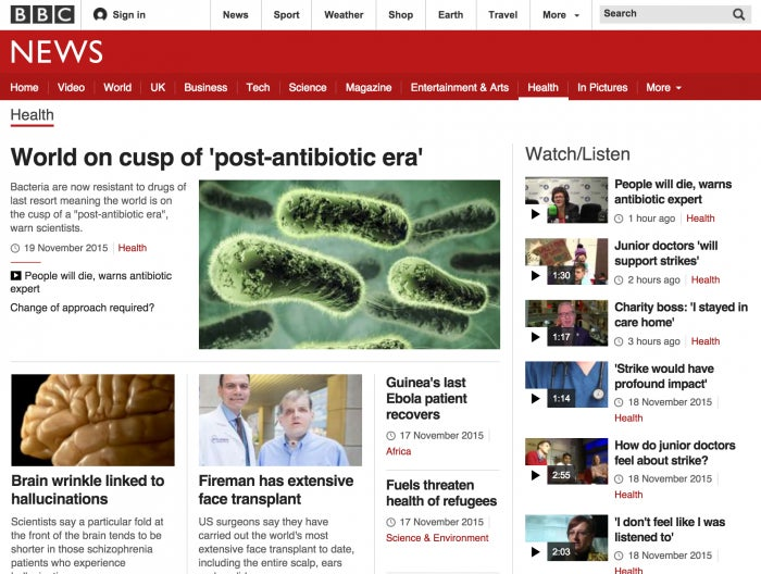
Where am I? BBC.com uses a white underscore to indicate the section a user has navigated to. Page headings strengthen the message.
Users are also accustomed to seeing navigation in certain locations. Horizontally across the top and along the left-hand side are traditionally where navigation has been located. Some mobile and responsive sites make use of a fixed navigation bar that stays with the user when they scroll. Top left and right corners are frequently used for menu buttons today.
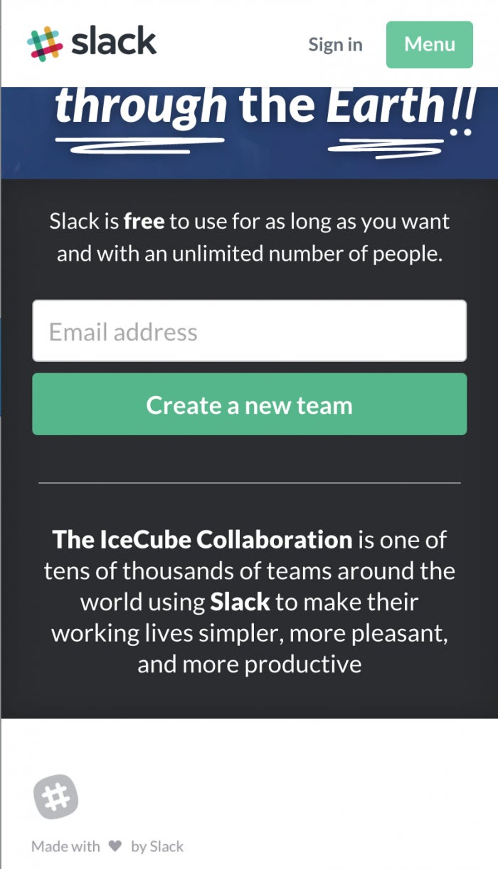
http://blogs.adobe.com/dreamweaver/files/2015/12/nav-5.png
Slack has a fixed navigation bar that stays with you as you scroll on small screens. It is located at the top of the screen and spans the horizontal width of the screen, a familiar place for navigation to reside.
Think about scalability – is there a possibility that the navigation paradigm will need to grow to accommodate more items? A horizontal tabbed navigation is an example of something that may not be very scalable – there is a limit to horizontal screen real estate, especially on mobile screens.
A word about the hamburger
Responsive web design has given rise to many patterns and ways of dealing with creating navigation that has to be flexible enough to work on small and large screens alike. Brad Frost has documented many of these patterns, and their pros and cons, in detail.
One very common pattern has been using the ‘hamburger icon’ to denote that a menu or navigation will be revealed once it is pressed. While this icon is still widely used in responsive sites today (cnn.com, airbnb.com for example), there are ongoing questions about its usability. One A/B test found that using the word menu performed better than using the hamburger icon.
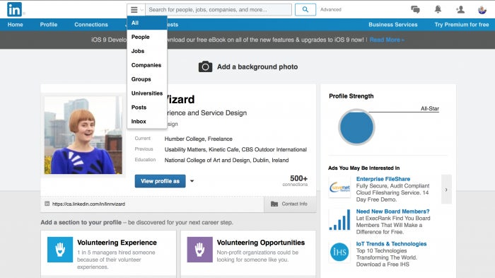
http://blogs.adobe.com/dreamweaver/files/2015/12/nav-6.png
Hamburger icon in use to denote a menu on the LinkedIn site.
The use of this icon will continue to evolve, and we are seeing it also be used on desktop interfaces. Over time this icon may become widely understood, but for now, testing with users and tracking analytics will help to ensure that the navigation you are using works for your particular context.
Get your users where they want to go
Above all, navigation is the primary means that people will use to wayfind on your site. It is crucial that it works well. Users need to be able to quickly locate themselves on the site, and figure out how to get to where they want. Spending time navigating by guesswork or trial and error will frustrate people, who will often resort to using Google to get to what they need. Bearing in mind navigation best practices will improve the chances of creating a good experience for your users. Navigation is not usually the place to innovate – stick with what works!