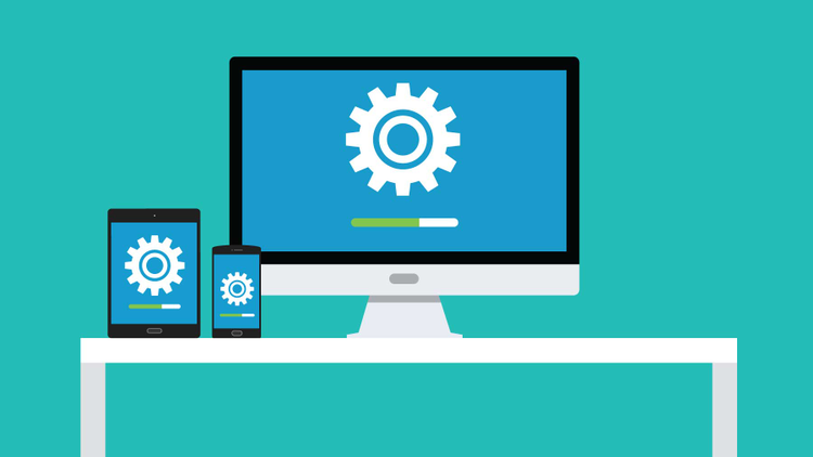
XD Essentials: Best Practices for Animated Progress Indicators
Visibility of system status is one of the most important principles in user interface design. Users want to feel in control of the system they’re using, which means they want to know and understand their current context in it at any given time, especially at a time when the system is busy doing work. A wait-animation progress indicator is the most common form of providing a system status for users when something is happening or loading.
In this article, we’ll explore the main types of animated progress indicators and provide recommendations on when and how to use each type.
Good Interaction Design Provides Feedback
While an instant response from an app is the best, there are times when your app won’t be able to comply with the guidelines for speed. A slow response might be caused by a bad internet connection, or an operation itself can take a long time (e.g. install an update for OS). For such cases, in order to minimize user tension, you must reassure the users that the app is working on their request and that actual progress is being made. Thus, you should provide feedback for the user about what is happening with the app within a reasonable amount of time.
Always Give Some Type of Immediate Feedback
A user’s wait time begins the moment they initiate an action, and the worst case is when they don’t have any indicator the system has received it. When an app fails to notify users that it’s taking time to complete an action, users often think the app didn’t receive the request and they try again. Plenty of extra clicks/taps have resulted due to a lack of a feedback.
Any action such as clicking a button or pulling to refresh should have an immediate reaction. It’s essential to give some visual feedback immediately after receiving the request from the user to indicate that the process has initiated.
Use a Progress Indicator for Any Action That Takes Longer Than One Second
When the app takes more than 0.1 second but less than one second to respond to user input, it feels like the app is causing the result to appear. Although users notice a short delay, they stay focused on their current task. After one second, user’s attention begins to wander and they notice that they’re waiting for a slow app to respond.
In order to reduce a user’s uncertainty, offer a reason to wait with a progress indicator for any action that takes longer than about one second (Note: the use of animation isn’t recommended for anything that takes less than one second to load, because users might feel anxious about what just flashed on the screen). Animated progress indicators mitigate the negative effects of waiting and prolong the user’s attention on the site/in the app.
Types of Progress Indicators
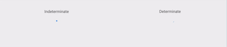
Progress indicators tell users that the app needs more time to process the last user action. The simplest form of process indicator is indeterminate — these types of indicators request users to wait while something finishes, but they don’t indicate how long it will take.

As a general rule you should use this type of progress indicator for fast actions (2–10 seconds). Making the user stare at a spinning wheel or infinite linear animation longer can increase bounce rates for your website or cause people to close your app.
Another type of progress indicators tell how long an operation will take (approximately or exactly). These types of indicators are called determinate. They are the most informative type of wait-animation feedback, since they show the current progress, how much has already been accomplished, and how much is left. A visual indicator that progresses towards completion puts the user at ease and increases their willingness to wait.
Two Most Popular Animated Progress Indicators
There are two popular types of animated progress indicators — looped animation and percent-done indicator.
Looped Animation
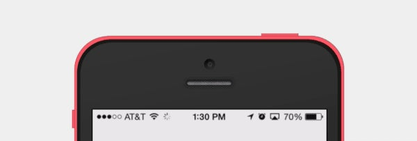
Since the majority of looped animation is indeterminate and serve a variety of types of delays, including long ones, this type of progress indicator tends to have negative connotations. For example, a default loading icon in Apple iOS (spinner of gray lines radiating from a central point area) serve a variety of operating system functions, indicating the status of everything from device boot to problems connecting to network or loading a data. Because of that, users don’t like to see only a loading spinner with no indication of progress or time.
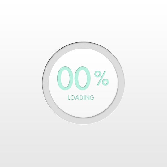
Percent-done Indicator
A percent-done indicator is a determinate progress indicator that fills from 0% to 100% and never decreases in value. Both linear and circular progress indicators may be percent-done.
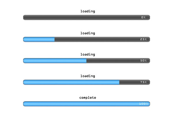
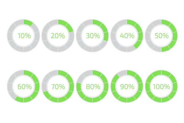
As a general rule of thumb you should use a percent-done animation for longer processes that take 10 or more seconds. Based on Jakob Nielsen’s research about response times, 10 seconds is a limit for users to keep their attention on a task, after this time users quickly grow impatient if they don’t have enough information on how long they have to wait for the result.
Tips for Progress Indicators
You should always try to make the wait more pleasant if you can’t shorten the line.
Explain Why User is Waiting
Many times, if users are informed, they may be more patient. It can be helpful to add additional clarity by including text that tells the user what is happening or explains why the user is waiting.

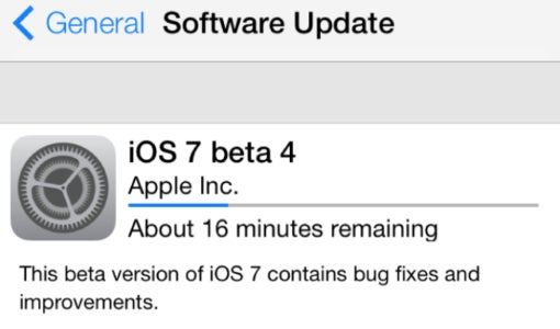
Provide a General Time Estimate for Time-Consuming Tasks
Don’t try to be exact, a simple, “this might take five minutes” can be enough to the users and encourage them to wait it out.
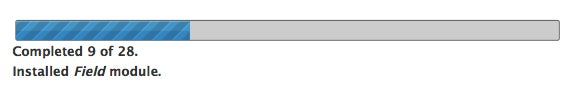
Show Absolute Amount of Work Done
For time-consuming operations where it’s unknown in advance how much work has to be done, it may be impossible to use a percent-done indicator, but you still can provide running progress feedback in terms of the absolute amount of work done. In this case consider showing the number of steps, because knowing the number of steps helps users at least form an approximate estimate.
Don’t Stop a Progress Bar
A progress bar makes users develop an expectation for how fast the action is being processed. As a result, any unexpected freezes will be noticed and will impact user satisfaction. The worst possible case is when progress bar approaches 99% and suddenly stops. Most of users will be frustrated by this behavior because it makes them think the app is frozen. Hopefully, there is a simple solution — you can disguise small delays in your progress bar by moving it instant and steady.
Make Progress Bars Feel Faster to Users
Keep in mind that perception can be just as important as raw speed. In order to make progress bar feel faster to users you can start the progressive animation slower and allow it to move faster as it approaches the end. This way you give users a rapid sense of completion time.

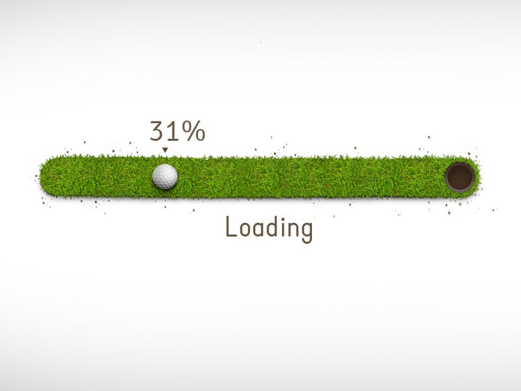
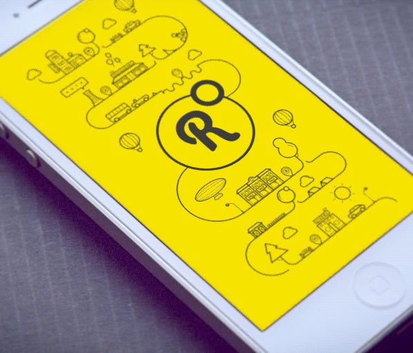
Offer a Visual Distraction
Creative progress indicators can reduce user’s perception of time. If an app gives users something interesting to look at while waiting this makes users pay less attention to the wait itself. Thus, to ensure people don’t get bored while waiting for something to happen, offer them a distraction. For example, this can be something fun…
or something adorable…

or something unexpected that catches users’ attention long enough for your app to load.
Conclusion
No matter how fast we make our app and sites, there will often be something that takes time to process. Wait animations, such as loading spinners and percent-done indicators, reduce uncertainty by informing users of the current working state and increase the likelihood that the user will stay and wait for the information to load. A rule of thumb is to use a looped indicator for reasonably fast operations taking between 2 and 10 seconds, and a percent-done indicator for operations taking more than about 10 seconds. Ultimately, good progress indicators make users stick around to finish the task and generally have a more positive impression of your site or app.