XD Essentials: 12 Tips for Mobile Design
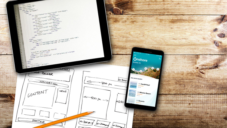
If you’re not thinking about the end user experience before you start a new mobile app, it’s time to start. The most important thing to keep in mind when designing a mobile app is to make sure it’s both useful and intuitive for your users. If the app is not useful, it has no practical value. At the same time, if the app is useful but requires a lot of time and effort, people won’t bother learning how to use it. Good design addresses both moments: It has a clear focus on key users goals and removes all obstacles from their way by bringing clarity into user interface. But creating good design is not an easy task. In order to help you create really great mobile user experience we’ve prepared these 12 UX design principles.
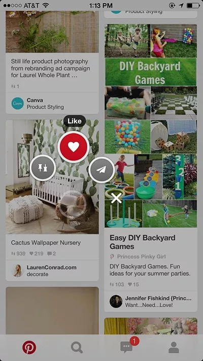
1. De-Clutter Your User Interface
A huge factor in making your app’s mobile UX shine is its user interface. Clarity is the most important characteristic of a great UI. User attention is a precious resource, and should be allocated accordingly. Cluttering your interface overloads your user with too much information. Since mobile displays have a limited screen estate, every added button, image, and line of text makes the screen more complicated. You need to focus on delivering messages in a clear and concise manner, so try to keep the UI as “invisible” as you can—focus on the essential content.
2. Design for Interruption
Whatever you’re designing for a mobile device will be used “on the go.” Users often have to quickly accomplish one core function in a mobile app—make a payment, check for new messages, etc. This critical flow should be crystal clear for the user, so break down larger tasks into smaller ones so as not to overload the user. A simple rule of thumb: one primary action per screen. Every screen you design for the app should support a single action of real value to the person using it. Short mobile sessions also mean that you must design for interruptions—allow users to save state and re-engage with an app later.
https://blog.adobe.com/media_fb093a2789e5b662b95aad766c457fcdc5c21f0c.gif
3. Make Navigation Self-Evident
Know your user and design to support this user’s core need. Use easily recognizable functions that are inherent in other well-known apps in your category together with simpler layouts. Surface these functions in an obvious way and make it clear and intuitive. Navigation should help the user discover and use these functions. Good navigation should feel like an invisible hand that guides the user along their journey. After all, even the coolest feature or the most compelling content is useless if people can’t find it.
https://blog.adobe.com/media_01d9ed8a1dd6902f45eeced0d501291e9c230b58.gif
4. Making a Great First Impression
It’s no surprise that a first impression is a big deal for mobile app. Just like a person, your mobile app doesn’t get a second chance. There is only one chance to sway someone into becoming a user, because if you disappoint the first time, you can bet (with 80 percent confidence) they won’t be back. Onboarding shouldn’t be generic or interruptive, instead it should be beneficial to the user. Think of onboarding as building an entry ramp for people to use the app. It can include a variety of techniques to keep users engaged during their first time, but it should only be employed if it’s really essential for first use. The trick with onboarding is to show just what users need to know to get started—nothing more, nothing less. If you’ll keep onboarding light and simple, you’ll see an increase in usage.
https://blog.adobe.com/media_fe9d7af8a025d8ed8a312b7979a4fe6fca5a6a24.gif
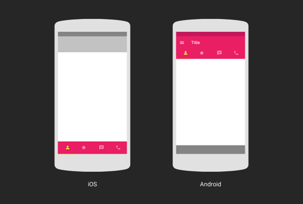
5. Align with Device Conventions
As you build your app for Android/iOS, don’t carry over themed UI elements from other platforms and don’t mimic their specific behaviors. Because if you replicate elements from one platform to another, you risk compromising the user experience and conversion. Input fields, check boxes, switches and other functional components should give a native feel. You should use the native components as much as possible, so that people know how to use them, and trust your app with their sensitive data.
https://blog.adobe.com/media_be214721cf52af3d74f9448fb914c03068790a9d.gif
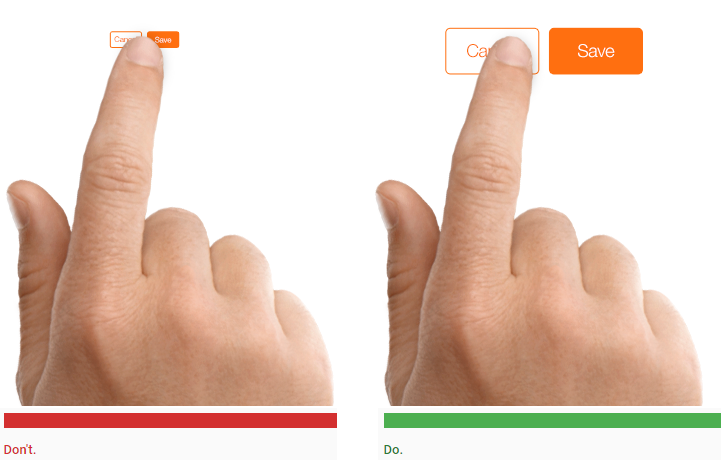
6. Design Finger-Friendly Tap-Targets
Smaller touch targets are harder for users to hit than larger ones. When you’re designing mobile interfaces, it’s best to make your targets big enough so that they’re easy for users to tap. Create controls that are 7 to 10 mm in size so they can be accurately tapped with a finger. Such button size allows the user’s finger to fit snugly inside the target. The edges of the target should be visible when the user taps it.
https://blog.adobe.com/media_a69d2d268c970db63bde6f9293a59fba211dde1f.gif
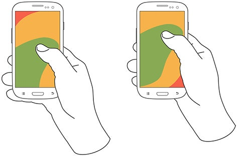
7. Design Controls Based on Hand Position
Hand positions and grip should influence the placement of controls on a mobile design. It’s important to place top-level destinations and frequently-used controls within the thumb’s reach. In the figure below, the diagram that appears on the mobile phones’ screens are approximate reach charts, in which the colors indicate what areas a user can reach with the thumb to interact with the screen. Green indicates the area a user can reach easily; yellow, an area that requires a stretch; and red, an area that requires users to shift the way in which they’re holding a device.
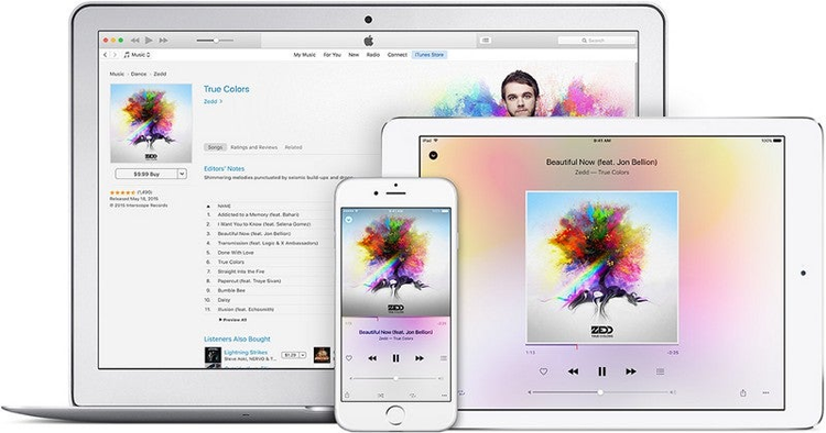
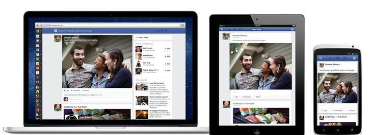
8. Create a Seamless Experience
Users can use your apps on a phone, on a tablet, or on a desktop, and when users engage with the app through a specific device, they see it as one of the many interactions that make up their overall user experience with the app. Since users often don’t complete an activity in one sitting or through a single device, apps that allow users to switch channels while completing tasks have a competitive advantage.
A seamless user experience—regardless of device—is one of the most important requirements for a usable cross-device experience.
https://blog.adobe.com/media_889b2ee6b6064c0c1f12eb39b3cbafe5dd547778.gif
9. Use Subtle Animation and Microinteractions
User-experience is not just about usability. It’s also about feelings. It is the little things that can make your user experience truly delightful and memorable. By injecting subtle details—like animated microinteractions, animated feedbacks, or in-app sounds—into design, you can make users feel like they are interacting with something that’s has a personality. And showing personality in your app, website, or brand can be a very powerful way for your audience to empathize with you.
https://blog.adobe.com/media_f80c779b3b63bca857d47d25c72ac035f35ebde0.gif
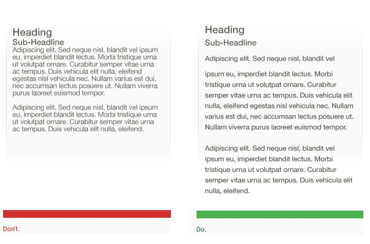
10. Focus on Readability
When compared with desktops, mobile devices have relatively small screens, which means that one of the challenges of designing for them is to fit a lot of information on a small UI. You might have a temptation to squish everything down in attempt to provide as much information as possible, but you should resist that temptation. Keep in mind, that text content should be legible. A rule of thumb for mobile: Text should be at least 11 points so it’s legible at a typical viewing distance without zooming.
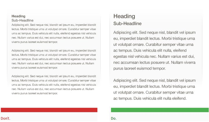
You can also improve legibility by increasing line height or letter spacing. Good, generous whitespace can make some of the messiest interfaces look inviting and simple.
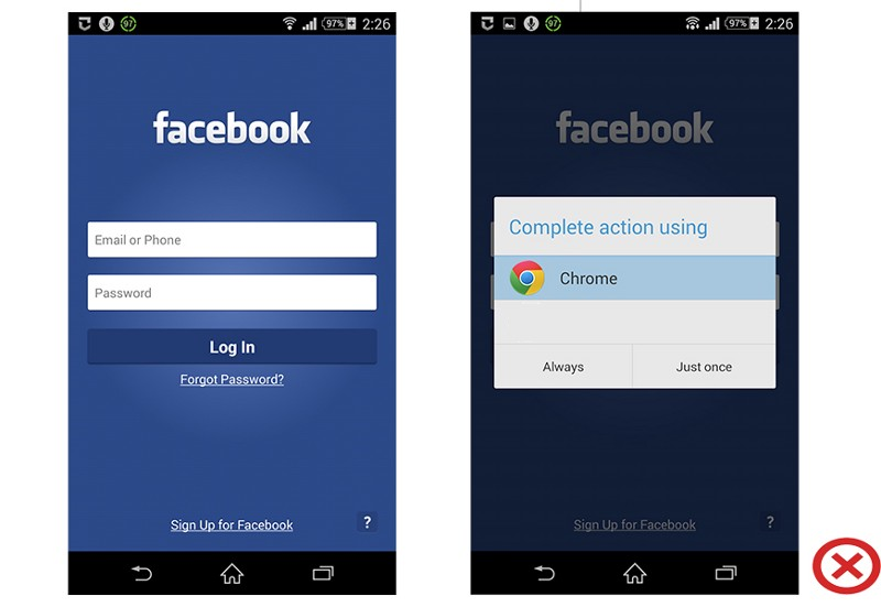
11. Don’t Interrupt Your Users
No one really wants to be interrupted, much less for something useless while they’re in the middle of something important. Avoid interrupting users by asking them to rate your app if they’ve only recently downloaded it. Instead, wait until they prove to be repeat users and they’ll be more likely to rate your app and provide more informed feedback. Also if your app lacks a specific feature or content, try to use an in-app browser. But do not invoke the smartphone browser, or you will cause users to lose track and not return to the app, which will increase abandonment and reduce conversion.
https://blog.adobe.com/media_c92fe65e6b256326e2377ef3ef9e484315edcb9f.gif
12. Refine Your Design Based on User Testing
All too often a mobile design looks great when viewed on a large desktop screen but doesn’t work nearly half as well when used on an actual mobile device. Even the most thought-out UX will ultimately contain some unseen flaw when put into the real world. That’s why it’s so important to test your app with real users on a variety of mobile devices. You should ask real users to complete regular tasks, in order to see how well the design really performs. Treat your app as a continuously evolving entity, using data from analytics and user feedback to constantly improve the experience.
https://blog.adobe.com/media_5d93c3555e8767da8a6a8c26237ecabf845042fc.gif