XD Essentials: Shadows and Blur Effects in Modern UI Design

While the function of a design is key to a product’s success, aesthetics and visual details are equally important. In this post, I’ll show you how visual elements, such as shadows and blur effects, can improve the functional elements of a design.
Shadows and User Interface Discoverability
There’s a reason GUI designers incorporate shadows into their designs — they help create visual cues in the interface which tell human brains what user interface elements they’re looking at.
Design Affordance
Since the early days of graphical user interfaces, screens have employed shadows to help users understand how to use an interface. Images and elements with shadows seem to pop off a page, and it gives users the impression that they can physically interact with the element. Even though visual cues vary from app to app, users can usually rely upon two assumptions:
- Elements that appear raised look like they could be pressed down (clicked with the mouse or tapped with a finger). This technique is often used as a visual signifier for buttons.
- Elements that appear sunken look like they could be filled. This technique is often used as a visual signifier for input fields.
You can see how the use of shadows and highlights help users understand which elements are interactive in Windows 2000 dialog box:

Create a Visual Hierarchy and Impression of Depth
Modern interfaces are layered, and take full advantage of the z-axis. The position of several objects in the z-axis act an important cues to the user.

Shadows help indicate the hierarchy of elements by differentiating between two objects. Also, in some cases, shadows help users understand that one object is above another.
Why is it so important to visualize the position of an element within three-dimensional space? The answer is simple – laws of physics.
Everything in the physical world is dimensional and elements interact in three-dimensional space with each other: they can be stacked or affixed to one another, but cannot pass through each other. Objects also cast shadows and reflect light. The understanding of these interactions is the basis for our understanding of the graphical interface.
Let’s have a look at the Google’s Material Design for a moment. A lot of people still call it flat design, but the key feature is that it has dimension – the use of consistent metaphors and principles borrowed from physics help users make sense of interfaces and interpret visual hierarchies in context.

Provide Visual Feedback Using Elevation
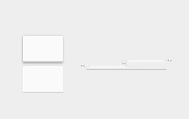
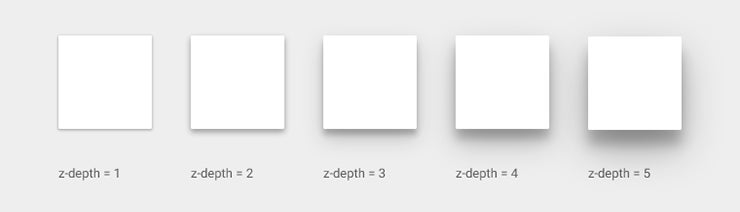
One very important thing about shadows is that they work in tandem with elevation. Elevation is the relative depth, or distance, between two surfaces along the z-axis. Measured from the front of one surface to another, an element’s elevation indicates the distance between surfaces and the depth of its shadow. As you can see on the image below, the shadow gets bigger and more blurry the greater the distance between object and ground.
Some elements like buttons have dynamic elevation, meaning they change elevation in response to user input (e.g., normal, focused, and pressed). Shadows provide useful cues about an object’s direction of movement and whether the distance between surfaces is increasing or decreasing. In order for users to feel confident that something is clickable/tappable, they need immediate reassurance after clicking/tapping which elevation provides through visual cues:

Blur Effects in the Layered Interface
When Apple introduced iOS 8 it raised the bar for app design, especially when it came to on-screen effects. One of the most significant changes was the use of blur throughout, most notably in Control Center: when you swipe up from the bottom edge of a screen you reveal the Control Center, and the background is blurred. This blur occurs in an interactive fashion, as you completely control it with the movement of your finger.

Apple moved further in this direction with the latest version of iOS which uses 3D Touch for flashlight, camera, calculator and timer icons. When a user hard presses on those icons, real-time blur effect takes place.

Make User Flow Obvious
Blur effects allow for a certain amount of play within the layers and hierarchy of an interface, especially for mobile apps. It’s a very efficient solution when working with layered UI since it gives the user a clear understanding of a mobile app’s user flow.
The Yahoo Weather app for iOS displays a photo of each weather location, and the basic weather data you need is immediately visible, with more detailed data only a single tap away. Rather than cover the photo with another UI layer, the app keeps you in context after you tap — the detailed information is easily revealed and the photo remains in the background.

Direct the User’s Attention
Humans have a tendency to pay attention to objects that are in-focus and ignore objects that aren’t. It’s a natural consequence of how our eyes work, known as accommodation reflex. App designers can use to blur unimportant items on the screen in an effort to direct a user’s attention right to the valuable content or critical controls. The Tweetbot app uses blur to draw users attention to what needs to be focused on: the background is barely recognizable, and the focus is on information about accounts and call to action buttons.

Make Overlaid Text Legible
The purpose of text in your app is to establish a clear connection between the app and user, and to help your users accomplish their goals. Typography plays a vital role in this process, as good typography makes the act of reading effortless, while poor typography turns users off.
In order to maximize the readability of text you need to create a proper contrast between the text and background. Blur gives designers a perfect opportunity to make overlaid text legible — they can simply blur a part of the underlying image. In the example below you can see a restaurant feed which features the closest restaurants to the user. What might immediately get your attention is that the restaurant images feature a darkened blur with text overlay.

Conclusion
Shadows and blur provide visual cues that allow users to better and more easily understand what is going on. In particular, they allow the designer to inform users on the relationship between objects and on potential interactions with these objects. Carefully applied, such elements can and should improve a functional aspect of design.