XD Essentials: The Art of Minimalism in App Design
User interfaces look way different than they used to just a couple years ago — user interfaces (UIs) are becoming less cluttered and more contextual. Preferences are shifting toward a simpler interface, stripping the UI to its very basic, necessary elements. The Minimal Calendar app by Rationale Design, is a great example of how typography can shape the user experience. Most skeuomorphic patterns are in the past, and now users wish to see flat, simple, and minimal design solutions. Minimalism is at the forefront of this movement. All modern design guidelines, such a Material Design, iOS Human Interface Guidelines, and Metro design language take inspiration from minimalism.
In this article we’ll take a look at what minimalism is and go over important minimalist design techniques.
What is Minimalism?
As Antoine de Saint-Exupéry once said, “Perfection is achieved, not when there is nothing more to add, but when there is nothing left to take away.“ Minimalism is a perfect combination of form and function. It follows the ”less is more” principle, where a design is stripped of everything except for absolutely essential components needed to complete a user’s task. Every element in a design is deliberate, and every element serves a purpose.
When you embrace minimalism, you seek to simplify interfaces by removing unnecessary elements or content that does not support user tasks. In order to achieve this goal, you need to focus on following:
Smart Use of Color
Color is one of the most powerful tools in a designer’s toolkit. It can be used to create visual interest or direct attention without adding any additional design elements or graphics.
Simple Color Scheme
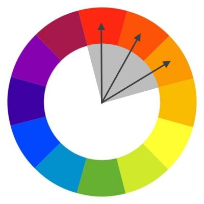
Simplifying the color scheme improves the user experience while having too many colors can have a negative impact upon it. Limiting the number of colors in your work doesn’t mean that you need to design in black and white, the idea is more about using only the colors necessary to accurately portray your design and create hierarchy. You can start with a simple color scheme such as monochromatic or analogous:
- Monochromatic color schemes are made up of different tones, shades and tints within a specific hue. By modifying the saturation and brightness of a single hue, you can generate multiple colors, and color scheme it’s not overwhelming on the eye.

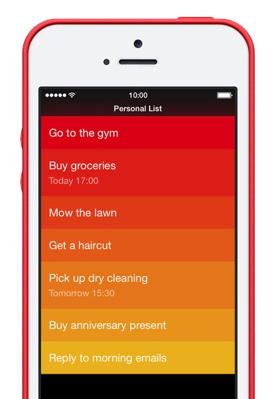
- Analogous schemes are created by using three colors that are next to each other on the color wheel. Minimalist gesture-driven task manager app Clear uses analogous colors to visually prioritize important tasks and highlight the most critical ones (the topmost items will be the boldest in color, while items lower on the list will be lighter and more subtle).
However, make sure your color scheme uses enough contrast to be legible to people with limited vision or color blindness.
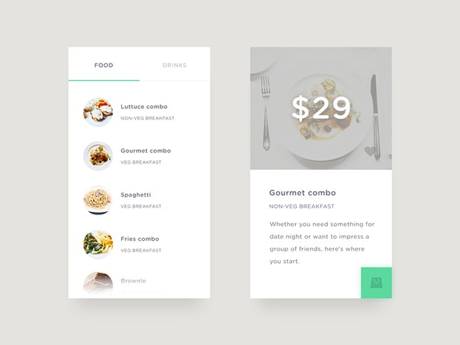
Use Color to Spotlight an Action or Data
You should use accent colors intentionally and consistently to highlight primary actions or important information. Using neutral colors for the general scheme and adding contrasting colors for calls to action helps the user focus on the action we want them to take.

Powerful Typography
Communication plays a vital role in design. The purpose of text in app is to establish a clear connection between the app and user and to help your users accomplish their goals. Typography plays a vital role in this interaction: great typography enables clear communication.
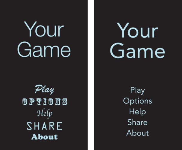
One App, One Typeface
Mixing several different fonts can make your app seem fragmented and sloppy. Reducing the number of fonts on a screen can reveal the power of typography. When designing an app think about how can you make the typography powerful by playing with weight, style, and size, not different typefaces.
Choose Standard Typeface for iOS and Android
Unless your app has a compelling need for a custom font, such as for branding purposes, stick with the platform’s default font:
- Apple uses the San Francisco family of typefaces to provide consistent reading experience across all platforms (the San Francisco font for iOS 9 is called SF-UI).
- Roboto and Noto are the standard typefaces on Google Android and Chrome.
Emphasize Important Information
Use font weight and size to highlight the most important information in your app. Increased font size draws the users’ attention to a particular area of the screen without additional visual hints. As a result, users can access information more quickly and more easily. However keep in mind that drawing attention to bold typography is only useful when that text communicates meaningful information.
Divide by Elements and Spacing, Not Lines
Traditional dividers such as horizontal or vertical lines might break up content well on a desktop screen, but they have one big disadvantage for mobile apps — they take up valuable space on mobile screen. A heavy use of dividers can also lead to visual noise and dense, crowded interfaces.
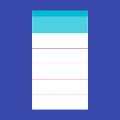
Less lines and dividers will give your interface a cleaner, modern and more functional feel. There are other ways to separate content with methods such as using whitespacing or elevation.
Whitespace
Whitespace is the areas of a design where there is no element placed by a designer. Whitespace has been called “the backbone of” minimalist interfaces. Generous whitespace can make some of the messiest interfaces look inviting and simple — it creates the spaces around elements in the design to help them stand out or separate from the other elements.
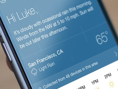
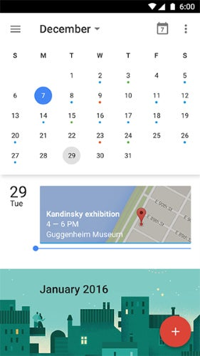
Shadows and Elevation
Shadows and elevation aren’t only able to create some depth in the UI, but they also can visually separate content sections. Calendar App from Google is a good example of how leveraging space and using shadows instead of drawing lines helps to define different sections in a non-obtrusive manner.
Simpler More Universal Icons
Iconography is a visual language used to represent functionality or content. Icons are meant to be simple, visual elements that are recognized and understood immediately.
Don’t Oversimplify Icons
In minimalism, icons are creating by reducing any elements that don’t contribute meaningful information. That’s why most icons are flat textures. However, the primary purpose of an icon is to be understandable, it’s really important to be sure that removing even a tiny specific detail won’t hurt usability. For example, this is how the Home icon on Kindle devices has evolved recently:
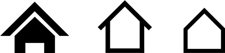
Amazon decided to simplify this icon and remove some graphical details step-by-step, making the third version hard to recognize at first glance.
Use Stroke/Fill Icons to Show Inactive/Active State
Since iOS 7 many minimalist UI has stroke and filled icons. A single icon can have both solid and hollow characteristics.
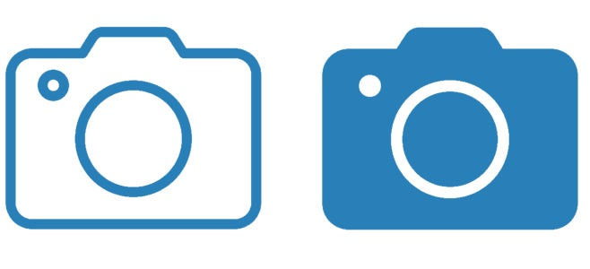
This pair of icons works great as navigation tab bar icons: these are the icons that you usually see in a row of four or five at the bottom of the screen in mobile apps. Because bar icons serve as navigation to other sections of the app, it’s important to indicate which section is currently active by highlighting its icon in some way: a solid version to show an active/selected state and a hollow version to show an inactive/unselected state. This makes recognition of active tabs and controls more straightforward.
Conclusion
Minimalist interfaces design techniques are certainly a way to achieve good design, but they are not the goal. The ultimate goal is to simplify our interfaces and make them more functional and usable at the same time. Design, like language, is defined by the way people use it. That’s why minimalist design can be a powerful tool, but only when it’s framed by the needs of your users.
Your app should prioritize function over the form, and aim to address problems for your users through clear visual communication. Beautiful minimalist apps combined with great usability create a seamless interaction.