The Power of The Palette: Why Color is Key in Data Visualization and How to Use It
When it comes to making charts, scales, and explaining data visually, using color is a very effective tool. Use it right, and you can not only draw your readers in, but you can help them better understand the underlying data.
So how can you use color in your data visualization and win? Here’s what to do, and what to avoid.
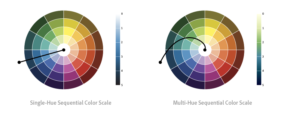
Sequential Color Scales
When you use color to represent a number, you need to create a scale. This is important—don’t use a scale for mapping categorical data (more on why later). Think of your scale as a gradient with a larger number on one end and a small number at the other. We can take advantage of some visual psychological here: We associate darker colors with density and density with greater numbers. Because of this, dark colors are perceived as being higher in value than lighter ones. So make sure you map the large end of you scale to a dark color and the smaller end to a light color. The bigger the difference between these two extremes, the more effective your use of color.
https://blog.adobe.com/media_275c0fafcc9efd268aff7eeeca03a363be09d9f7.gifWe can start with a simple black to white scale. By swapping black for another dark color we make things a bit easier to look at. Now instead of white, make the other end of the scale yellow. As you shift towards dark blue, your scale slowly changes and becomes a sea green in the middle. This is an example of a multi-hue scale, and is actually easier to read, understand because you’ve encoded you colors with changes in both hue and lightness.
If your chart is on a light background, it’s best to start with a cool, high-contrast color like blue or purple and use a warm, low-contrast on the other end. This will accentuate the dark-to-light transition. Moving in the opposite direction fights against this natural trend—it will be more difficult to read and it won’t look very good.
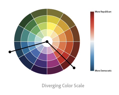
Diverging Color Scales
Diverging scales are also used to represent numbers, but in this case there is a meaningful mid-point to our scale. You probably saw lots of examples of these scales during the U.S. election—scales showing how democratic or how republican each state is. To be effective in creating this type of scale we need to think of our scale as two sequential scales that share a low value. This will be our mid-point. Be sure the hues of each scale don’t get too close to one-another—we want to accentuate the distance from our midpoint, not hide it.
https://blog.adobe.com/media_ed759e3f2dd97b9b9008e1c5ee1c0861e0314e29.gif
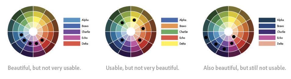
Categorical Color
When we’re mapping data without numerical meaning (categories—usually text) we want readers to be able to tell data-objects apart (slices on a pie chart, lines, bars, etc.).
As designers, we want these colors to look good next to each other. We often choose adjacent hues. These look nice. And with my young, hipster eyes and fancy laptop I can easily tell the states apart. But if you look at these colors on a projector, or an older computer, or if you have impaired vision… these colors will look very similar. This is a big problem because the entire reason for using color here is to help readers understand that objects are different from one another.
https://blog.adobe.com/media_494b40f80d852019a72814624e1f00370d99fd2a.gifTo combat this you could choose colors designed to maximize differences by bouncing to and from opposite ends of the color wheel. This approach is popular in academia—my colleagues and I call them ‘cosby sweaters’ because they’re incredibly noisy and (to most eyes) ugly.https://blog.adobe.com/media_b40c8685c5b80ca52608523dd102707afce794c3.gifSo, which approach is best? Form or function? Now, some people will tell you to alter the first approach by adjusting the lightness in these charts to create more visual separation between colors. Readability is improved—but only a little—and now we’ve introduced a new problem. Remember the psychological phenomena where we associate darker colors larger numbers? Well, now we’re unwittingly telling our readers that our darker colors are higher in value than our lighter ones.
There’s no silver bullet here. My best advice is to compromise: relinquish some beauty and some readability. Choose adjacent hues, but take larger steps (at least 35° of hue change) and maintain a consistent lightness. This will limit your color palette to 5-6 colors, but readers will have a hard time remembering the meaning behind more than that anyway.
A Little Help?
When I’m working with color, I like to start by eyeballing things. I pick values that look good and reflect the data I’m explaining. But before I get too far, I enlist the help of a few handy tools. These will take the heavy-lifting (and math) out of the optimization of your color choices.
- Color Scale Helper – Built by Gregor Aisch on top of Chroma JS, it generates diverging and sequential scales for you. It’s very easy to make mistakes when selecting new hues, but with this tool you can generate perfectly even color scales.
- i want hue – This is a great tool from Mathieu Jacomy to enforce best practices when creating and refining charts with optimally distinct colors. (Careful with that color-blind toggle—it like to crash your browser)
- ColorBrewer – Originally developed by Cynthia Brewer and Mark Harrower for cartographers creating maps, this is a great library of pre-built colors you can use.
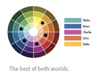
- Adobe Color CC – Adobe’s own tool makes it easy to pick a set of 3-5 colors for your categorical data.
We all know that color can make data more engaging, but by leveraging these techniques you can also make it more meaningful and useful! Your readers will thank-you for treating data with the respect and attention it deserves. And hey—it’s pretty fun too. Happy charting!
