Iconography, Typography, and Twitter: Designer Jeremy Reiss on Giving Products Personality
Design and baseball – those are two of designer Jeremy Reiss’ great pursuits; but it’s when he combined the two that he really hit a homerun. An active Twitter user, the social media giant came knocking after seeing a baseball-themed illustration and typography piece Reiss created.
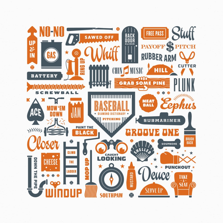
http://blogs.adobe.com/creativecloud/files/2017/03/Reiss-Baseball-Print.png
Now he’s working as a graphic designer in Twitter’s product design team, using his skills in typography and iconography to subtly redesign the app. We asked him to share his work and some tips on how designers can add personality to their products using typography and iconography.
What’s the best way a designer can add personality to an app or website?
First and foremost, a designer needs to work with stakeholders (decision makers) to learn or help define what that personality is. Once that’s been nailed down, I believe the combination of brand appropriate color, typography, and engaging visuals are the foundation for designing personality.
How are you doing that at Twitter?
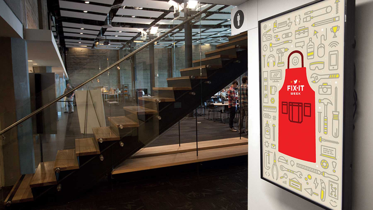
When I was tasked with redesigning the iconography set it was pretty clear that we needed to do two things: unify the set by creating a consistent style and design the set in a way that presents Twitter in a more personal way.
To create that consistency we started by incorporating the same stroke weight for everything. To add a little personality, we rounded all the corners to make them feel more comfortable and less stuffy or rigid.
Why are typography and iconography so important in 21st century design?
Typography communicates a personality very quickly. Immediately, you can tell if something is playful or corporate, entertaining or expressionless, sophisticated or approachable. Whether it’s custom, hand-lettered, or a typeface purchased from a fontshop they all have characteristics.
https://blog.adobe.com/media_0080de2ca606d954eed6ccdd4cc7326e4a373be4.gif
With regards to iconography, we’ve come to expect answers quickly since we have little computers in our pocket. Iconography serves as the wayfinding to get to those answers.
What started your love affair with fonts, symbols, and graphics in design?
From an early age I remember my dad making surprisingly beautiful yard sale signs. They were simple, white poster boards but he hand lettered everything adding dimension to the type and he used a lot of colors to make them stand out and get people’s attention. Still to this day I think they’re the best yard sale signs I’ve ever seen. So maybe that’s where my love started.
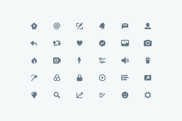
http://blogs.adobe.com/creativecloud/files/2017/03/Twitter-Iconography.png
What kinds of challenges are designers facing now?
On the illustration front, it’s becoming increasingly difficult to define and be known for your own unique style. There are so many sites now where designers can post work and gain inspiration. Because of all the great work out there it’s harder to stand out.
Now that apps and web standards have been around for awhile, designers have a set of guidelines and templates with which to begin their work. The challenge is working within those restraints and creating something fresh and original.
Where are we heading in design?
We’re heading into a time, and quite possibly we’re already there, where younger designers are creating at a higher level earlier in their careers than ever before. I think technology has opened the door for quicker learning to take place.
Check out Jeremy’s designs and expert use of typography on his website or catch him on Twitter.