UXperts Weigh In: Designs We Love, May Edition

May is in full swing, and for many of us that means a fresh start is on the horizon as the seasons change. It’s a perfect chance to check out some new designs, get inspired, and do something great. We’ve tapped a few of our favorite UXperts to share the websites or apps they’re loving, right now, and tell us why they’re examples of fresh design.
Jack Morgan – Designer at Duolingo
Pick:Google Fonts

http://blogs.adobe.com/creativecloud/files/2017/04/Jack-Morgan-250.jpeg
I’ve been really enjoying the new Google Fonts. It embodies what I think of as good old-fashioned graphic design. It’s as if they took The Vignelli Canon and applied it to a highly-functional tool for finding web fonts.
There’s this timeless approach of big, beautiful typography paired with a solid grid system and strong colors. When you compare the new design to previous versions of the product, it’s obvious that this was a very bold and creative redesign of a project that has traditionally focused on function over form.
The Google Design team wrote a great little case study on the UX challenges they faced with the design, including notes like “users don’t know what the number means” and “users were confused about these icon.” It’s proof that if you don’t user-test, even the best design can contain big flaws.
https://blog.adobe.com/media_a6395a80bf6364164044edfc1169e98d3267f6da.gif
Mandavi Kaushik – Senior UX Designer at Travel Supermarket
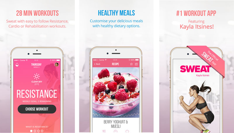
Pick:Sweat with Kayla

http://blogs.adobe.com/creativecloud/files/2017/04/Mandavi-Kaushik-250.jpeg
I was looking for a healthy lifestyle app which supports a workout plan as well as a nutrition plan. Sweat with Kayla does the job. The app is engaging and keeps motivating you to do your best. The set timed workout videos keep you motivated and the workout music is a bonus. The app is easy to follow and as a first time user I was able to navigate the journey with ease. It also allows the users to easily jump from one section to the other and I always have full control on how I want to use the app. The visual look and feel is inspiring and guides you along the user journey.
I found the app on Instagram, and it would make sense to bring some more social elements to the app. There are a few areas where it can be improved further, especially around reminders and sending positive messages, and the food advice content can be made a bit more engaging.
https://blog.adobe.com/media_ab1de1e395b9aecccdf130a3645a063b47c9bdc8.gif
Shane Mielke – Freelance Designer at Shane Mielke
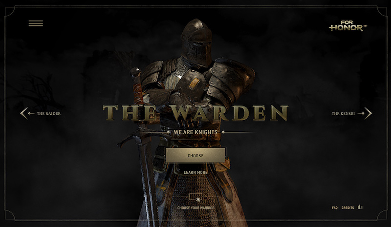
_Pick: _For Honor – Scars

http://blogs.adobe.com/creativecloud/files/2017/04/Shane-Mielke-250.jpeg
In a world where good design is slowly becoming boring product websites with formulaic scrolling UX grids and static photos, experiences like this are becoming rare. It leverages all of the unique interactive design techniques and assets and creates a great immersive experience.
During the preloading, your senses are teased by audio and video that create an emotional response, keeping you interested and setting the tone for the product and experience. As the site opens, you’re treated to a beautiful 360 animation which lays the groundwork for understanding how to navigate through the character choices. Every navigation element or background element yields a silky smooth interaction animation letting you know how the item should be used.
Upon choosing a character, the site continues to keep you engaged in the storytelling process by requiring you to actively scroll through different poses, and clicking items to view and digest the content piece by piece. This is great design because, just like a movie with great cinematography, you can stop at any point in this experience and see the beautiful layout, background, and content regardless of the context.
https://blog.adobe.com/media_eb3d97decbeda9e76cc718ca4ca7501e5cf8975b.gif
Kenji Arakawa – Senior Experience Design Manager at Adobe
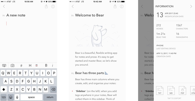
Pick: Bear

http://blogs.adobe.com/creativecloud/files/2017/04/Kenji-Arakawa-250.jpeg
I write a lot of notes through the course of the day for work and for my personal ideas. My go-to app for notes had been Evernote, but lately I’ve been using an app called Bear. I love how focused it is.
It’s also beautiful, which isn’t what you’d naturally expect from a utility – but you should. Although Avenir (Next) does tend to get a bit overused these days, it manages to somehow feel unexpected in a text editor. It’s a tasteful and quiet typeface that still has some personality and it works nicely with the pictograms they’ve designed for the UI.
I also love how Bear handles markdown. I’ve gotten really used to using markdown for formatting since it appears in a lot of tools I use, like Trello. What’s really nice is that Bear makes it easy to use keyboard shortcuts (or icons) to quickly format markdown, and it visually displays the formatting inside the tags. It’s a nice touch.
As a bonus, try tapping on the info icon. When was the last time you saw mundane document information presented so beautifully? The elegance of Bear’s experience reminds me a lot of how I felt about Medium when I first saw their editor: refreshingly focused and intuitive.
https://blog.adobe.com/media_6cf89dec75eb0bb372346d66354a66d90da8bf0c.gif