Designing a Small Business Website: Wants vs Needs

Let me start off by saying something that might not sit well with everybody. Namely, designing a quality small business website is not about making the thing pretty. Nor is it about agreeing with every single idea that the client brings to the table.
So where’s the actual sweet spot?
Let’s begin with needs vs wants.
When a client first thinks about building a website for their business, they, somewhat naturally, want for that website to “be all things to all people.” Or in other words, they want to make sure that the website covers the business and its offerings from top to bottom – that nothing is left out, that nothing is left unattended.
But that’s perhaps not the best approach out there.
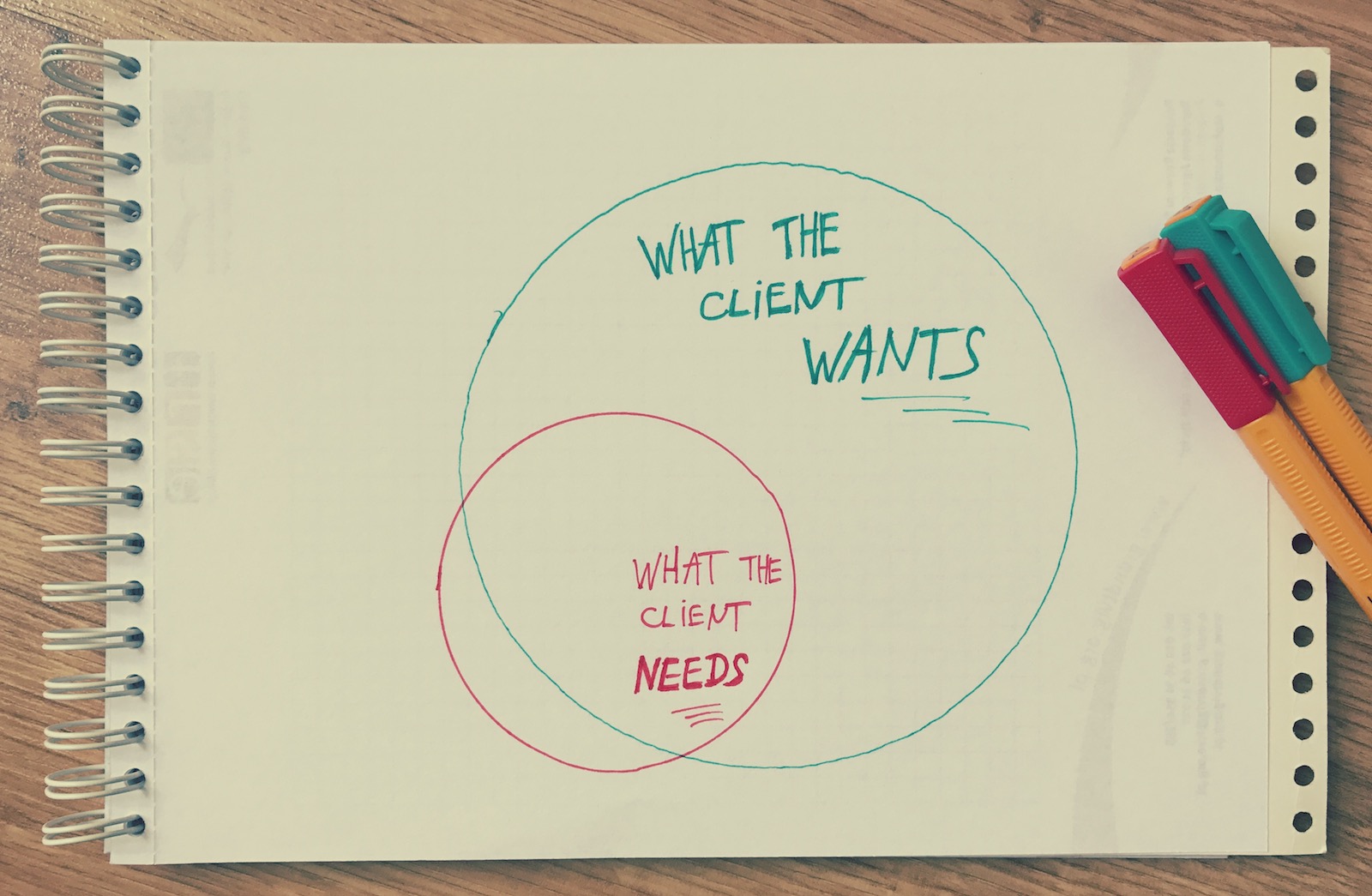
This is where needs vs wants come into the picture. Very often, it plays out something like that:
https://blog.adobe.com/media_1d1c7eb2493dca517a6e58cbdcb898462ed40ddd.gif
Here’s how you can understand the above illustration:
- Needs – the things that will make the website successful
- Wants – all the things that can be done with the website
As you can see, one is (mostly) contained within the other. On the one hand, you could argue that as long as you have all the needs taken care of, the size of the implemented wants shouldn’t matter all that much in the long run. However, this is not entirely the case.
First, with too many wants, the website loses its focus. It becomes harder to achieve the main goals, plus the visitors have a harder time figuring out what it is that they should do on the site.
Second, devoting too much time to all the wants, rather than spending it on perfecting the needs will also impact the quality of those needs.
The key thing here, therefore, is to limit the website to what really matters, and not to fall victim to feature paralysis as you go along. Taking all of this into account, here’s how to design a successful small business website:
1. Do one thing right
Most small businesses are launched for the purpose of providing either just one type of service or selling one type of products (or at least one range of products). The same mentality should be carried over into the website.
Therefore, the main meta-goal of any small business website is to do just one thing right:
- Sell just one flagship product, or promote one main service, or raise awareness about one main initiative, or care for one specific community. Whatever that specific thing is, make it a single specific thing.
Let’s take a classic small business as an example – a restaurant. Above all else, the most common goal for a restaurant website is to convince people to either make a reservation right there on the site or do so over the phone. Everything else is second in importance.
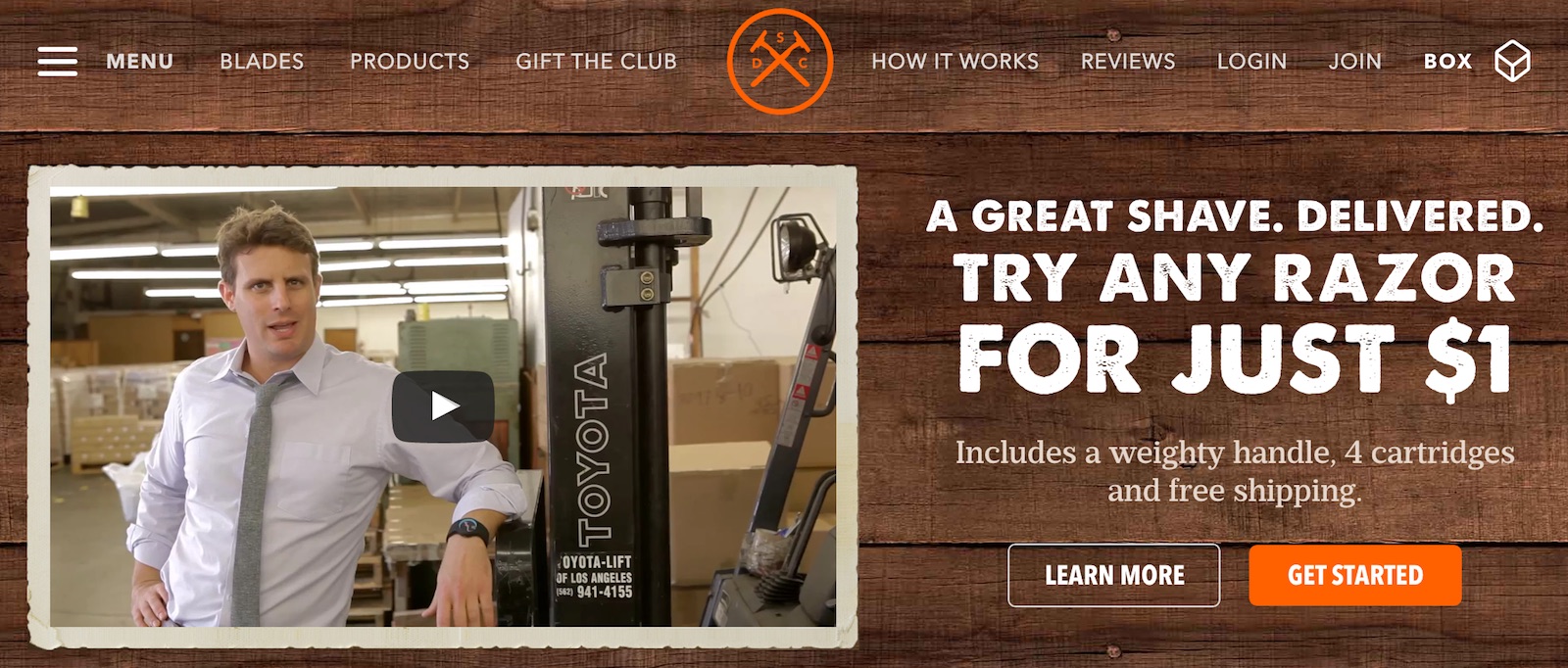
A good small business website should reflect this principle of doing just one thing right. They also call this a Minimum Viable Product in the startup world. The idea is to provide the end user with something that offers just enough to satisfy their main desires, and nothing more.
Here’s an example of a website that does just that – Dollar Shave Club. As soon as you visit them, you know exactly what that one thing is.
https://blog.adobe.com/media_705e3a8d9a689dc886f10894a5e1ecfe20ec41ca.gif
2. Decide on who the end user is
Something that’s very important to realize is that you’re not really designing a website for your client – the small business owner. You’re designing it for your client’s customers – they are the true end users.
So, who those people are? What do they want? What the website can give them? What the small business has to offer them?
The funny thing here is that those answers are not always in line with what the client initially had in mind. Quite naturally, every website owner wants their site to fit them, most of all. It’s only afterwards when they start thinking on how to align their own preferences with those of the audience.
So this is where you step in. Your main task when designing a small business website is discovering who the true end user is and how your client can serve them better with the help of the website.
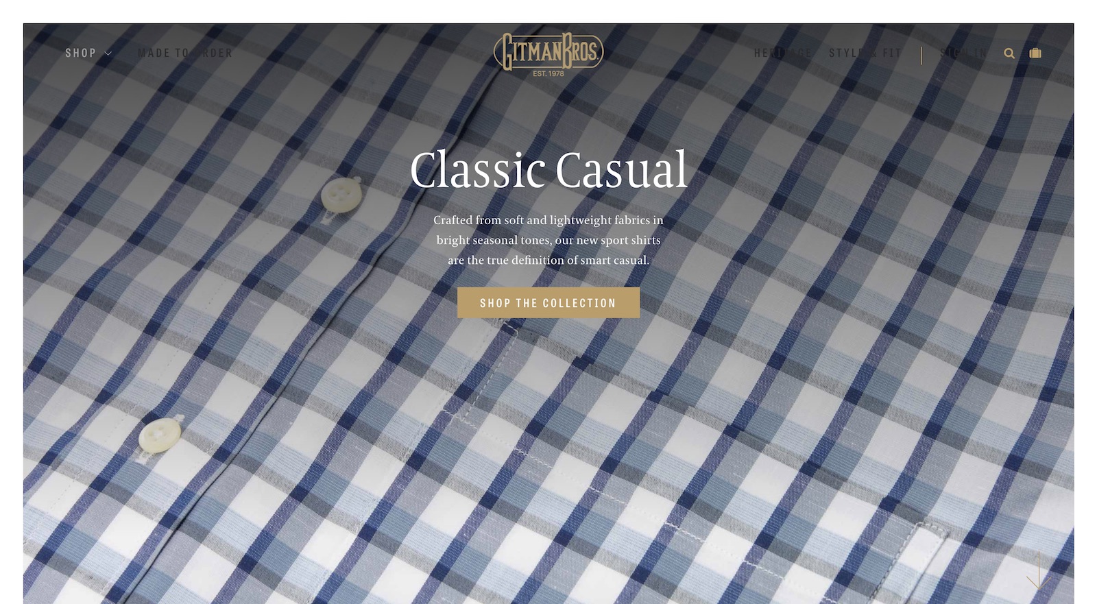
One example of a website that seems like it really has its end customer figured out is Gitman Bros.
https://blog.adobe.com/media_bc3589a0af15809783b801807dc052f7c22a5631.gif
They sell shirts and ties. They don’t use any unnecessary stock pictures of happy young people riding bikes by the beach or anything. They are entirely product-centered instead. They cater to people who value the quality of the shirts themselves, and they want to see that quality in the pictures right away. This is an educated type of customer. A customer who doesn’t need to be sold on the lifestyle aspect of clothing.
3. Matching design with demographics
The target audience affects the design style of a website hugely. Based on who it is meant for, you need to employ different typography, image use, emotions, layouts, and so on.
Some of the more important aspects of this:
Colors
Depending on the audience’s background, they will respond differently to different color schemes. Picking the wrong one can undercut the business’ ability to deliver their offering effectively. Things like the audience’s location, religion, political views, age, cultural background, will play a role here.
And obviously, you need to factor in the business’ own identity into the mix, which might not be entirely in tune with what the audience’s demographics would dictate.
The logo
The logo sets the mood and establishes the look and feel of the whole website. For that reason, it needs to also resonate with the target audience and convince them that the website is indeed for them.
Robert Mening says it well in his guide to designing a logo:
[Logos] need to incorporate everything about an organization’s past. And they should be designed in a way that signals where they’re headed. […]
A logo for a new start-up company (with zero brand equity or awareness) for some twenty somethings is going to look vastly different than a thirty-year-old business with hundreds of customers run by middle aged people.
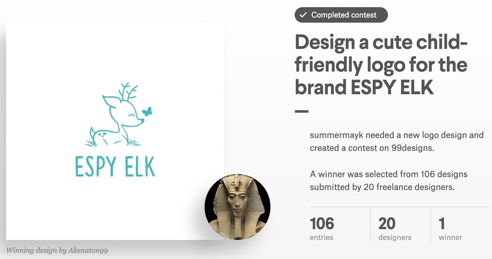
Consider the following example:
https://blog.adobe.com/media_849cacb171da7bb49cf488051dd20fbe664e7ebb.gif
This is probably not a logo of a care center for senior citizens, I would guess. Or this one:
https://blog.adobe.com/media_ca56333a6d52a9d99ae138a6c0a649d5ba14b284.gif
Probably not a brewery.
And please bear with me, I know that these are extreme examples and that no designer would ever make such a mistake – designing an MMA-like logo for senior audience. However, when we’re in the trenches just “designing away,” it’s very easy to forget some of the key principles set for the logo you’re working on, which might cause you to make a number of smaller mistakes. When all put together, those small mistakes can have a significant impact on the final result.
In a nutshell, think people first, styles later.
Typography
Typography is one of those not immediately obvious elements that have a huge influence over how a brand expresses itself on the web and how it’s understood by the audience.
Think using Comic Sans on a website of a local printing house or a local newspaper. That’s pretty much business closed, right?
What I’m getting at is that we need to be careful with typography. It should never be an afterthought. It should be selected deliberately and be in tune with the audience and their sense of comfort.
Older audiences will appreciate larger fonts in general. Young professionals will resonate better with modern slick fonts. Anything finance-related? Try trustworthy and classic fonts. And so on.
Images and interface elements
Most of the time, image-rich websites are seen as engaging and interesting. However, that’s not a general rule, and this goes back to the site’s target audience again.
Similarly to how things work with colors, your audience’s excitement with images will depend on their location, age, cultural background, profession, interests, etc. Also, consider the audience’s internet connection speed (for people living in remote places, displaying large images might not be possible).
Overall, the path to follow here is to research what sort of websites the audience already goes to. Where do they spend their time? How image-heavy those websites are?
Also, look into what the competition is doing. Do they use images heavily? If so, how?
Here’s an example by UVE:
https://blog.adobe.com/media_e0873641b8a31477811eeb54227b8485c5c549e1.gif
From what I’m seeing, this is a winery and guest house with rooms for rent. A business like that indeed can benefit hugely from good imagery. The first thing their customers probably want to know is what the place looks like (plus the area it’s in).
Another thing to focus on are the UI elements of the website itself. This is where making a mistake is probably the easiest, and especially when following the newest trends in design.
For example, ghost buttons. Overall, they’re neat. They’re simple, work well, and look nice on most designs. However, the problem with them is that basically only people with sufficient web experience know what to do with them. Everyone else won’t even notice that it’s a button.
This is just one example, but it shows how sometimes a generally acceptable UX element might not be perfect for all audiences.
4. Guide the visitor step by step
One of the challenges with small business websites is focusing too much on showcasing all of the business’ information and offerings in a “dry” way, while not paying enough attention to guiding the visitors to a certain end result.
That end result is what enables the website to achieve its goal. For example, this can be making a purchase directly on the site, reserving a table, making a phone call to set an appointment, etc.
Whatever it is, it needs to be doable through the website directly.
In simple terms, a small business website needs to tell the visitors what to do exactly, and the design needs to make sure that this call-to-action block has a sufficiently prominent place on the page.
Here’s an example by Craft Coffee:
https://blog.adobe.com/media_649b01ae6289c257cb3f658ad9a2843926249b4b.gif
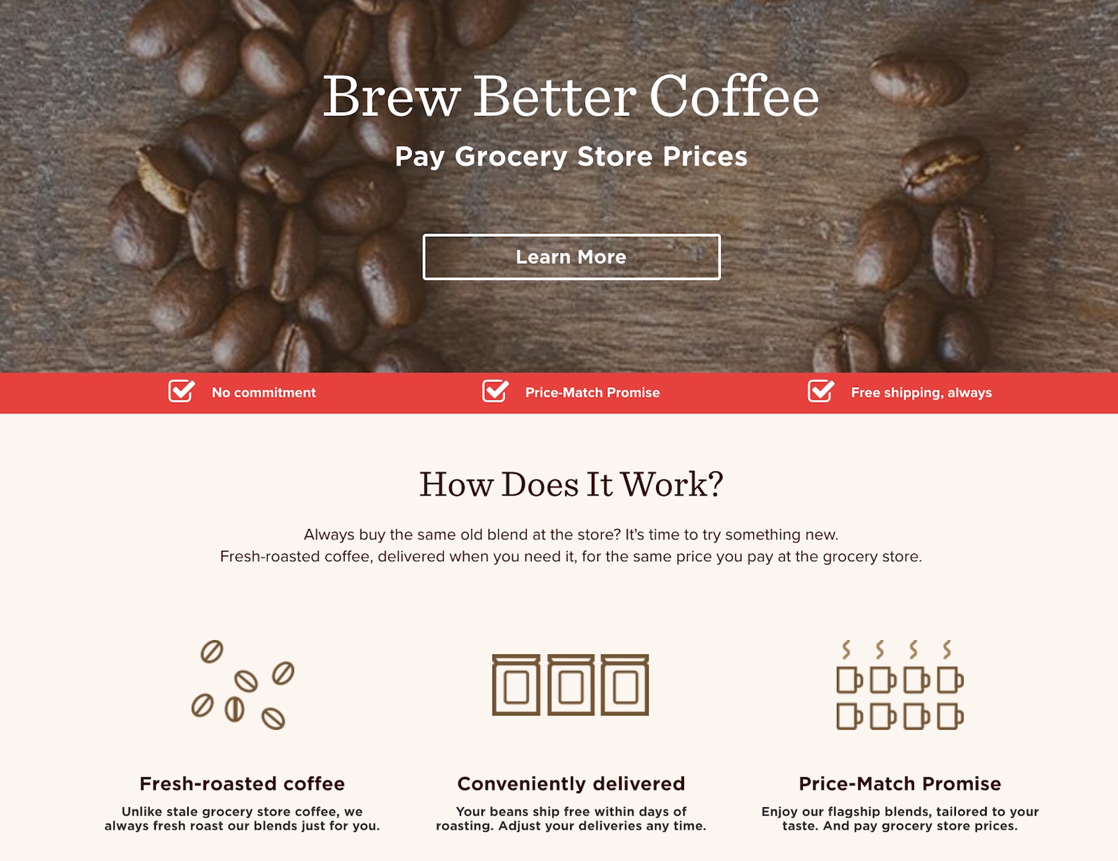
Notice how each block on the homepage takes the visitor step by step to understanding what the main offering of the website is, how it works, and what to do next.
When working on this aspect of the project, think about the user’s path through the website. Where do they most likely land? Where do they go next? What obstacles might appear? And among all those, how the business goal can be furthered in a way that intersects with the visitor goals. Much like this:
https://blog.adobe.com/media_a68d8c5b5b237f3c52942987fb8a542f25da4bc6.gif
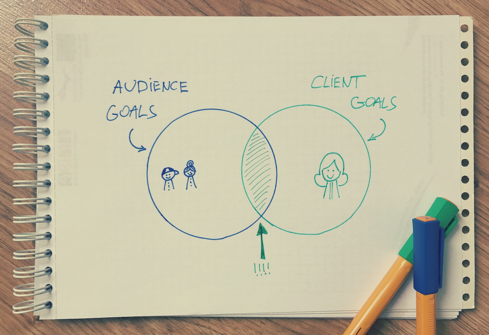
Not understanding this principle can have a huge impact on how the website resonates with its visitors … or, rather, how it doesn’t resonate. It’s very easy to overcrowd the website with too much content, which causes the message to become unclear and thus confuses the visitor as to what they should do next.
This is also something that Andrei Baicus, designer at ThemeIsle, points out as the main mistake people make when designing a small business website:
I think the most frequent mistake is overwhelming content. It’s always nice to see a website that delivers what the visitor came for in a clean manner and without cluttering the page with useless information.
If you’re a small business, the site should try to deliver the essence as clean and simple as possible so that everyone knows what it’s all about.
Also, don’t make your visitor work for information or look for something that should be simple to reach (e.g. links to the shop page hidden in dropdowns).
5. Make it mobile first
The fact that more people access the web via mobile than via desktop/laptop nowadays is pretty much common knowledge at this point. However, many websites are still designed in a way that neglects that mobile side of the story completely.
Mobile is crucial, and even more so for a small business website. It’s not hard to imagine, for instance, people walking by a business’ door, seeing the web address on the shopwindow and deciding to check it out immediately, on the go.
When talking small business websites, there are three elements that come to mind as crucial, mobile-wise:
- Responsive design – make it accessible on everything. Kind of a no-brainer at this point in time.
- Click-to-call links – very useful for customers who want to contact the business right away.
- Maps with the business’ location marked.
6. Create all the crucial pages
A good small business website can really benefit from a handful of crucial sub-pages:
(Of course, not every website needs every single one of them. Consider this your reference file.)
- Custom homepage – preferably one that can be rearranged whenever a new product, service, or promotion is going on.
- About – everything that your client wants people to know about their small business.
- Products or Services – either a listing of what the business offers or a complete and functional e-commerce store module.
- Blog – gives visitors a reason to come back (not everyone will come back just to have a look at the products again; sometimes a separate content section on the website can work great).
- Contact – allowing people to reach the business directly (this is also where the map and click-to-call links can be placed).
- Terms, Legal – use if there are any specific terms that the business needs to list for legal reasons.
Not every small business website needs to look the same
For a small business owner, their website is often the be-all end-all of the entire business. And I’m really not exaggerating. The responsibility of a website designer working on such a project is really a huge one. Probably even more so than when working on a big-budget corporate website.
Think about it, if you fail a corporation, they will just scrap the project, hire someone else, and get on with it again next week. If you fail a small business owner, they may never have another go at all.
It’s important for us just to have that in mind, and to really devote our full abilities to creating the best small business website that we can – one that really resonates with the target audience and takes the business owner toward their goals.