UXperts Weigh In: Designs We Love, June Edition

Whether you’re in the mood to design, play, travel, or just get more organized, our UXperts have some top recommendations for you this month. To celebrate June, we asked them to share the apps, websites, and even video games they’re loving right now, and tell us why they’re stellar examples of UX and UI design.
Michelle Cortese, Senior Design Technologist at Refinery29
Pick: Byte

http://blogs.adobe.com/creativecloud/files/2017/06/Michelle-Cortese-250.jpg
Byte launched in the summer of 2015—nearly two years ago—making it ancient in world of cutting-edge apps. However, after one playthrough on the bizarre content-creation app, I knew I’d seen something special. Byte is a playful, exploratory app that allows its users to quickly and easily create/share highly expressive pieces of art. These pieces are full-bleed, portrait-scale collections of whatever media the user can drag in via the simple, pictographic interface (gifs, images, custom music). The interface, components, and general sense of whimsy were inspired by the 1990s SNES hit, Mario Paint.
What I love about Byte, from a UX perspective, is how simultaneously daring and effective its creators were at building an intuitive, fun, fluid, and nearly textfree interface. As interactive media becomes more immersive, the demand for simpler, textless UI will increase. Experiments like Byte are incredibly important in testing the boundaries of UI.
If you want to get the gist of this app’s magic, download it and head straight for the music composer. I guarantee that the app is so intuitive, you will have learned the interface and composed an enchanting piece of music in about one minute.
https://blog.adobe.com/media_5f0a7a611fada7fcf66b275d17c259a3c25706bb.gif
Nick Slough, Creative Director at BEHOLDER
Pick: Thumper

http://blogs.adobe.com/creativecloud/files/2017/06/Nick-Slough-250.jpeg
Thumper, a rhythm violence game, leaves your mind exhausted and your senses turned up. Half Guitar Hero and half simulated DMT trip into inner space, this is a game that is fully experienced with a VR Headset and a good set of headphones. It is worth noting that you can play without either, but what is the fun in that?
Having truly integrated UX requires a balance of game design and UI. Thumper marries these two aspects beautifully with audio and colors without sacrificing valuable functionality for the player.
Thumper uses on-beat audio cues to let you know when a new series of button taps are required, while visual cues are built into the 3-D environment that allow the player to understand what button to press and how much health their beetle has remaining. Other standard UI is there to inform the player of their score and level of button tap accuracy.
If you are a music fan and haven’t played Thumper, I suggest you beg, borrow, and steal to get a couple hours in this fantastic game. It’s some of the best VR on offer.
https://blog.adobe.com/media_663159030bec17929331c290ada379704fc652cb.gif
Ivan Tolmachev, Senior Product Designer at Onfleet
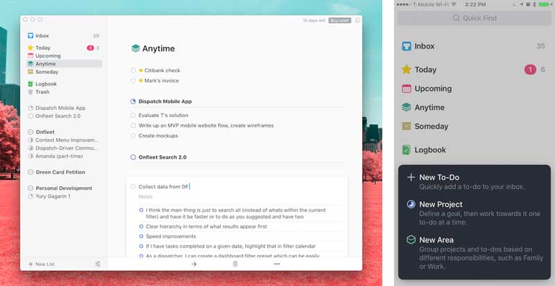
Pick: Things

http://blogs.adobe.com/creativecloud/files/2017/06/Ivan-Tolmachev-250.jpg
I’ve been a longtime fan of Things. On top of delightful visuals, its design language is always consistent and its attention to detail is beyond remarkable. Designing a personal task manager is challenging. It needs to be flexible enough to work within user’s circumstances, instead of forcing the solution onto them, and must have all the features power users demand without feeling overwhelming.
The newly released Things 3 is stunningly beautiful and doesn’t feel messy or busy at all. The app is full of great features, syncs well across all of your devices, and is just an exceptional example of UX design best practices developed in the last decade.
Its onboarding flow does a great job of educating users about using the product but doesn’t throw itself at you all at once, something a lot of apps in this segment struggle with.
Cultured Code’s design team put a lot of work into the visual design and the animations, but it’s not just all eye-candy. The established visual hierarchy does a great job of separating common interactions from more complex power features, while the animations and popovers break down complex patterns into smaller, easier steps, reducing cognitive load and keeping the interface clean and accessible.
https://blog.adobe.com/media_5ad08713457d58b0ca0ab103814659762273e5bc.gif
Vignesh Ramesh, Experience Design Manager at Adobe
Pick: Google Translate

http://blogs.adobe.com/creativecloud/files/2017/06/Vishnesh-Ramesh-250.jpeg
My wife and I love traveling. About a year ago we visited Switzerland and Italy, and we had this obsessive need to immerse ourselves in the culture and experience life in these countries like the locals do. But how do you do that when you don’t even know the language? That’s the problem that Google Translate solved for us.
The simple and powerful app that allows you to translate text from one language from another. It’s not just that it translates text, there are plenty of services that do that, but here is why I love the experience of using this app. The user interface is simple and focused on the primary problem at hand.
Additionally, it has a few subtle gems that make it a great and useful tool. Like the live camera capture that translates text in real time on your phone screen. Or when you do type in some text to translate, the landscape view with large font allows you to easily show the translated text to a local for easy communication. The google translate app is outstanding in ease of use, at the point of need and, above all, it makes the entire experience fun!

What websites or apps are you loving right now? Let us know in the comments!