A Look Back In Time At Some of The World’s First Websites

Happy Birthday, World Wide Web!
Yes, the World Wide Web as we know it turns 26 on August 6. To celebrate, we’re taking a trip back in time to visit some of the web’s first sites to see how they’ve evolved since they first his our screens.
Websites have come a long way. Formerly static, the web is now a highly visual medium. It has become a resource that has reshaped and redefined how we live our lives, interact, conduct business, and store information. Websites didn’t always hold the cachet they do now. These days, a website’s presentation says a lot about the business, product or brand behind the website, which is one of the reasons why designs have become richer and more elaborate.
“The web can be made to work with any type of information, on any device, with any software, in any language. You can link to any piece of information. You don’t need to ask for permission. What you create is limited only by your imagination,” Sir Tim Berners-Lee, Inventor of the World Wide Web, said last year.
And imagination is key to designing a web product that stands out. But, as you’ll see here, sometimes a simple design is all you need to stand the test of time.
Then & Now
In honor of the WWW’s 26th birthday, we explore three of the world’s first websites to see how they looked when they first hit the web, and how they look today. Thanks Way Back Machine for the trip down memory lane.
Internet Movie Database (IMDB)
IMDB was created by computer programmer Col Needham and launched on October 17, 1990. The company took to the web in 1993, but we were unable to find an image of the site from that early on. However, this screen cap taken from 1996 shows a very simple design with several hyperlinks.

http://blogs.adobe.com/creativecloud/files/2015/03/imdb-1.png
In the 2000s, the site began to resemble the version we know today, embracing a busier design and more offerings. Users can now purchase DVDs from the website and check movie showtimes by entering their zip code. There is more to the website now, including movie/tv news, a category for independent films, and an option to sign up for a newsletter delivering weekly showtimes directly to your email inbox. What was at the top of the Box Office in 2000? The Fast & The Furious.

http://blogs.adobe.com/creativecloud/files/2015/03/imdb-2.png
And finally, we get to today. Look how much cleaner the design is. From the navigation to how the box office listings are displayed, everything has been condensed and organized in a simpler way.

http://blogs.adobe.com/creativecloud/files/2015/03/imdb-3.png
MTV
Launched in 1993 by VJ Adam Curry, who ran the site unofficially and personally at first, MTV was an early adopter of landing pages.

Once you clicked inside though, the site was not much to look at. Unfortunately much of the images weren’t archived, but you get the general idea from the screenshot below.

http://blogs.adobe.com/creativecloud/files/2015/03/mtv-2.png
I also wanted to show you this screenshot from 1997. The site is now beginning to get a bit more advanced by offering users two options: a frame-based website they call “decaf,” and a “scrumptious” java offering that promises you’ll never look at the web the same way again.

http://blogs.adobe.com/creativecloud/files/2015/03/mtv-3.png
Fast forward to today, and MTV’s site is much more visual, consisting almost exclusively of images. Top navigation has been swapped out for a more mobile-friendly and contemporary user interface, and the logo is placed subtly beside it.

http://blogs.adobe.com/creativecloud/files/2015/03/mtv-4.png
The Economist
Lastly, we thought it would be neat to look at one of the first online news sites. The Economist launched an online component to complement their magazine offering in 1994, but the first available screen cap is from 1996. Calling it an “experimental home page” featuring limited articles from the current issue, the Economist’s website cost only $120 to make and was named one of the world’s top ten news sites, beating out Time-Warner’s Pathfinder website, which is said to have cost $120 million to build.
Here’s what the Economist’s website looked like:

http://blogs.adobe.com/creativecloud/files/2015/03/economist.png
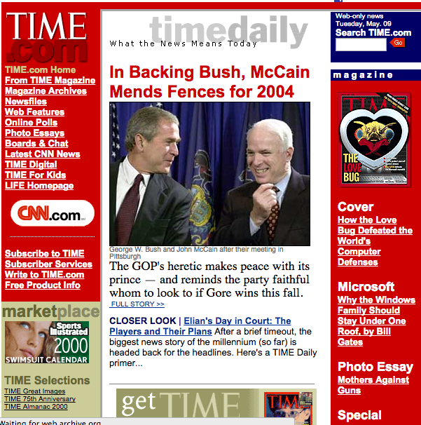
And here’s what Pathfinder’s website looked like. The earliest screen cap we were able to find is from 2000, so it might not be an accurate representation of how the two sites compared initially. However, it does show how news was organized then—very much resembling the layout of a traditional newspaper.
https://blog.adobe.com/media_d9eed0aaf19e49f2b6d77cfd26407474b293573d.gif
This goes to show that you can create a meaningful website without a large budget, a testament that is still true today.
The Economist’s website today, like IMDB’s, is much cleaner. Navigation is fluid and easy, while visuals, though carefully selected, are complementary rather than the main focus.

http://blogs.adobe.com/creativecloud/files/2015/03/economist-3.png
Adobe
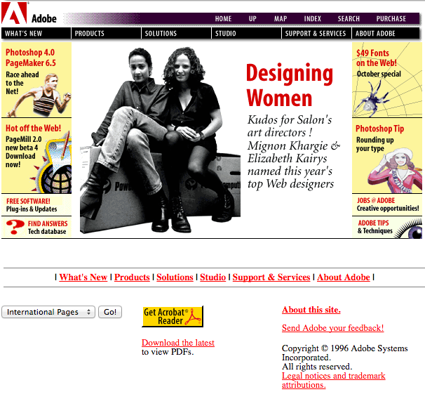
And just for fun, here’s what we looked like back in 1996.
https://blog.adobe.com/media_6c49ffbc383fd41ed6b119622b2d3db79ebb9611.gif
Happy Birthday World Wide Web! We look forward to seeing how you evolve over the next 26 years.
