10 Tips for Getting Started on a Web Design Project

Getting started on a web design project can be intimidating. There are a lot of moving parts, and clients tend to expect high quality. Goal identification, scope definition, sitemap and wireframe creation, content creation, UI design, testing the site, these are all the elements that the web design process most commonly includes.
In other words, there’s a lot that could go wrong. And I’m not saying this to scare you, but to let you know how important it is to come prepared, and to always have your game plan ready.
“Don’t bring a knife to a design fight.”
So today, we’re looking into 10 web design tips that you need to keep in mind when designing a website for your client. This goes for all types of websites where a business is selling to a customer (B2C). Think e-commerce stores, small business websites, product websites, and so on.
1. Set the Expectations Right
A web design project cannot be successful until you have defined what “success” actually means.
Depending on how experienced your client is with the idea of owning a website, they may or may not be able to articulate what they truly need.
This can be catastrophic later down the road. There’s nothing worse than a client realizing mid-project that, “this is not what I wanted!”
That’s why it’s incredibly important to set the expectations during your initial communication with the client. Here are 5 questions to ask:
- What’s the value of this website for you and your business?
- What do you want the website to achieve?
- How do you want to measure the website’s success?
- Is the website an essential part of your business? Or is the website a place to provide information on the company, an extension of the brand (microsite), or a side project?
- Who is the target audience? Who will visit the website?
Once you have the answers, prepare a document that will “sell” the client on your proposed solution. Include that document with the contract. At this point, you’ve limited the number of surprises that can pop up later on.
2. Define the Goal
This one is in direct correlation with the previous point. Quite simply, a website without a clear, single goal has no chance of being successful.
The goal is something that you and your client should define together. The goal needs to be clearly defined, measurable and achievable. Here’s an example of a good goal for a website:
Option: A good goal for a website should be these three things:
- Clearly defined. E.g. “it needs to bring in sales.”
- Measurable. E.g. “it needs to bring in at least X sales a month.”
- Achievable. Not “it needs to bring in gazillion sales a month.”
And most importantly, a website should have only. One. Main. Goal.
3. Think Audience First, and Solve a Specific Problem
Goals are what your client wants to achieve with the website. Problem solving is something that the website does for its audience.
“Let the audience know what’s in it for them.”
For example, here’s Dollar Shave Club:
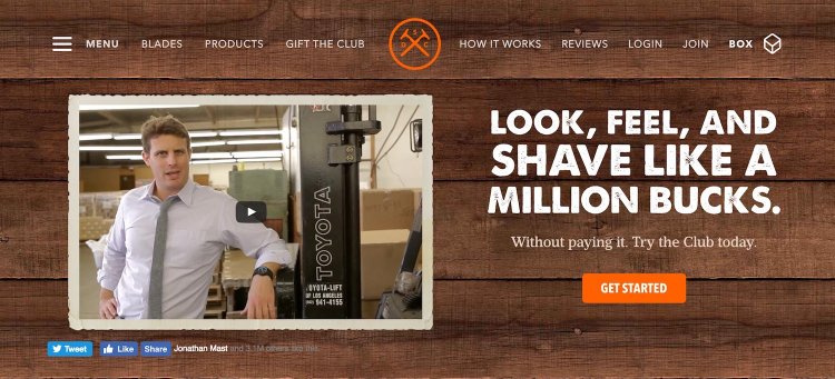
The main purpose of this e-commerce website is to deliver new blades and shaving accessories to people every month. The Dollar Shave Club’s subscription based service solves the problem of having to buy those items at multiple different locations. The website’s message and goal (buy now) are clear. In order to convert visitors into customers, the designers created a user experience and navigation focused only on the things their audience wants to know when considering the subscription based purchase.
4. Put Content First
No amount of beauty can replace good content presentation. Content is king. You should always be thinking about content because content drives engagement, and engagement drives action.
As a web designer, the worst thing you can do is put beauty above function. Or, as John Maeda says it, “spray-on design.”
Always start with the content that your client wants to showcase on the website, and only then think how design can help make that content more visible and resonate with the audience better.
For example, if you’re building an e-commerce store, you should think about how you can make the products stand out rather than blend in with the rest of the design. Here’s an example by Tessemae’s:
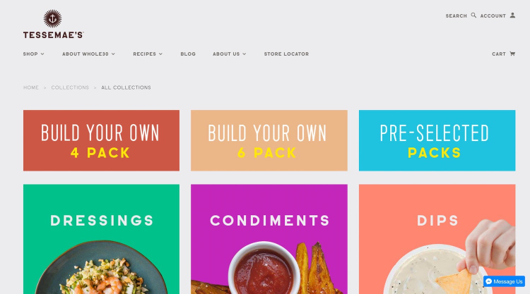
Notice how the products are the most visible elements on the page. Not the header, or the menu, or anything else.
5. Respect Web Standards
Standards are great. Learn to love them. Don’t rebel.
There’s one main reason why standards are great: people – your audience – have gotten used to them. Don’t make your user learn a new design language to navigate the website. Make it easy for your users by implementing web standards that they’ve already come to understand.
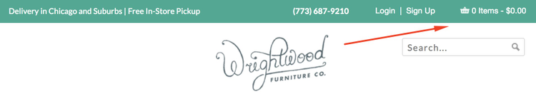
For example, every e-commerce store places the shopping cart module in the upper right corner. They don’t do that because it’s pretty. They do it because people expect to find the shopping cart there.
Here’s an example by Wrightwood Furniture:
Embrace other web standards, too. Such as:
- Logo in the top left (a Nielsen Norman study says that users are 89 percent more likely to remember logos shown in the top-left position).
- Consistent branding and look across the whole website (individual pages shouldn’t follow different design patterns – something often occurring with e-commerce stores).
- Contact in the top right or center (for example, as visible in the screenshot above).
- Main navigation across the top and avoiding confusing menus (which are annoying to the users, as another Nielsen Normal study shows).
- Value proposition and call-to-action high up on the homepage (making your call-to-action highly visible guarantees better conversions).
- Search feature in the header.
- Sign-up box in the footer.
6. Make Navigation Simple
If people can’t navigate from point A to point B easily then the website won’t be able to achieve its goal.
Therefore, your navigation design should require only the minimum amount of information needed to get the user from A to B quickly.
Start by laying out the most important steps along the user’s journey through the website. Make sure that your navigation helps them with that journey instead of making things more difficult. Think how you can help the user do what they already want to do rather than forcing them to see things your way. Utilize website navigation best practices and know basic patterns of mobile navigation for an optimized user experience.
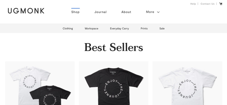
Here’s a nice example by Ugmonk.com. Notice how the navigation is very minimal, and only gives you a handful of main options. At the same time, it makes it very clear what page you are currently browsing:
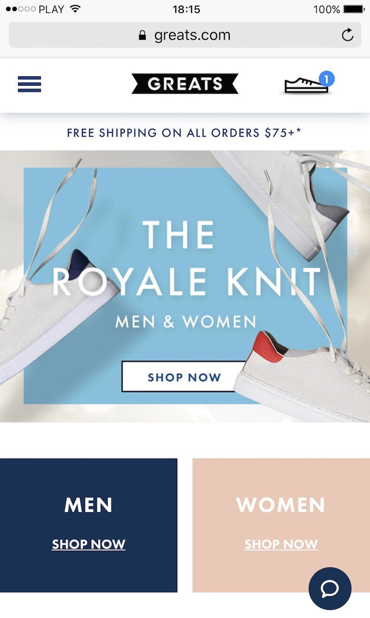
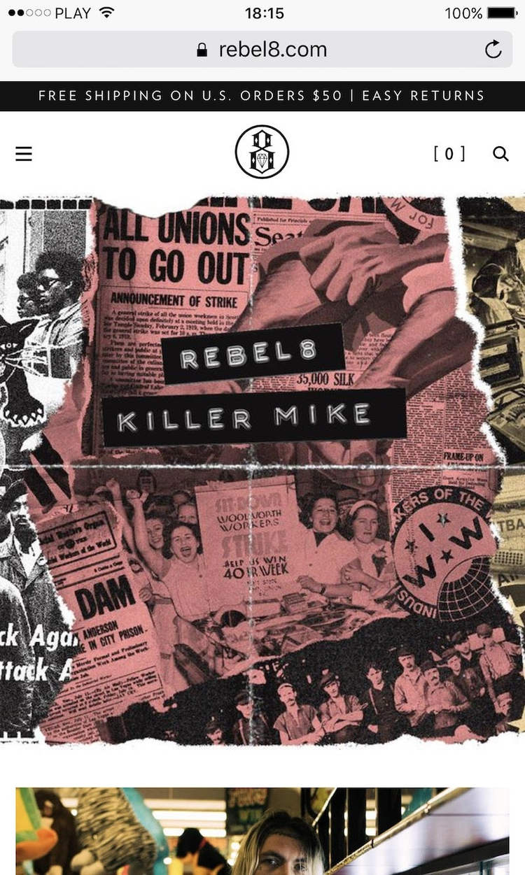
7. Focus on Mobile
Mobile is where things are at right now – from surfing the web and watching media, to engaging on social media and shopping. Today, more people go online on mobile than on desktop.
For this reason, you absolutely have to make sure that your website design is mobile optimized, meaning that everything is completely operational on mobile. “Completely operational”, means that all the features, including the shopping cart, need to work flawlessly for a great user experience.
Here are two examples of websites with very good mobile optimization in terms of the layout and how easily accessible all the UI elements are:
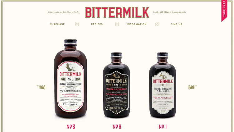
8. Don’t Disregard Typography
When you’re in the trenches and working on the visual aspects of your project, it’s easy to make typography an afterthought … just adding some fonts to an otherwise “finished” design.
Please don’t.
These days, many quality web design projects rely heavily on typography, basically making typography not just a design element but a design tool in and of itself. Another great thing about good typography – and this is something that relates to the previous point – is that it must work on all devices.
Here’s an example by Bittermilk(viewed on desktop):
And on mobile:
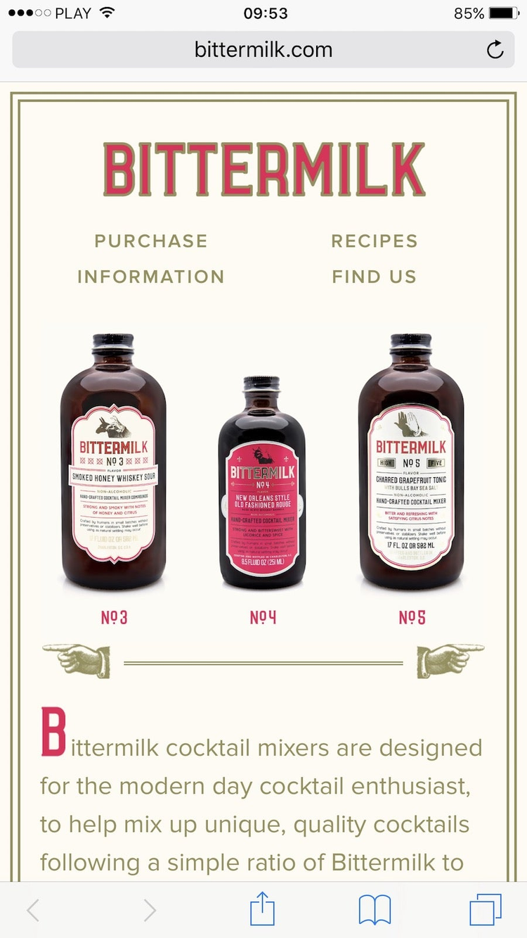
Please notice how the choice of fonts, colors, spacings, etc. plays a role in the overall look and feel of the whole page, and works well on both a desktop and mobile.
9. Deliver in Batches
Designing in solitude is never a good idea. If you think that building something behind closed doors and then revealing it to your client after X amount of weeks will produce good results then, sorry, but you’re wrong.
Instead, divide the project in two or three main parts, based on the complexity of the project, and deliver those pieces according to the set schedule. Each time, get feedback from the client and adjust the rest of the process accordingly.
10. Embrace Social Media
Just like mobile, social media is an ever-present element in the modern web landscape. Don’t ignore it.
Whether we like it or not, or more accurately, whether your client likes it or not, social media is where people are, and they will certainly be spending way more time on Facebook than on your client’s website. So, use that to your advantage.
It’s been reported that around two billion people visit Facebook every month. For that reason, you absolutely have to build some social media integration into your client’s website. By doing so, you’re making it more likely for people to share the client’s content or products and thus helping others find it by directing traffic to the website
Here’s a good example by The Colossal Shop (notice the small social media buttons under the item’s price):
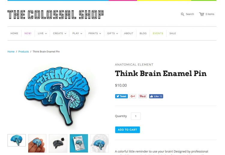
As much as The Colossal Shop would want for people to stay on their pages indefinitely, they know that’s not a real possibility, so they provide handy tools for sharing the word about their products.
What’s Next?
While we’ve only scratched the surface of what it takes to design a successful website, follow these web design commandments to get you started on your next project. Remember to avoid common mistakes, and that graphic designers have skills that naturally translate to web design and user experience.
Get tips for being a freelance designer, increasing your income as a web designer and if you should offer additional services as a web designer. If you’d like to see what other advice we have for you, feel free to hop over to the Adobe XD blog.