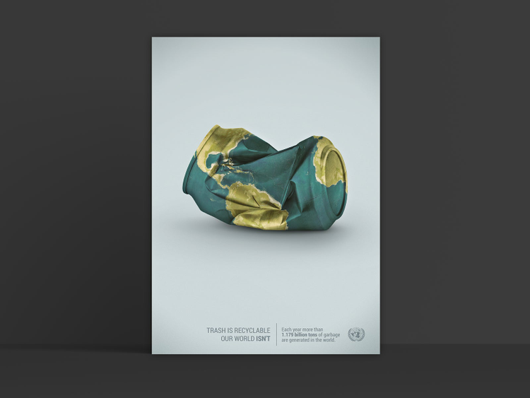
Online ads are a necessary part of any modern marketing strategy. Not only is it proven that online ads have better ROI (return on investment) than other forms of advertising, they’ve enabled a new, improved way of targeted advertising.
Jacob Amundsen, a graphic designer and owner of Venture Creative, says, “Online advertising makes sure that the right people see and act on your work. If you can stay aware of design and marketing trends in the world of online advertising you can most effectively share your message.”
The beauty of online ads is how they can connect the dots between target customers, marketing objectives, and the brand experience as a whole. So what’s the secret to making your ads cut through the noise of the digital world?
How to make your online ads effective
To create effective online ads, you need great design. Designer Yshai Sutton suggests following these principles to make your ads pop.
**Create contrast with color.
“**Add as much color as possible to your ads so they stand out against the general content of the websites where they are shown,” Yshai says. “Whether you’re promoting a law firm or a real estate agency, dynamically colorful will absolutely help grab the attention of potential clients.”
**Don’t forget about User Experience (UX).
**“Never compromise UX,” Yshai says. “Even if your ad looks delightful, it won’t achieve its goal unless it is also understandable. So, always verify that the content is clear enough that anyone will understand the action or behavior you’d like them to take.” In the world of advertising, misunderstanding is failure.
**Keep it simple.
**An ad that can be understood at first glance is extremely important — especially in the world of scrolling. The key to quick understanding is simplicity. “Try to be as minimalist as possible, and limit the quantity of text in your ad so people can understand it at first glance,” Yshai says. Learn how to add text to your images to create social media posts here and try tools like Adobe Spark to add text to images in ad sizes. Need more space to communicate your message? Try creating a carousel ad.
This need for legibility and understanding is Jacob Amundsen’s top consideration as he designs ads for cross-channel campaigns. He asks a series of questions to help him assess his designs in each of these areas.
**What is the alignment?
**“Alignment in advertisement is incredibly important,” he says, “and will vary greatly depending on the placement of the ad.” Questions to ask: Will it be featured on a side bar? ? If so, on which side of the page will it reside?
**How much space will I have to design?
**Using your given design space wisely can make the most of the area you are given for your advertisement and get your point across. Questions to ask: Am I overcrowding the area I’ve been given? Can you easily read and understand what is in the given space?
**What size restraints am I dealing with?
**“Above all consider size,” Jacob says, “It is imperative to creating effective ads.” Questions to ask: How much screen space will this ad occupy on the site? Will your typography be readable? Will it be crowded? What type of device will the consumer be using to view the ad — desktop, smartphone, tablet?
Know your ad space — and size accordingly
One of the challenges a designer faces when designing an online ad is the variety of places an ad may be featured — all with their own sets of rules and constraints. Each social platform, website, and forum may have their own parameters for ads. When designing for a cross-channel campaign, it’s important to consider these up front and be prepared for how your design must adjust to best fit each platform.
As a starting point, Jacob says, “Always remember the basics when setting up your documents for online ads. You’ll be using RGB color and sticking to a 72 pixels per inch resolution.”
After that, each platform has its own set of rules. Choosing what kind of ad to run will depend on the goals of the campaigns. For example, Facebook has various types of ads to choose from (see them here), and very specific rules about how much text you can run on your ads.
These very particular restraints on text and what percentage of the ad can include text are one of the challenges when designing ads for platforms like Facebook. Try creating a grid for your Facebook ad in Illustrator to help you easily see how much text space you’re occupying and adjust accordingly.
Google AdWords also has specific parameters and various sizing for their ads. “First, create the biggest Ad (300×600) and then adapt its content to smaller sizes as needed,” Yshai says. Get started by learning how to create a simple, stunning banner in Photoshop here.
The importance of sizing an ad to fit its space is too often overlooked. Incorrect sizing can distort your images, make your message less legible, and even cause your ad to be rejected for sizing issues. This includes optimizing for both desktop and mobile ads. Jacob says, “Make sure that when exporting your work that the artboard is pixel perfect to the size requirements. If your art is off by even a few pixels, the ad won’t be accepted by the platform. Keeping your document clean and precise when it comes to sizing will save you the hassle of having to go back to the drawing board after an ad is rejected for sizing issues.”
Using Adobe Creative Cloud, you can easily create successful online ads that stand out, lead to conversion, and help grow your business — then tailor them to each channel. And don’t forget to use Libraries to share completed ads and design assets with your team and other designers.


