Simple Tips to Improve User Testing

Testing is a fundamental part of the UX designer’s job and a core part of the overall UX design process. Testing provides the inspiration, guidance and validation that product teams need in order to design great products. That’s why the most effective teams make testing a habit.
Usability testing involves observing users as they use a product. It helps you find where users struggle and what they like. There are two ways to run a usability test:
- Moderated, in which a moderator works with a test participant
- Unmoderated, in which the test participant completes the test alone
We’ll focus on the first, but some of the tips mentioned can be applied to both types of testing.
1. Test As Early As Possible
The earlier you test, the easier it is to make changes and, thus, the greater impact the testing will have on the quality of the product. A lot of design teams use the excuse, “The product isn’t done yet. We’ll test it later,” to postpone testing. Of course, we all want our work to be perfect, which is why we try to avoid showing a half-baked design. But if you work too long without a feedback loop, the chances are higher that you’ll need to make a significant change after releasing the product to the market. It’s the classic mistake: thinking you’re the user and designing for yourself. If you can invest energy to learn early and prevent problems from happening in the first place, you will save a tremendous amount of time later.
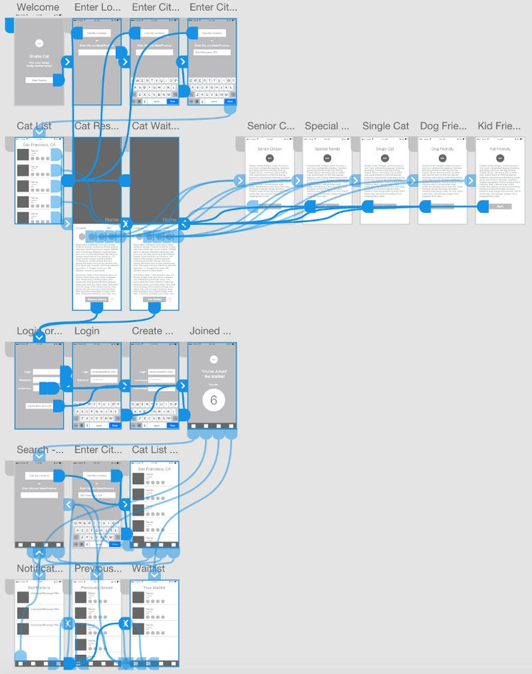
The good news is that you don’t need to wait for a high-fidelity prototype or fully formed product to start testing. In fact, you should start testing ideas as soon as possible. You can test design mockups and low-fidelity prototypes. You’ll need to set the context for the test and explain to test participants what’s required of them.

2. Outline Your Objectives
Before starting usability testing, be crystal clear on your goals. Think of the reason you want to test the product. What are you trying to learn? Ask yourself, “What do I need to know from this session?” Then, once you understand that, identify exactly which features and areas you want feedback on.
Here are a few common objectives:
- Find out whether users are able to complete specified tasks successfully (e.g. purchase a product, find information)
- Identify how long it takes to complete specific tasks
- Find out whether users are satisfied with a product and identify changes required to improve satisfaction
3. Carefully Prepare Questions And Tasks
Once you have an objective, you can define which tasks you’ll need to test in order to answer your questions or validate your hypothesis and assumptions. The objective is not to test the functionality itself (that should be a goal of the quality assurance team), but to test the experience with that functionality.
Actionable Tasks
When designing tasks, make them realistic and actionable. These could be specific parts of the product or prototype that you want users to test — for example:
- Getting started with the product
- Completing a checkout
- Configuring the product
Prioritize Tasks
Don’t squeeze in many subjects in your usability testing checklist. Conducting the tests and analyzing the results will take a lot of time. Instead, list the important tasks in your product, and order them by priority.
Clearly Describe Tasks
Testers need to know what to do. Make it easy. Users tend to become discouraged when tasks are unclear.
Have a Goal For Each Task
As a moderator, you should be very clear about the goal of a task (for example, “I expect that users will be able to complete the checkout within two minutes”). However, you don’t need to share that goal with participants.
Limit The Number Of Tasks
Patrick Neeman of Usability Counts recommends assigning five tasks per participant. Considering the time of the session (usually 60 minutes), leave time for your questions, too.
Provide a Scenario, Not Instruction
People tend to perform more naturally if you provide them with a scenario, rather than dry instruction. Instead of asking them something like, “Download a book with recipes,” you could phrase it as a scenario, like, “You’re looking for some new ways to cook beans. Download an ebook with recipes.” A scenario provides some context and makes the task more natural for the user. The more naturally participants perform the task, the better the data you will get as a result.
Test The Set Of Tasks Yourself
Go through the task several times yourself, and work out appropriate questions to ask. It’s hard work but will definitely pay off.
4. Recruit Representative Users
Finding the questions you want to ask is important, but also, the people who participate in your test should be representative of your target audience (user persona). There’s no point in watching people use your product if they don’t match your target audience. Therefore, as soon as you have some idea of what to test, start recruiting. Carefully recruit people based on your goals. Be advised: Finding people for usability tests is not easy. In fact, recruiting is one of the biggest reasons why many companies don’t regularly talk to their users. Thus, put in the extra effort to find people who represent your target audience.
Analyze Existing User Data
If your product already has a customer base, then a quick analysis of available information (for example, analytics data, customer support tickets, surveys, previous usability sessions) will help you assess what you already know or don’t know about your users.

Test With Users Who Aren’t Only Friends or Family
Of course, feedback from friends and family is better than nothing, but for better results, you’ll need independent and unbiased users, ones who haven’t used your product before. Your friends and family are too close to the product to know how real people would perceive it for the first time.
Define Your Criteria
Before recruiting users, you’ll need to decide on the type of people to test your product. Define criteria and select testers according to it. For example, if you are testing a mobile app for ordering food, most probably you’ll need feedback from people who order food regularly. Translate this requirement into precise, measurable criteria, so that you can use it to screen prospective participants: people who order food at least once a week from different delivery services (participants should have experience with at least three services).
In addition to specifying the users you want to talk to, think about people you don’t want to see in any of your sessions. As a rule of thumb, avoid testing with tech-savvy users and early adopters, because such testing might not be as revealing as you’d like. Also, avoid participants who have conflicts of interest (such as ones who work for competitors).
Create Screener Questions
Next, create a screener questionnaire to identify people for your testing sessions. As with any good survey or questionnaire, avoid leading questions. An example of a question that would reveal the “right” answer is, “Do you like ordering food using a smartphone?” Most people who want to join a testing session would surely answer yes to that question.
You can prepare a list of questions in the format of a survey and ask potential testers to fill it out.Google Forms is a great tool for creating screeners and collecting the responses in a spreadsheet. Because responses go right into a Google spreadsheet, you can sort and filter them.
Get People to Fill Out the Screener
Next, you’ll need to get people to fill out the screener. One way to achieve this is to create a job description with a link to your survey. In the description, explain your expectations, and offer an incentive to motivate people to show up (such as a $100 Amazon gift card for a 60-minute interview). Craigslist, Twitter and Facebook are the most obvious places to post the job description.
Things will be a bit harder when you need to recruit very specific and hard-to-find types of users. But even in this case, it’s totally solvable:
- Talk with your sales or marketing team to see if they have lists of contacts they can share.
- Find contacts in relevant community groups and professional associations.
Tip: If your product is on the market, you could show a message — “Want to give us more feedback?” — somewhere in the user flow, which leads to your screener form. Also, if you use a service such as Intercom, you could automatically email new users after they have used the product five times, inviting participation in testing.
Think Quality, Not Quantity
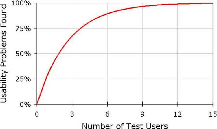
Some product teams think they need a lot of participants for usability testing. In fact, testing with five users generally unveils 85% of core usability problems. The most important problems are easy to spot for people who are new to your product, and difficult for you to spot because you no longer have fresh eyes. It turns out that you’ll learn a lot from the first person you talk to, a little less from the next, and so forth.
Once you collect the responses and filter the list of potential participants based on your criteria, select the five candidates who fit your criteria the best.

Clearly Instruct on How to Join the Session
When you schedule a test session, provide all details in a confirmation email to participants:
- The time (if you do remote testing, provide the time in the relevant time zone)
- The location (including building, parking information, etc.)
- What test participants need to bring with them (for example, personal ID, a mobile device with iOS or Android, etc.)
- Your phone number (in case they have questions or need to reschedule)
To minimize frustrating no-shows, you could ask users to reply to confirm. For example, your subject line in the confirmation email could be something like, “Usability session scheduled on May 14 at 3 pm. (Please reply to confirm).” You could also call participants to remind them about their appointment on the day before the session.
5. Get The Most Out Of In-Person Testing
Hearing directly from users is one of the fastest ways to learn about and improve your product. By watching someone use your product, you can quickly identify areas where the product isn’t clear enough.
Building a Good Rapport
When a session begins, the participant might be nervous and unsure about what to expect. The quality of a usability session is directly related to the rapport you build with the participant. The deeper the participant’s trust in the moderator, the more frank their feedback will be. Conduct the test in a way that participants will feel comfortable giving you honest feedback.
A few things to remember:
- In case of failure, people tend to blame themselves, rather than a flaw in the design. Thus, make sure they don’t feel like they’re being tested. (For example, “We’re not testing you; we’re testing our design. So, nothing you say or do is wrong.”)
- You want participants to be as candid as possible. If they don’t like something or they think it’s silly, make sure they say so. Some participants don’t like to share such thoughts because they are afraid of hurting your feelings. Just tell them something like, “You won’t be hurting our feelings. We haven’t been involved in designing these screens at all.”
- Start with easy tasks or questions. They won’t yield any juicy insights, but they will get people talking and will help relax them. Learn a bit about the person. Try to find out what the person likes or doesn’t like, their hobbies, as well as tech habits. This information will help you better evaluate the results of the test.
Listen, Don’t Lead
Once you have presented the task, everything should be led by the participant. Your goal in this session is to understand how users will use the product. For example, if the participant takes an unplanned route through your app, don’t correct them! Wait to see what happens. This is valuable learning.
Don’t Judge Participants
Your participants are there to teach you something, not the other way around! Judging users or trying to educate them during the test would be counterproductive. Your goal is to get as much information as possible in the time available and to understand it all from their perspective.
Thus, avoid phrases like, “That was obvious, right?” and “Do you really think so?” while raising your eyebrows, even if something seems obvious. Instead, ask something like, “How easy or difficult was it for you to complete this task?” or “Why do you think that?” There should never be any judgement or surprise in either your tone or body language.
Don’t Explain
When you explain how the product you’re testing functions, you’ll almost certainly be introducing bias to the test. In the real world, your product will live on its own. You won’t be there to guide users along and tell them exactly what to do and how to use it. Participants should have to figure things out based on the task’s description and what they see in the interface.
Don’t Interrupt
When participants start a task, try your best not to interrupt them. The more you interrupt, the less likely they’ll have the confidence to complete the task. They’ll lose their flow, and you won’t see anything resembling natural behavior.
Don’t Draw Attention to Specific Issues
Drawing attention to specific issues that you care about could cause people to change their behavior and focus their answers on the issues you’re emphasizing. This problem is particularly common in discussions on user interface design: If you were to ask people about a particular design element (such as the color of the primary call-to-action button), they’ll notice it thereafter much more than they would have otherwise. This could lead participants to change their behavior and focus on something that doesn’t matter.
Use the Think-Aloud Technique
The think-aloud method is critical to getting inside the participant’s head. In fact,Jakob Nielsen argues that it’s the best usability tool. Using the think-aloud technique, the moderator asks test participants to use the product while continuously thinking out loud — simply verbalizing their thoughts as they move through the user interface. Using this technique for the food-ordering app, most probably you’d get responses like, “Hm, this looks like a food-ordering app. I’m wondering how to order food. Maybe if I tap here, I’ll see a form to request a meal.” The technique enables you to discover what users really think about your design and will help you turn the usability session into actionable redesign recommendations. Responses like, “Oh, it loads too slowly”, “Why am I seeing this?” and “I expected to see B after A” can be translated into actionable design changes.
Tip: Because most users don’t talk while using a product, the test facilitator will have to prompt them to keep talking. Ask something like, “What’s going on here?” when test participants interact with the product.
Observe Behavior
Mind the distinction between listening and observing. While both methods will provide UX designers with valuable information, many UX designers focus too heavily on listening. Observing users can uncover a lot more in a lot less time. You can learn a lot by listening to people, but you can learn way more by seeing how they react to a product.
Most people want to look smart, which is why during testing sessions, you’ll notice participants struggle through a task but then tell you that it was easy for them. Thus, focus on their behavior, not their opinion.
When in Doubt, Clarify
When you’re not quite sure what a participant is talking about, ask for clarification. A simple question like “When you said… did you mean…?” will make things clear. Don’t leave it to the end of the session. The end of a session is too late to go back and figure out what someone was talking about.
Follow Up With Questions
Be eager and curious to learn as much as you can about the user’s experiences and perspectives. Don’t settle for the first answer you get. Always dig deeper by asking follow-up questions. Follow-up questions will give you a lot of insight into what has really happened. People often can’t clearly state their motivations without being prompted. A simple well-timed follow-up question will usually yield a more thorough explanation or valuable example.
Answer Questions With Questions
During the session, participants will certainly ask you some questions. Here are some of the most common ones:
- “Should I use it?”
- “What do you think?”
- “What did others think about this?”
Resist the temptation to tell them all about it! Ask them a question right back. It’ll reveal a lot.
6. Treat Design As An Iterative Process
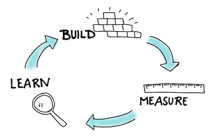
A lot of product teams think about the design process as a linear process that starts with user research, has a phase for prototyping and ends with testing. However, treat it as an iterative process.
Testing, as much as coding, designing and gathering requirements, has a place in the iterative loop of product design and development. It’s important to test at each interval of this process, if resources are available.
Feedback Loop
The best way to avoid having to rework a product is to inject feedback into the process. Regular user feedback (not necessarily in the form of usability testing, but also in online surveys or analysis of customer support tickets) should be at the heart of the UX design process.

7. Don’t Limit Yourself To In-Person Sessions
Testing in-person is a great way to understand user behavior; unfortunately, it’s not always possible. What if you need to test only one small feature, or your test participants are dispersed (for example, if your product targets international customers), or you need results fast (ideally, today)? In this case, focus on remote testing. But how do you handle remote sessions?
Use Tools for Unmoderated Tests
Nowadays, a ton of tools are available for you to run remote unmoderated tests. Here are some:
- Lookback: This tool allows for both remote live moderated testing and unmoderated testing. Live sessions are automatically recorded in the cloud — no uploading, waiting or managing files.
- UserTesting: UserTesting allows for easy remote usability testing. You can run an unmoderated test on your website with a predefined user base.
- Validately: With Validately, choose either unmoderated or moderated testing. To test a product, add a link to your website or prototype. Testers will receive a URL to take the test or join a moderated session. After the session, you’ll receive a qualitative report and sharable videos.
- Usabilla: Collect both qualitative and quantitative insights from users to make the right design decisions. Among testing deliverables, you’ll receive nice heat maps.
Conduct Moderated Remote Testing
You could conduct remote moderated sessions using Google Hangouts or Skype. Simply ask users to share their screen, and then see how they interact with your product. Don’t forget to record the session for further analysis. (Record both video and audio; without audio, it might be hard to tell why certain behavior occurred.)
Avoid “Professional” Testers
The downside of remote testing is that many participants get tested so frequently that they’ve learned to focus on certain aspects of a design. To compensate for possible “professional” testers, you’ll need to analyze the test sessions (for example, by watching the video recordings), and exclude results from people who don’t seem to provide genuine feedback.
8. Engage The Whole Team In The Process
Involve the whole product team in the testing process. Having an opportunity to observe users will help the whole team understand the problems with usability and to empathize with users. Testing enables you to build shared understanding, even before the team starts designing.
Discuss the Testing Strategy With the Team
Product design is a team sport. And because testing is an essential part of the design process, it should be discussed with all team players. Direct involvement in preparing the test will make team members more interested in the activity. As the person responsible for UX research, you should make it clear how your team will use the findings from the usability tests.

Ask Everyone to Watch the Sessions
You can’t expect the entire team to join the testing sessions. In most cases, it isn’t necessary for everyone to observe all usability testing first-hand (although it might be desirable). But you can record the testing sessions on video and share it with colleagues. Video can be extremely helpful during design discussions.
Ask Team to Help With Analysis
One thing that slows down many forms of usability testing is analysis. Extracting findings from the data collected during testing sessions could take days or even weeks. But if the entire team watches the sessions and takes notes, they will be better able to summarize the findings and decide on next steps.
9. Test Before, During And After The Redesign
A common question among many product teams is, “When should we test?” The answer is simple: Test before a design or redesign, test during the design, and then test afterwards, too.
- Before a design or redesign: Testing would be conducted during the discovery phase of the UX design process. If you plan to redesign an existing product, usability testing could help you identify the biggest pain points in the current version. Consider testing competitors’ products, to compare results.
- During a redesign: If resources exist, do this at every milestone of the project. In the time it takes to build and launch a new product or feature, you could run several testing sessions and improve the prototype after each one.
- After a redesign: Knowledge of how real users use the product will help you make it better.
10. Don’t Try To Solve Everything At Once
Trying to solve everything at once is simply impossible. Instead, prioritize your findings. Fix the most important problems first, and then test again. However, if that’s impossible (for example, if the problems are too big to tackle), then prioritize problems according to their impact on revenue.
Conclusion
You can’t afford to skip testing, because even a simple round of testing could make or break your product. Investment in user testing is just about the only way to consistently generate a rich stream of data on user behavior. Thus, test early, test often.
Further Reading
- “The GV Research Sprint,” Michael Margolis, GV Library
- “The Art of the User Interview,” Nick Babich, Springboard
For the latest trends and insights in UX/UI design, subscribe to our weekly experience design newsletter.