
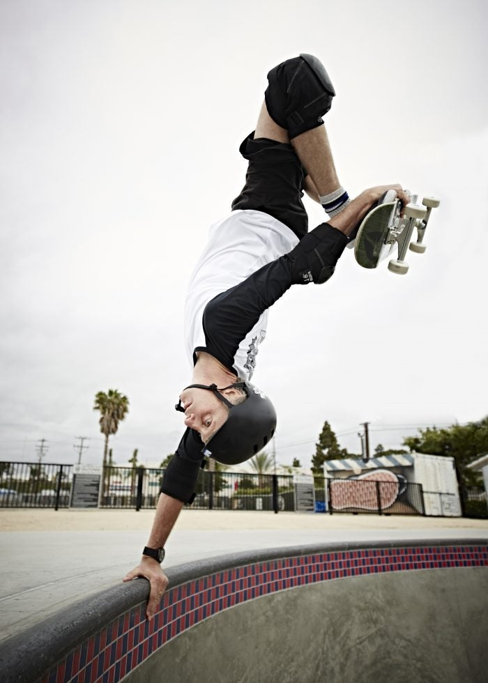
Tony Hawk Foundation
Skateboarding doesn’t need a logo — but if it did have one, it’d probably be a silhouette of Tony Hawk. The skateboard icon became a household name starting in the 80s as a member of the legendary Bones Brigade, starring in skateboarding’s first skate film — yes, shot on film — The Search for Animal Chin. In addition to becoming Thrasher Magazine’s inaugural Skater of the Year, launching Birdhouse Skateboards, creating a massively successful skateboard video game series, and becoming the first skateboarder ever to successfully land the 900, it’s no understatement to say Tony Hawk is a living legend.
Amidst Tony’s many accomplishments, the Tony Hawk Foundation is one of his greatest. Since 2002, the Foundation has helped young people by issuing grants to low-income communities for building quality public skateparks, and providing guidance to city officials, parents, and children through these often complex processes. To date, the foundation has awarded over $5.7 million to 588 public skatepark projects in all 50 States, and $100,000 to support the Skateistan program in Afghanistan, Cambodia, and South Africa.
The foundation is now working with Adobe to host a skateboard design challenge for creatives 13-24 years old called #boards4better. Here’s Tony Hawk in conversation with Adobe’s José Vadi about how design, digital tools, and more have shaped his creative perspective:
José Vadi: Within your time skateboarding, what are some of the most innovative designs you’ve seen?
Tony Hawk: I think for sure footwear has influenced more mainstream fashion. Originally, skate shoes were designed for functionality but became iconic just through their look — you can easily identify what a skate shoe is now — but other than that, I think it’s more the aesthetics of skating, and the graphics that people have used.
Skateboards nowadays are very much acceptable canvasses. You go to someone’s house or restaurant and many times they are adorned by skateboards that are painted. Skateboarding has always been infused in art and culture so that’s not surprising to me, but the fact that it’s permeated other cultures and mainstream recognition is something to consider.
Beyond that, I think that skateparks have changed into looking more like urban parks and areas as opposed to strictly skate-specific designs. A lot of times it’s hard to distinguish a skatepark from an outdoor plaza area — which is great for city aesthetics, for incorporating these type of facilities into a city area where they don’t look too out of place.
As a kid, what were some of your favorite skate graphics/artists?
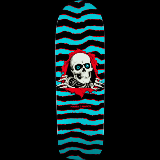
Obviously I loved any of the Powell styles, with skulls, very detailed and very real looking creatures that are sort of more fantastical, and some of the more basic stuff, like where the skateboard has a 3D element to it — where the board feels like a wall and someone’s breaking out of it. Graphics come and go so fast now that it’s hard to pinpoint any that have had a huge impact, but I think those early days of the 80s was the formative years of what skateboarding became.
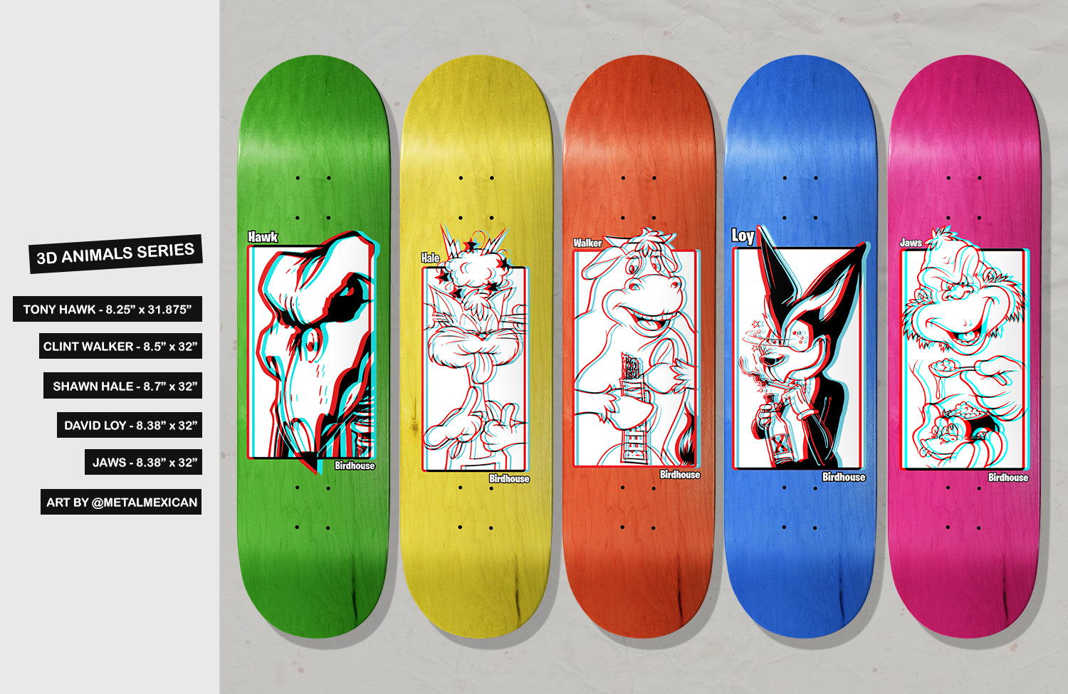
Do riders at Birdhouse ever approach you with design ideas for their boards?
TH: A lot of times we try to do more of a themed series, so it’ll be like our last series, which was a Mexican-pulp-fiction cover theme, and everyone has their own personality embedded in it. It is great because they’re easily identifiable, and then other times it’ll be some one-off thing where it’s like, “Hey this would be really funny, let’s do that.” For instance, I had four of our skaters recreate this really iconic Damned album cover where they all have pie on their face. But I had them meticulously recreate it because I was listening to that album recently. They did it, and I thought of it just as a print ad, but it came out so well that it’s going to be a skateboard graphic.
Did you use Photoshop for any early Birdhouse ads?
When I started Birdhouse, I just really learned how to use computers for the most part, but I didn’t have the hardware that I could run it in a way that was easy or efficient, so I had to rely on using my hard drive space as RAM and literally leaving things to render overnight.
The very first Birdhouse logo I did, I followed a tutorial in Adobe Photoshop to make it look metal, by doing different blurs and embossing, and things like that. It actually took all night to render on my black and white Powerbook. And then I would wake up in the morning and if something was wrong with it, I’d start over — and that was the process.
A lot of the video sequences we were doing was just taken from video — digital video had just started to come into play, and it was way easier than trying to get a photo sequence of some super hard trick that took a hundred tries. So even though that was the baseline of modern digitizing, I guess I was all over it because for one, it was cheap, and for another, it was mobile. And like, skaters — we weren’t trying to win Cannes awards or anything, we were just trying to get the information out there and show people what we were capable of.