How To Create The Perfect Résumé
Adobe Stock / ijeab
There is nothing more daunting in the working world than the job search. And there is nothing more important in the job search than the materials that market individuals to the companies they hope will hire them.
As much as the optimist in each of us likes to think our skill will trump the flaws in our resume materials, the truth is that a resume is more often than not the first glimpse an employer has into who we are and what we can offer. How our UX design resume represents us is vital in the job search. So, don’t sell yourself short! Taking the time to perfect your resume and help it genuinely reflect who you are is the difference that can make landing that dream job a reality.
We asked the experts which elements in resumes catch their eye and which make them look away. As you revamp your resume, here are some best practices to get started:
Simple ways to get noticed
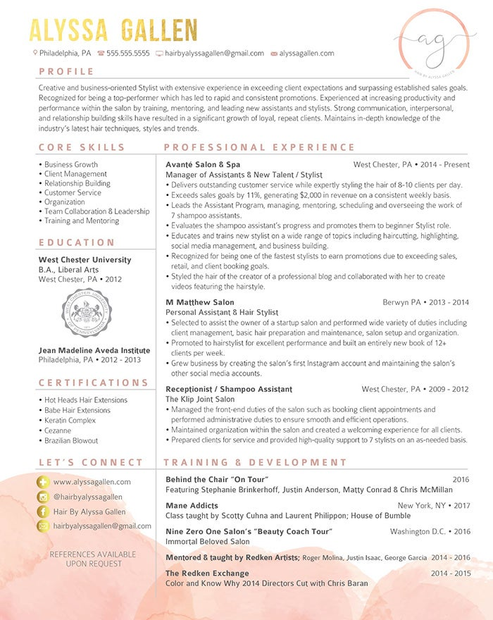
If you want your resume to be noticed for all of the right reasons, the most important thing is to make sure anyone can read it. Allison Tatios Hamscher — founder of Elevated Resumes — says “Your number one goal is to make your resume easy to skim without having to look for information.”
When recruiters are vetting several resumes every day, they are less likely to value a resume they have to decipher. Make it easy on them by including clear, concise information. Your experience should speak for itself — but it can’t speak if no one can hear what you’re saying. Dawn Boyer, Ph.D., CEO of D. Boyer Consulting, agrees that simplicity is key. “Make your resume plain and easy to read. Get rid of all the extra.”
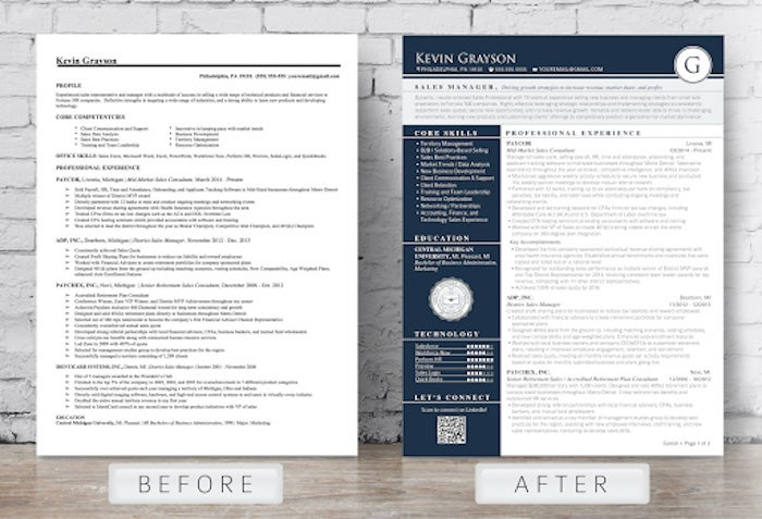
Sometimes, incorporating graphics can be a way to highlight what you want to stand out on your resume. Allison says, “Adding design elements like infographics can be a great idea — but don’t over-complicate the design. There is such a thing as too much.” Keeping things professional will make an impact on the recruiter looking over your resume.
One of the obvious — but often overlooked — ways to make yourself stand out with your resume is to use a format that highlights your best skills. Geoff Scott, career advisor and hiring manager at ResumeCompanion.com, explains how to do this successfully: “If you have ample amounts of relevant experience, the standard reverse chronological format is an excellent option,” he says. “If you’re highly skilled, but aren’t as proud of your work history, you can move your skills section up the page and downplay that work experience with a functional format. And, for students, the education section should be beefed up since they typically haven’t been part of the workforce or relevant industry yet.”
If you need a help getting started, begin with a free stock template and customize from there.
Common mistakes to avoid
No matter how much experience someone has, everyone can make mistakes on their resumes. One of the most common is simply having too much on the page. Most of those “extras” are turn-offs to recruiters. Geoff advises strongly against including things like headshots and other irrelevant personal info in your resume. “They take up space and hold no real value,” he says. “I don’t care what you look like. I’m concerned about whether or not you’re qualified for the work.”
Other things that Geoff says to avoid are self-rated skills sections and implementing humor in your resume. “Having personality is great,” he says, “but save the jokes.”
Allison agrees. “Using creative content like calling yourself a ‘design ninja’ may turn off hiring managers.” She also suggests avoiding long, wordy resumes, eliminating the old-fashioned objective statement all together. “Objective statements are outdated and unnecessary,” Allison says. “Instead, include a short professional summary that highlights your key skill sets and answers the question: ‘Why are you the right person for this job?’”
Alternative resumes
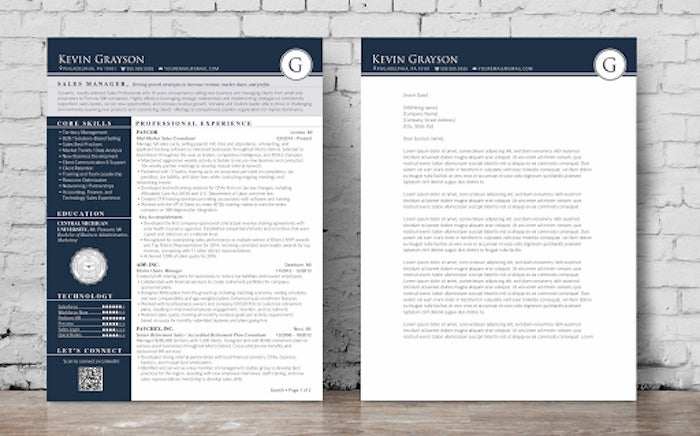
With so much available on social media and the internet, “alternative resumes” have become popular with professionals in all fields. Allison is a fan of alternative resumes as supporting materials, as long as they don’t attempt to take the place of a normal resume that aligns with your brand.
“Your digital presence is very important now — and will be even more so in the future,” Allison says. “Video is very popular, and your LinkedIn profile is a great place to showcase multimedia.”
Allison also suggests personal websites as a means of showcasing your body of work — just make sure you’re consistent. “Your resume, online portfolio, and LinkedIn page should all back up your brand. Try to create a consistent aesthetic that shows off your style.”
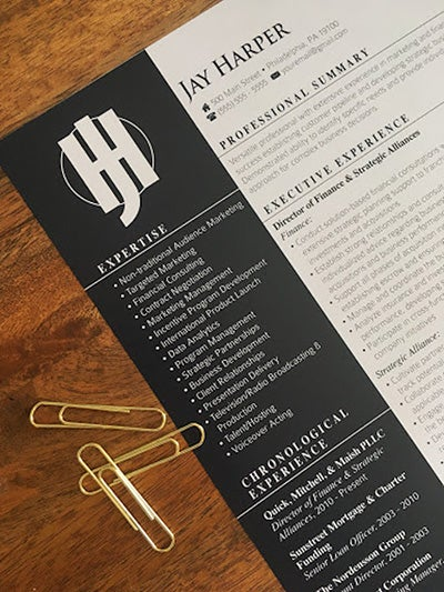
As a designer or creative, an alternative resume is an essential part of showcasing your body of work, and can guarantee you are sharing your work in an engaging format. Even if you aren’t a designer — with the help of new tools such as Adobe Spark — you can create a video resume or a resume landing page in minutes. It can be a great supplement to your static paper resume, and is the ideal designer showcase.
No matter what your current career is or where you’re hoping to end up, having a great resume is crucial to your success. Luckily, there are tons of tools to help you build a CV that is perfect for you and the jobs you’re chasing after.
Learn more about building the perfect resume and hiring managers’ tips here, and use this resume template to quickly spruce up your resume in Adobe InDesign.