Logos: Learn What Separates the Great from the Good
Skim the pages of any fitness magazine and you’re likely to see a Nike Swoosh. Glance up at a billboard and you might see Mastercard’s dual circles staring down at you. Do you recognize these brands? Of course. What makes their logos work?
First, recognize a logo on its own is not a brand identity, but just one part of it. Think of all the pieces of your identity together and how they can be aligned visually with your logo to make up a cohesive and effective brand identity.
Whether you’re trying to establish a new brand or get creative with one that’s already well-known, an effective logo is key. Context and style may vary from year-to-year, but the principles and best practices that guide logo design remain unchanged.
When we think about the elements of effective logos, here are some things to keep in mind.
Design principles for creating a logo you’ll love
Create a visual strategy for your brand. The modern approach to logo design is to create an entire system — a primary mark, a secondary mark, typography, and a color scheme — that aligns with your overall brand. Will your logo be a wordmark — a stylized typographic logo without a separate icon, such as FedEx, 3M, or Coca-Cola? Or perhaps you will simply use a pictorial or abstract mark, like Apple, Nike, or Target. A logo system includes all these elements along with guidelines for when to use them individually or when to use a lockup (a grouping of several brand elements like an icon, wordmark, and tagline). Logos are often surrounded by and gain meaning from context, so the key is to think about how much or little your visual brand system needs to communicate.
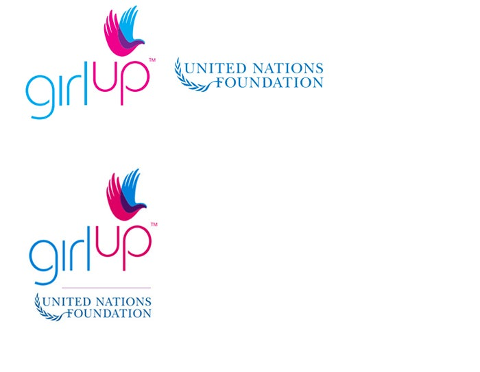
Horizontal and vertical logo lockup.
Ensure the logo works in multiple environments. The best logos are memorable, but they also have to function and work in a variety of modern environments and across digital platforms, communication channels, and physical objects. Great logos resize easily and can be reproduced across a variety of different contexts — they should be scalable, responsive (for mobile-first design), and identifiable across a variety of sizes, shapes, dimensions, and applications.
Find the sweet spot of complexity. Color or black and white? Detailed or simplistic? Abstract or literal? The best logos can be reduced to one or two colors and resized easily. If it can’t, chances are it’s too complicated and not likely to be legible or memorable. While it’s not a rule that logos should be produced in one color, it can be indicative of whether or not it is at the right level of visual complexity. One way to test the utility of a logo is to envision how it would reproduce stitched on a ball cap. If it would work well there, it is probably simple enough for most any application.
Watch trends, but aim for timeless. The “flat” design and minimalist approach may be hot now, but in a decade, logos in multiple colors with extra detail may be on trend. Design trends are seen through a moving window — timeless logos stand out visually by differentiating themselves from what has already been done in the past. Use sites such as Behance.net to get a handle on current design trends, but also pay attention to the great timeless logos to visualize how designs can adjust to the flavor of the day and stand the test of time.
Minimalist logo. Image credited to Martin Servantes.
Flat design. Image credited to Daniel Triendl.
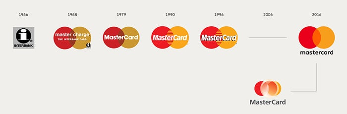
Great logos evolve over time
Make it unique. When you’ve gone to the trouble to develop a brand and create its visual identity, you’ll want it to have real staying power as it evolves over time. Make sure the design you have is unique enough to be trademarked, and then do it. This is also important to prevent other brands from adopting a similar look and confusing — or stealing — your customers.
Best practices for meeting your client’s visual identity needs
Creative Brief. Most good design starts with asking the right questions. In the case of designing a logo, developing a complete, concise creative brief is a great place to start. A creative brief should help you discover things like:
- The company’s personality that you will visually communicate. Is it playful or serious? Dynamic and energetic or secure and stable?
- Define the target audience and understand that audience’s visual preferences. Who are the customers and what are their tastes?
- Review competitors’ logos and designs and determine how your brand can stand apart.
- Understand the various applications the logo will be adapted for. Will the logo need to be turned into building signage? Embroidered on a shirt? Have an app icon?
- Interview key stakeholders to understand not only their vision for the brand, but also to give them a sense of ownership in what will become the “face” of their company.
Concept Development. Once you understand the target you are aiming for, a mood board can help you define a visual direction for your brand. A mood board is a collage of visual examples you find in the world that represent the look and feel you want to create. When you start sketching ideas, don’t fall in love with the first decent concept you have. Start with a large volume of varied designs and be sure that you’ve done your diligence in complete exploration before you start narrowing in and refining the best ones.
Refining. Once you establish your three or four top ideas, spend time refining and iterating on your original design. Don’t rush this process — many designers find it helpful to take time away from an intensive design project to see it more objectively and with “fresh eyes.” Get inspiration from good design in unrelated places.
Test your design. Send your logo to a variety of people in your target demographic and ask for their candid reactions. It can be difficult to break through people’s natural desire to be nice and artificially positive when reviewing your creation, but it’s essential to success. You might consider an anonymous web-based survey. You should also distinguish between helpful and unhelpful feedback. Helpful feedback will critique how well your logo communicates your brand identity and how it makes your audience feel about your brand. Try to make a distinction between people’s personal tastes and the objective effectiveness of a design. Feedback questions that focus on the effect of the design (for example, “Which of these companies would you buy from based on the logo alone?”) are better than questions that focus on personal taste (“Which of these colors do you prefer?”).
User-friendly tools to simplify logo creation
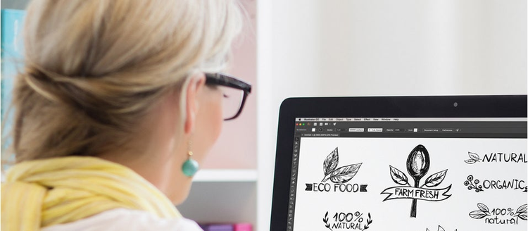
Click, capture, create. With the free mobile app of Adobe Capture CC, you can take photos of inspiration anywhere you find it and convert them into shapes used to create your logo. The shapes can be saved to Creative Cloud so they are instantly made available in Adobe Illustrator CC.
Use reference images. Even complex art design is easy to create using basic shapes — rectangles, triangles, and circles — to build your artwork. With Adobe Stock you can download vector art files to use as building blocks for your original design and modify them in Adobe Illustrator CC to suit your needs. Add color, fine tune your project and round out your logo by adding text with easy-to-use features in Adobe Illustrator CC.
Share your files. Save your final logo files and guidelines in the file formats you’ll regularly use and in a place that’s easily accessible for your team, such as CC Libraries.
Designing a brand logo that excites your audience doesn’t need to be complicated. With a few good tips, the right tools, and some creative inspiration, building a one-of-a-kind logo is easier than ever.
Visit the Creative Cloud HelpX page for easy-to-follow tutorial videos that will help you start your next project using simple-to-use tools and these best practices. Read our blog post about five logo design trends you should know about.
