At this point, it’s pretty apparent that design systems are here to stay, and the bigger your organization, the bigger the challenge of designing at scale. At Adobe, we’re confronting this challenge head-on with our own design system, Spectrum, and now we’re ready to start sharing the key insights and lessons we’ve learned along the way.
Nowadays there’s no shortage of articles explaining what design systems are and how to build one. However, there’s still a lack of shared insight into how these problems are solved across larger, more complex ecosystems. This is the first installment in a series of articles and resources all about Spectrum that will help you address these challenges at their own organizations.
We recently highlighted the process of building our design system at the San Francisco Design Systems Coalition. There we discussed the problem of scale, and how Adobe is solving it via collaboration between design, engineering, product management, and program management functions. Coming up, we’ll talk about how we’ve built Spectrum for success, but first, let’s talk about the challenges and solutions facing large organizations looking to redefine design.
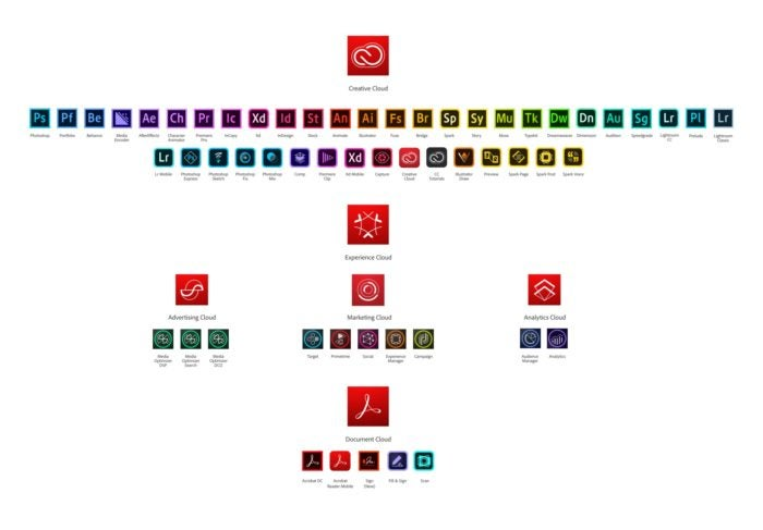
Adobe’s product ecosystem
The Adobe brand ecosystem.
Adobe has a massive product offering with over a hundred fully branded products and services that are mostly split between three sides of the business: Creative Cloud (creative and design tools), Document Cloud (Acrobat and PDF software), and the Experience Cloud (marketing and analytics).
— Sonja Hernandez, “Designing Adobe’s Evolving Brand System”
Adobe is a large company, overseeing more than 100 fully branded products in market (each supporting multiple clients across desktop and mobile). Many of these products have a long legacy and huge install bases serving millions (or, in some cases, hundreds of millions) of users. At a technical level, we build products at a massive scale, spanning dozens of locales, on every major platform (UWP, macOS, Android, iOS, etc.), with many frameworks adopted internally.
These products serve a diverse array of customers: creative individuals (novice and expert), design studios, document services teams, marketing/analytics organizations, and many others. Despite this diversity, these products are all part of an increasingly integrated ecosystem, so part of Spectrum’s job is to bring it all together.
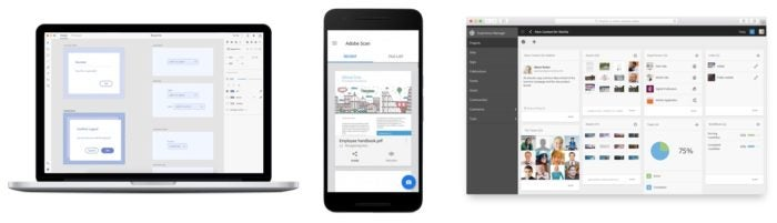
Solving for a diversity of user needs: XD, Scan, and Experience Manager.
Few of our products could easily be described as simple. Adobe has built its reputation by providing powerful tools to pro users. However, that doesn’t mean our customers should have to experience all of that complexity.
There are meaningful efforts in the works to make our products easier to learn and use, and Spectrum is a crucial tool that Adobe is using to achieve that goal. Still, powerful functionality continues to be the selling point for many Adobe tools. We can’t ignore these challenges, or work around them — for our design system to be successful, we must face them head-on.
Spectrum is designed to retain that power within our products, while simplifying the user interface (UI) and experiences of the products themselves. It’s also providing a framework that can be used to create consistency and clarity across our many applications, user bases, and platforms.
The impact of scale
In any given application there are often dozens of screens or panels; hundreds (or thousands, in some cases) of unique icons and cursor states; as well as a mix of messaging like onboarding tutorials, notifications, and feature announcements. It can be a real challenge to solve for patterns that work across that kind of variety.
A myriad of dialogs in Adobe Illustrator.
And that’s just one application. Taken across our full portfolio, this complexity is multiplied exponentially, and the challenge of scale becomes apparent immediately. Let’s take one simple example — your basic button element. Even this simple element can be incredibly complicated in a design system this large.
How many variants and states of this do we need to consistently serve to meet the basic requirements of a button across all of Adobe’s products? As of this writing, there are 1,080 ways a button element can be displayed within our design system.
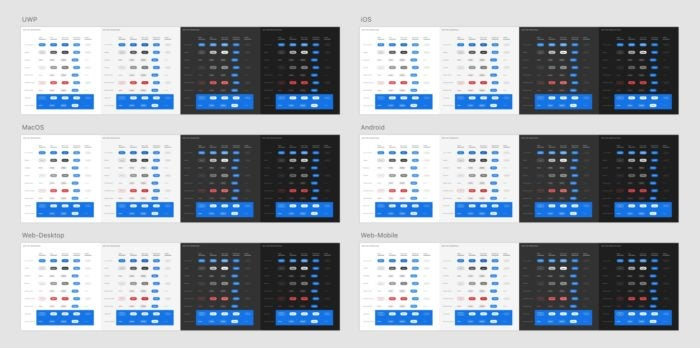
First, the button element has nine variants, and each variant has five states. Each of these needs to work across the 4 color themes we use, from lightest to darkest. That brings us up to 180 permutations. Lastly, we support six platforms_:_ UWP, MacOS, iOS, Android, web desktop, and web mobile. Multiply all of that together, and you get something like this:
The Button UI kit.
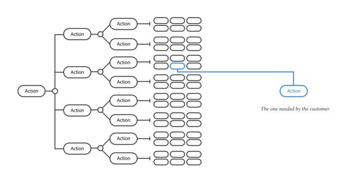
This means the designers and developers working on Spectrum have to study, design, and test every last one of those permutations to make sure they all work — and are all consistent — in each of those scenarios. They then need to package and distribute those permutations in a way that is clear and simple to the folks using Spectrum. Traditional approaches like sticker sheets become challenging to navigate at this scale.
Out of many, one.
One of the biggest challenges for Spectrum is distilling that kind of complexity into a simple, usable result. Even though there may be 1,080 buttons behind the scenes, our goal is for designers and engineers to just get the one button they need.
What’s next
Adobe’s large and diverse ecosystem presents an interesting set of challenges. To take on this massive task, we’ve employed a multilayered strategy that includes:
- Creating trust: Encouraging a company of Adobe’s size to adopt a single design system is a tall order. It starts by building trust between the Spectrum team and the teams of designers and engineers building our products.
- Implementing at scale: Duplication leads to fragmentation. So even though Adobe has a complex landscape of frameworks in play, we strive to reduce duplication of design constants and other essential data as much as possible.
- Empowering contribution: We can’t accomplish our mission by ourselves. We need the expertise and creative energy from other teams to expand the system, and to provide the necessary outside perspective to keep Spectrum honest.
- Creating a cross-functional team and process: Widespread product consistency (and excellence) isn’t just a design problem — it’s a design, technology, and operations problem. We bring these experts together to collaborate on Spectrum’s many areas of focus.
- Measuring success: We need to regularly assess how effective Spectrum is at achieving our goals. We came up with a Spectrum Scorecard to objectively assess our progress in serving the needs of Adobe’s broad ecosystem.
We’re solving for a kind of scale here at Adobe that most teams don’t have to contend with, so we’ve learned quite a lot. In the coming months, we’ll dive into more detail on the processes above, sharing a series of articles written by our team that highlight some of our challenges and what we’ve learned. We’ll look at everything from how we built our visual language, to models for collaboration, to some of the technical solutions we’ve cooked up to solve these unique challenges. We can’t wait to share it with you on the Adobe blog, and for our UX insights sent straight to your inbox, sign up for Adobe’s experience design newsletter.


