Best Practices for Designing with Responsive Resize in Adobe XD

Illustration: Justin Cheong.
We live in a world where designing for multiple devices is not only important, it’s essential. In the United States, it’s now even a federal requirement for government services.
Designing for responsive environments is nothing new to designers. Now it’s about tailoring the experience for each break point. This is where the latest update of Adobe XD comes in. It features responsive resize, which allows you to resize groups of objects while keeping their placement and scalability. All you have to do is resize the group right there on the design canvas, and XD will keep the relative spacing in place.
The benefits of responsive resize
“We found that in order to design for responsive environments, designers working in XD were constantly duplicating elements, putting them on a different artboard, and adapting them to a new screen size,” said Hoyle Wang, product manager for Adobe XD, as he explained the reasoning behind the new addition.
“This process was very manual and tedious, especially when you consider that, generally, the layout of elements did not vary much from page to page. The changes are with regard to different spatial relationships between elements. In competitors’ products, designers also went from manually resizing each individual element to manually setting resizing constraints on each object, then resizing the object. When we studied the feature at Adobe, we realized there was a predictable pattern that we could use machine learning for,” he said.
Adobe XD now predicts which constraints you’re likely to set and automatically applies those constraints as objects are being resized, which saves a lot of time. The tool does so by analyzing the objects you have selected, their grouping structure, proximity to the edges of the parent group, and the layout information.
This means you don’t have to go through the cumbersome task of setting constraints in order to get a good result anymore, and can spend more time designing and experimenting with different layouts.
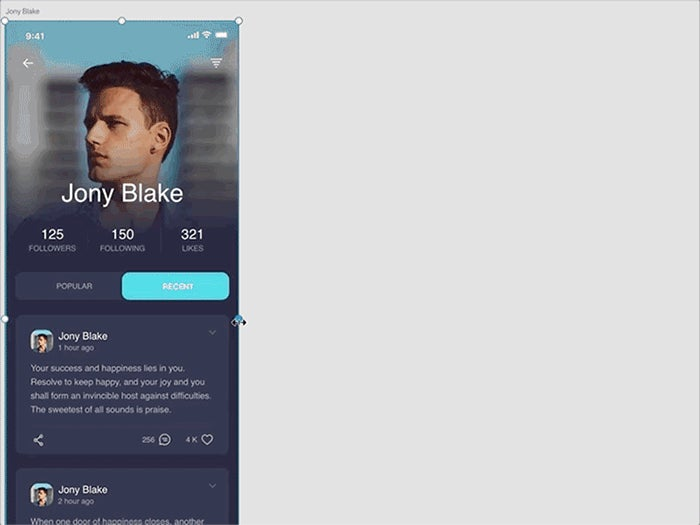
Responsive resize functionality in the latest Adobe XD update.
Before resizing, you can group similar objects to establish relationships between them. XD retains the grouped objects together by default, and allows you to establish a hierarchy in your projects.
If you’re not happy with the result, you can always edit the constraint rules manually, which enables you to explicitly determine how objects should behave when you resize the symbol, artboard, or group those layers are in. Just select the manual mode in the Property Inspector to manually edit the constraints that responsive resize has placed on objects. Your manual constraints will always override automatic constraints placed by XD.

Side-by-side renders illustrating responsive resize functionality on a tablet versus a laptop screen.
To summarize, we’ve asked Hoyle for some dos and don’ts when using the new responsive resize feature in Adobe XD:
The dos
- Use groups as an easy way of establishing relationships between objects.
- Override Adobe XD’s predictive technology by switching to manual mode and setting constraints yourself.
- Use responsive resize in the ideation phase. The team has built it so you can quickly explore design ideas in real time.
- Consider responsive resize for banner ads, as their output often includes a bunch of variants that have similar content in different layouts.
The don’ts
- Don’t expect responsive resize to do all of the work for you. Adobe XD will get you 80 percent there, doing most of the work for you, but it might not always get it right.
Take responsive resize for a spin in the latest release of Adobe XD, and discover the impact it can have on your workflow. Being able to rapidly conceive, design, and test across multiple devices without having to rebuild each component from scratch or adjust every element individually can lead to significant speed boosts. Ultimately, this will enable you to design more, faster. And, of course, if you need more control during the process, just switch to manual mode.
For more UX insights sent straight to your inbox, sign up for Adobe’s experience design newsletter.