Applying 2D Design Concepts in 3D with Adobe Dimension
Justin Patton, Adobe Dimension’s senior art director, walks through his creative process to show how he creates out-of-this-world 3D scenes.
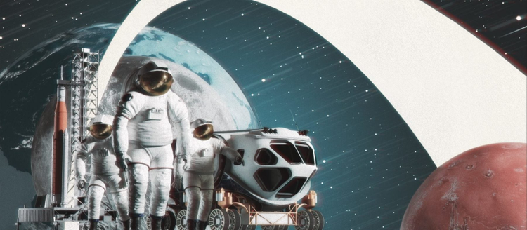
As part of Adobe’s celebration of NASA’s 60th anniversary and the 50th anniversary of the Apollo program, I created a set of 3D renders in Adobe Dimension, our 3D compositing and rendering tool. In this article, I’ll explain how I designed these images to pay tribute to the history of space exploration.
The goal of the the first image below, one of three 3D renders to commemorate 60 years of NASA, was to visualize the feeling we have when we think about the pioneering space agency and the progression of space travel. I applied some simple design concepts in a 3D layout and found inspiration in the look of some more traditional 2D design work.
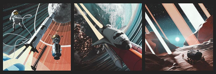
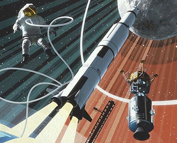
I started to work out the style by looking at reference artwork from past projects related to NASA, in particular the Jet Propulsion Laboratory’s Visions of the Future series, which saw artists create retro posters around the theme of space tourism. It sourced design ideas from a time when the idea of space travel was still a fantasy, and I found it hugely inspirational.
I wanted to attempt a similar process and mix the look of the rendered 3D content with some matching design techniques: using simple shapes and desaturated colors.
Concepting in Adobe Dimension
Since the assets used in this scene had already been provided, I did all of my concepting directly in Adobe Dimension. In some early prototypes I was looking at the silhouettes of the assets over solid color backgrounds by using the glowing material on the objects and changing the background around with a linked Photoshop file.
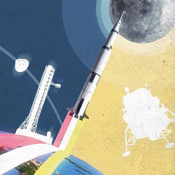
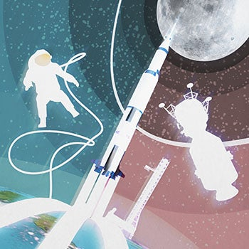
In the end I focused on maintaining the look of the 3D assets while working on the shapes around them, the background, and some solid elements like the engine trails. I used basic primitives with the glowing material to create them.
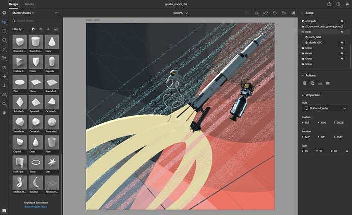
The lighting is similar to what it’s actually like in space, but with plenty of creative rule-bending thrown in for good measure. I have a strong key from the sun with zero cloudiness and colorized to white. The light of the environment is a simple strip of white at a low intensity to fill in the shadows a little and throw some reflections onto the objects. The result is a very hot highlight on the rim of the objects:

I still used the selection masks in Photoshop to create a stronger rim to help pull the objects off the background:
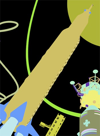
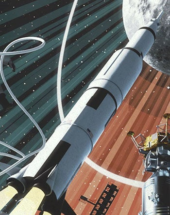
I worked out the color pallete after observing some common elements among the scenes, while keeping the theme in mind. The opposing red and blue represent the space race between the U.S. and Russia, and these colors are recurring on the Earth, Mars, and shuttle for the following images.
The final tone mapping includes small adjustments to the various elements by using the selection masks in the rendered .PSD along with adjustment layers, but generally I pulled the values to both ends of the range to get a starker transition between the shadows and highlights, and then clamped them in to wash the image out a bit to achieve the retro feel. Multiplying a subtle grunge map over everything helped push it even further.
Celebrating the 50th anniversary of the moon landing
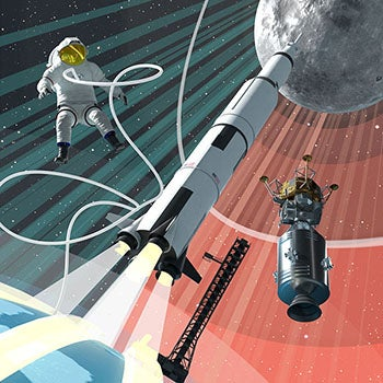
When I created an inspiration piece for the current art contest to celebrate the 50th anniversary of the Apollo Program (see below), I used the same techniques. The main difference was the aspect ratio of the frame, so I spent a lot of time thinking about how to frame the elements in an interesting way, and it became a bit of an experiment.
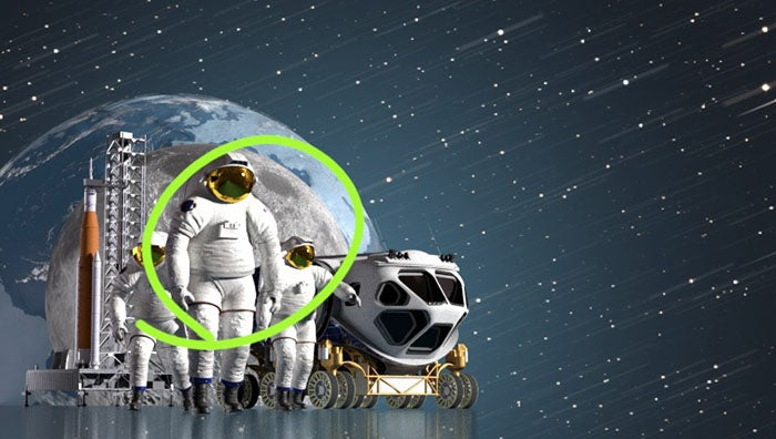
The layout of the assets on the left side of the frame is straight forward. It represents our progress going from the Earth to the moon and beyond, so the elements are stacked in that order.
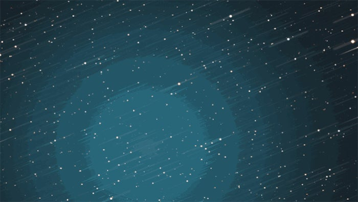
Here I’m using the same strong key from the sun, this time with more of a three-quarter angle coming from the right. This creates a broad and hot highlight on all the elements. This gathering of elements and lighting draws the eye and felt very ‘heavy’ to me when I considered how to weigh the framing of an image. So I thought of ways to balance it out without simply duplicating the same effects on the opposite side of the image.
I knew I wanted to contrast the cluster of elements to the left of the frame with something more minimalist and impactful related to Mars, and it took some time to figure something out that worked. I found that placing Mars very near in the foreground and partially out of frame made it elusive to the eye, which also felt appropriate for the theme. To guide the viewer’s eye to it, I used the rocket trail arc, which doubles as a representation of the traveler’s path.
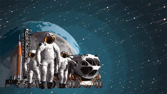
While placing the path, I was exploring the negative space it created between the objects and frame edge because those become their own visual element.

In the end, Mars would constitute a final discovery for the viewer, and as an artist I find that discovery is one of the most interesting elements you can add to a work of art.
Justin Patton is the Senior Art Director for the Adobe Dimension team. If you want to submit your own space-based scenes, you have until January 21, 2019 to enter the global art contest ‘From the Moon to Mars — Apollo 50th Anniversary Challenge’, run in association with online portfolio service ArtStation. Prizes include an HP workstation and an iPad Pro with early access to Photoshop for iPad.