When it comes to color, there’s no one more authoritative in the game than Pantone—when Pantone says a color trend is on the rise, the design world listens.
When it comes to color, there’s no one more authoritative in the game than Pantone—when Pantone says a color trend is on the rise, the design world listens. And according to The Pantone Institute’s Vice President Laurie Pressman, the colors to look for this year are bright, bright, bright.
This year’s palette of Pantone’s most popular, on-trend colors is comprised of bright, rainbow hues—Lime Green, Hawaiian Ocean, Flame Orange, Fuschia Purple, Cherry Tomato, Blazing Yellow, and Dazzling Blue—inspired by the intense colors of the social media landscape.
All the colors this year definitely make a statement. But how can you incorporate the colors of Pantone’s palette to make the right statement for your specific design and industry? Let’s take a look at the color psychology behind Pantone’s 2019 color palette, how they translate to the design world, and how to make this year’s trendiest colors work for you and your designs:
Why bolds—and why now?
So, before we dive into each of the individual colors in Pantone’s 2019 palette—and how to choose the right one for your creative—let’s talk about why these colors are so hot right now.
As social media has become more saturated, content creators have had to find a way to stand out—and one of the ways they’ve done is is through vivid images of exotic locals, brightly-hued product photos, and incorporating more intense colors into their imagery. And as social media has become a more vibrant, colorful place to be, deeply saturated, brightly hued colors—like the colors in this palette—have become more and more popular.
In other words, people on social media want a way to stand out—and they’ve found it through bright, vibrant color. And reflecting that trend, as designers look for ways to stand out in the upcoming year, we can expect them to turn to a bright, vibrant color as well.
Breaking down the psychology of each of the 2019 palette’s hottest hues (and how to use them)
Now that we have a bit of insight into why brights are so hot right now, let’s take a look at the colors that are trending the most —and how to choose the right colors to incorporate into your designs in 2019:
Lime Green
Design by 99designs designer Martis Lupus.
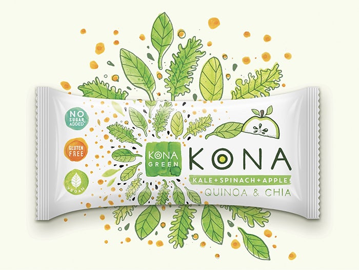
When it comes to choosing colors to feature in designs, green has always been a favorite for designers. And for good reason! The psychological pull behind green is strong, with most people associating it with one of two things: nature (which evokes feelings of calm, peace, and tranquility) or money (which evokes feelings of power, and wealth).
But this year’s hot shade of green is a little bit different. The vibrant lime hue is a little bolder, a little brighter, and a little more vibrant than more traditional shades of green—which adds a fun, youthful spin you won’t find in more subdued variations.
If you’re designing for an industry that’s in any way tied to nature (like agriculture or organic foods), lime green is a great color to work into your designs in 2019—not only will it connect to people’s cultural associations with nature, but it will put an on-trend spin to the final product that feels fresh and timely. Try incorporating lime green into your logo design or as an accent color in a website color palette (because this shade is so bright and vibrant, you probably want to avoid making it the focal color at the risk of overwhelming the audience with too much lime).
Hawaiian Ocean
Design by 99designs designer Andrewzz.
Ah, the clear, blue ocean. Is there anything better?
Apparently not—which is why blue is the most popular color choice for people to use in their branding (according to 99designs’ color psychology research, the color blue appears in more than half of all logos).
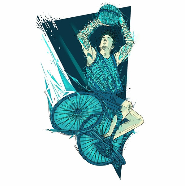
Hawaiian Ocean, one of two blue hues in the 2019 Pantone color palette, leans more towards the teal or turquoise side, which immediately brings up those associations with the ocean—and creates waves of calm, peace, and tranquility in the people looking at it.
If you want to inspire a sense of peace in your audience—so, for example, let’s say you’re designing a logo for a new therapy practice or creating the branding assets for a new line of yoga wear—Hawaiian Ocean is a solid choice. And because blue is such a universally loved color, no need to be shy—you can let Hawaiian Ocean take center stage (like as the background for packaging design or as the primary color for a logo).
Flame Orange
Design by 99designs designer J_Ivan.
Want your designs to read as fun, playful, vibrant, and exciting? Then try Flame Orange.
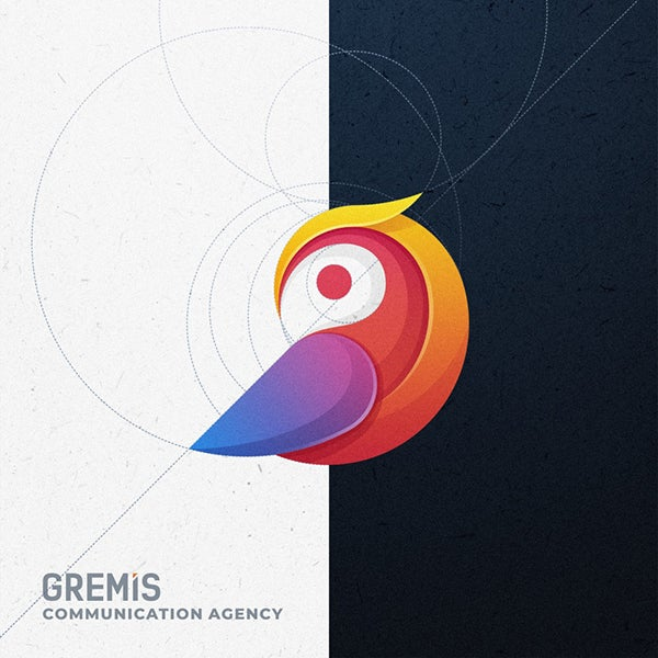
According to color psychology, people tend to describe orange as a bright, happy, energetic color that inspires feelings of excitement and enthusiasm—so if you want your designs to be described in the same way, this is a color trend you’re going to want to hop on board with.
One thing to keep in mind: because orange is so bright, it isn’t as universally appealing as other hues, like green or blue. For many people, orange is a “love it or hate it” kind of color, so if you don’t want to alienate the “hate it” crowd, try not to go overboard.
If you want your designs to feel playful, friendly, and energetic—or you’re creating a design for a company with a playful, friendly, and energetic vibe—this is a great color to feature. If you decide to make Flame Orange the focal color of your designs, we’d suggest balancing it out with plenty of neutrals to avoid making the end design visually overwhelming. Or, use Flame Orange as a pop of color to brighten up an otherwise neutral palette.
Fuschia Purple
Design by 99designs designer Spoon Lancer.
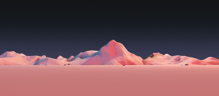
This color may be called Fuschia Purple, but it’s really much closer
to pink—and pinks, across the board, have been having a moment recently. While this shade is definitely more bright and vibrant than other popular hues (like the uber-popular Millennial Pink, the blush that has been everywhere since being named Pantone’s 2016 Color of the Year), it’s just as versatile—and arguably makes an even stronger statement.
In terms of association, pink is closely tied to femininity—but because this shade is so vibrant, it can also inspire feelings of excitement and passion like its parent color, red.
While pink is stereotypically (and outdated-ly) linked to women, this shade is by no means limited to female audiences in it’s appeal; the bold color choice would be just as effective for any kind of retail design (red is a favorite amongst retailers thanks to the sense of urgency it creates in shoppers—and because this pink is so bright and close to red, it’s likely to do the same).
Cherry Tomato
Design by 99designs designer Mad pepper.
Red is a powerful color with extremely powerful psychological associations (ever heard the term “I’m so mad, I’m seeing red?”)—and Cherry Tomato is a powerful shade of red that packs an energetic punch sure to leave a lasting impact on your audience.
As mentioned, red is a color of passion, energy, and excitement—so if the end goal of your designs is to rev people up and get them excited (so, for example, a flyer for an upcoming concert or a poster advertising an upcoming protest), this hue should definitely be on your list of go-to’s for 2019.
If you’re designing for a company that ultimately wants to inspire feelings of excitement in their audience, like a retail brand or a real estate company (what’s more exciting than buying a house?!), Cherry Tomato is a great option. Just avoid using too much red—you don’t want to cross the threshold from a design that inspires feeling of excitement to a design that inspires feelings of anger.
Blazing Yellow
Design by 99designs designer Milos Zdrale.
Yellow is the color of sunshine—and when used in the right way, Blazing Yellow can inspire the same kind of warm and fuzzy feelings in your audience.
Yellow has strong psychological associations with cheerfulness (thanks to the sunshine connection)—and people tend to think of it as a friendly, accessible, and upbeat color. So, if you want your designs to make people feel happy and cheerful, Blazing Yellow is a no-brainer.
Because yellow is such a bright and sunshine-y color, it’s a great choice for any designs geared towards children. Mix it with other primary colors to create accessible designs that will appeal to a younger audience.
Dazzling Blue
Design by 99designs designer BATHI.
Like we mentioned earlier, the color blue has deep psychological ties to feelings of peace and calm—but those aren’t the only psychological associations you can inspire with this color. Blue has also been shown to increase feelings of trust—and Dazzling Blue (which, unlike the rest of the colors in 2019’s palette, is a more traditional/less bright shade) is the perfect color to do so.
So, which industry is this color is best for? In a nutshell, anyone! Dazzling Blue is a classic color that you can work into any design in any industry—but if you’re designing for industries that, in particular, need to inspire a sense of trustworthiness with their audience (like a consulting firm or a financial institution), this is an especially good choice.
Find the perfect Pantone
Pantone’s 2019 color palette is all about bright, vibrant hues that make a lasting impact. And now that you know the psychology behind these colors—and how and when to use them—you have everything you need to make a lasting impact with your designs.
Still not sure which color will work best for your industry? Plug your brand traits into 99designs’ interactive Logo Color Generator and let the color gods choose for you!
A glimpse into the future – Pantone Color of the Year 2019
Image source: Adobe Stock
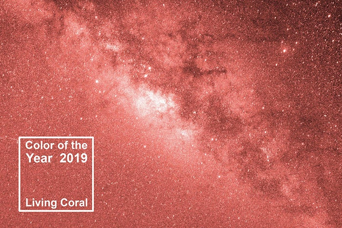
Start thinking visual trends in 2019, with the newly-released official Pantone Color of the Year – PANTONE 16-1546 Living Coral!
With vibrant yet soft hues that blend modern life with natural surroundings, Pantone calls Living Coral an “animating and life-affirming coral hue with a golden undertone that energizes and enlivens with a softer edge.”
Discover the playful synergies of Living Coral and photography and video with Adobe Stock’s dedicated Pantone Color of The Year Gallery.
Learn more about Pantone and the Adobe Color collaboration here.
