Classic Typography, Timeless Design: How Minimal Calendar Used Adobe XD to Create a Beautiful and Focused Calendar App

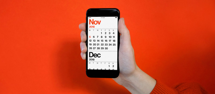
Take one look at Minimal Calendar, a new calendar app available now on iOS, and you know it was created by designers, for designers and design enthusiasts. It’s streamlined and visually appealing, with a devotion to its typeface that will make typography lovers squeal with joy. Unsurprisingly, given its name, its creators believe in the power of pared-down but effective user experiences; while the word ‘minimal’ is right in the name, Minimal Calendar’s designer stresses it’s much more than just following a design trend. For him, it’s about being intentional with what you do, and don’t, put in an app.
“We don’t think of minimalism as some sort of fetishized term, as it often can be,” said Sean Wolcott, founder and creative director of Rationale, which designed Minimal Calendar. “I think, really, taking out all of the crap [from other calendar experiences] resulted in a minimal experience. It is not about making something minimal in and of itself. It’s about creating a beautiful, focused calendar experience.”

Minimal Calendar.
For Sean, creating Minimal Calendar has been a long-term labor of love. What started as rough sketches, scribbles, and paper wireframes five years ago has now turned into a full expression of his design intentions, available now on the App Store. To achieve his goal of creating that “beautiful, focused” calendar experience, he turned to Adobe XD to design and prototype the app. Here is the story of Minimal Calendar, and how Sean and his team worked Adobe XD into their workflows to create it.
Recreating the clarity and beauty of the best printed calendars in a digital experience
Minimal Calendar was born out of Sean’s love of printed calendars, and dissatisfaction with the iPhone calendar app five years ago. “If you look at how digital calendars looked in 2013, you’d swear you’re looking at medieval times or something. It’s just shocking. I think we forget how far everything has evolved in six years,” he said.
“I wanted a digital experience that matched the clarity and the beauty I found in the best printed calendars. As my own design mentor, Massimo Vignelli, said, ‘If you can’t find it, design it.‘” That’s when Sean began concepting Minimal Calendar, but ultimately kept his focus on his client work. Fast forward to 2018, after Sean took his design firm Rationale full-time, and he decided to focus on taking Minimal Calendar to completion.

Sean Wolcott designed Minimal Calendar as a reaction to other digital calendar apps over the past several years.
“Good, smart, sensible design that uses color, scale, and typography to make a meaningful experience for people works. It worked five years ago, and it still works now. [Minimal Calendar] throws away most of the things you don’t need. In that sense, we made something for a specific audience, which is really ourselves, but we knew that it would appeal to lots of other non-designers that just that don’t need all the bells and whistles. For us, by essentially leaving the edge cases out and making the core experiences better, we were able to make something just really focused in a way that feels meaningful,” he said.
Designing for aesthetics and focus with Adobe XD
When designing a new app, from scratch, it’s especially important to be able to ‘focus in’ on the design process to make sure every detail is intentional, intuitive, and purposeful. This was especially the case for Sean and his team at Rationale, who set out to create a calendar app where every feature was heavily scrutinized to make sure it improved the experience without causing clutter. Many of the design principles behind Minimal Calendar are the same design principles behind Adobe XD, and so Sean said choosing it as their design and prototyping tool felt like a natural fit.
“Both Aesthetically, and the focus of Adobe XD felt in tune with the focus of our app. It provides you only what you need, when you need it. That was something that was really appealing to us. Having worked through the process, XD’s clutter-free interface really allowed us to focus on making Minimal Calendar clutter-free,” said Sean.

Sean Wolcott designing Minimal Calendar in Adobe XD.
It was also very important for the Rationale team to be able to design on desktop, and effortlessly transform their designs into interactive prototypes on their phones. Sean adds that Adobe XD’s ability to do this quickly allowed them to get a better sense of how their design was stacking up against their goal of creating a calendar app that was easy to navigate and intentional in its feature choices.
One of Sean’s favorite features in XD, however, is the Smart Guide system. In addition to a square grid, Adobe XD has a layout grid in its Smart Guide system, tied to the geometry of objects and artboards. For Sean, square grids were just too granular to use for Minimal Calendar. A full layout grid empowered him and his team to make things as aesthetically pleasing as possible in an efficient way.

To ensure Minimal Calendar nailed the desired aesthetic and clarity in its experience, the Rationale team made use of Adobe XD’s layout grid.
“In a sense, Minimal Calendar is a digital-first experience, but it very much takes grid-based layout principles from the print era and brings them into the digital domain. I think a lot of people that have built digital tools in the past don’t understand those things, so they get neglected from the products. We were really happy to find that kind of thinking in Adobe XD,” said Sean.
The importance of typography in Minimal Calendar
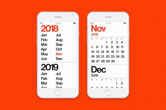
We all know words and their appearance in digital products are important, but in calendar apps they are crucial to whether a user finds the experience useful at all, due to a general lack of any pictograms and reliance on text. Minimal Calendar uses the Neue Haas Grotesk typeface, which is the accurate form of the original Helvetica. Using this typeface, and paying close attention to its proportionality, is a key factor that sets Minimal Calendar apart from other calendar apps.

Minimal Calendar uses the Neue Haas Grotesk typeface.
“For us, we were super specific about the typography in general and having it all be very thoughtful and proportional, where a large size is equivalent of three lines of the item the size before it. The type, in conjunction with the layout grid within Adobe XD, helped us achieve that clear and effective sense of proportion. The rendering of the typeface and the ability for us to instantly see it on our devices helped us iterate quickly, too,” said Sean.
“It’s just about making something that’s a joy to use”
Now that Minimal Calendar is available on the App Store, Sean says he is already getting very positive feedback from users who appreciate a “breath of visual fresh air.” He’s not resting on his laurels, however, saying he’s excited for what Minimal Calendar will be in another five years. He plans, along with his team, to continue using Adobe XD to iterate and update the app well into the future.

“I think in terms of digital products now, things are more intrusive and addictive than ever. We’ve sort of counteracted that in a lot of ways here,” he said. “People are realizing how cluttered other calendar apps are, and that by us being reductive, nothing’s missing in terms of functionality. I think really it’s not about simplicity for the sake of simplicity. It’s just about making something that’s a joy to use.”
For Sean and the team at Rationale, whose company motto for digital design is “timeless design for temporary screens,” the goal was to create an app that would stand the test of time, thanks to human-focused design principles and beautiful typography. Adobe is proud that our all-in-one UX/UI tool helped them do that.
To learn more about Minimal Calendar, head over to Rationale’s website, and for UX insights sent straight to your inbox, sign up for Adobe’s experience design newsletter.