Like Peanut Butter and Jelly: How Two Graphic Designers Added UX to the Mix

Illustration: Justin Cheong.
Graphic designers often find themselves working on digital projects like email campaigns, banner ads, and websites. More and more, designers who have a primarily visual design focus are finding user experience design skills are a natural expansion of their skill set, talents, and abilities.

Grace Hartman.
Grace Hartman is the director of product design at Spire Digital in Denver, Colorado. She works with teams to deliver client projects in industries like aviation, healthcare, B2B tech, and education. Corey Lewis currently works as a creative designer at an international professional services firm. Throughout his career, he’s worked in publishing; both print and digital magazines and books, and on product and UI design in industries like insurance.
For both of them, building up their graphic design skills using UX concepts has been a way to push their boundaries as designers. We chatted with them about their journey, how they went about learning UX, and the surprises they found along the way.
Propelled into expanding their UX design skills
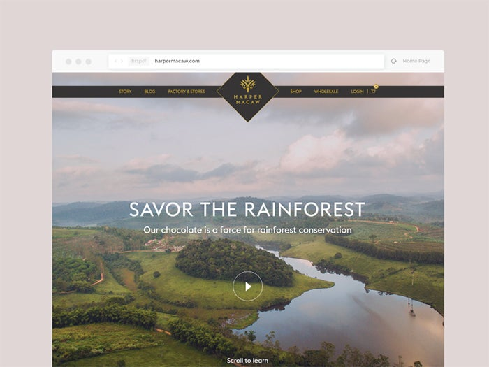
Working on web projects was Grace’s deep dive into the world of UX. Image credit: https://dribbble.com/gracehartman.
When their UX designer abruptly left the agency Grace was working at, she suddenly had to step up and develop a new skill set. “I had to jump in and start working on his website projects. At the time we were using Photoshop, which I was familiar with. I really just dove into the deep end, and found that it was actually a perfect blend of all of skills I had developed. It was a perfect marriage of the physical world in the digital world — implementing my graphic design skills in a digital medium,” she said. This opportunity was really the start of Grace’s journey to incorporating UX into her process and skills.
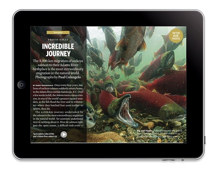
Corey’s work on digital editions of magazines like Macleans was a catalyst to thinking about designing for the best possible user experience. Image credit: http://www.coreybeep.com/macleans/.
For Corey, working on the digital edition at Macleans magazine introduced him to the world of screen-based design. He had an itch to figure out how to make the experience as good as possible for the reader, but didn’t quite know how to articulate these considerations. “I ended up working at Macleans, using InDesign to make the digital replica of the magazine. We’d find ourselves clashing about the best user experience and the best way to do things, and I didn’t always have the vocabulary to share my perspective,” he said. When he was between jobs, a friend recommended a UX course to Corey. “It seemed like a good opportunity to add to my skills and expand my employment options.”
Learning the ropes of user experience design
Corey took the route of more formal education, enrolling in a 12 week part-time UX class. This gave him the opportunity to learn in a classroom setting, and create projects to learn hands on skills. In contrast, all of Grace’s UX learning took place on the job. “Some of the things that helped me were learning the technical skills and software (and continuing to learn new tools like Adobe XD), talking to developers, and practice, practice practice!” said Grace.
“Things like responsive design and how to consider development in a project were the biggest transitions. Overall, the commonalities with graphic design were much larger than the differences. It came naturally to understand your audience, pinpoint the problem, prioritize what’s important for your users, and showcase the company’s visions and values. I was already doing these things in different context with graphic design.”
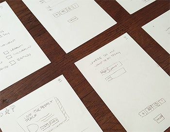

Working through the end-to-end UX process, including sketching, prototyping, and user testing during his coursework, allowed Corey to explore UX and learn new skills. Image credit: http://www.coreybeep.com/git-goin/.
Learning UX formalized a lot of Corey’s approach and expanded his understanding of what UX is. “I didn’t particularly understand UX like a lot of people, I thought it was more about UI (user interface) and designing screens. Taking the course helped to solidify my understanding of UX as a way of approaching problems,” he said.
He also found there was a lot of overlap with how he had been thinking and approaching things as a graphic designer. “When considering the user experience, I had always wanted to say something other than ‘other apps do it this way.’ Learning UX helped to give me the toolset and language to discuss user experience problems with stakeholders in a constructive way. It’s not that I don’t like this because it’s a personal thing, it’s because it doesn’t make sense to the user.”
Graphic design and UX design: The same, but different
“I was so surprised at how much I gravitated to the more analytical side of UX,” said Grace. “I was surprised that I liked it so much and how naturally it came to me, because previously I had thought that UX and developing websites seemed so intimidating and complicated.” Her conversations and collaboration with developers really helped to ease this intimidation, and helped her embrace a growth mindset. “I remember feeling like there were so many more components to one UX project. In my graphic design work, so much of the thinking and detail could go into just one component, like a logo.”
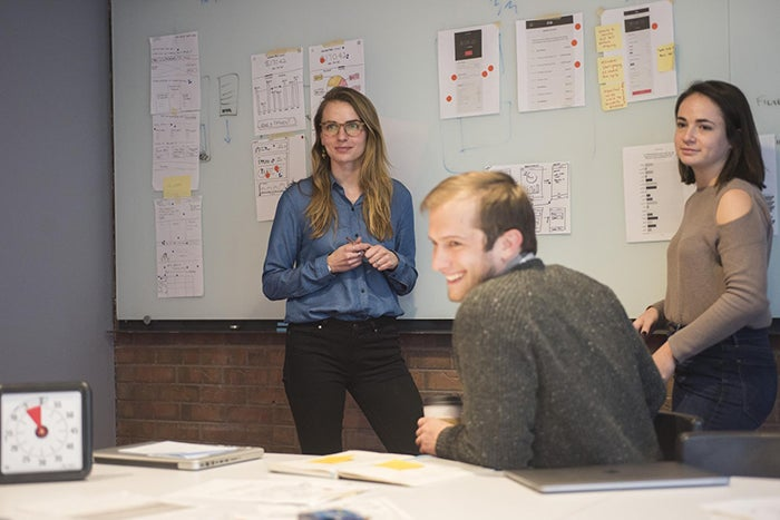
Grace working with her team at Spire Digital. Image credit: Spire Digital.
Corey says that “UX wasn’t what I expected but it’s actually better, it’s more about thinking and more about research and problem solving. UX can also be lots of things, it’s everything from the doors that don’t make sense and are hard to use, to loading screens that don’t give any feedback.”
One of the ways that UX was different to graphic design for Corey was in how he presents his work. “Rather than pitching or selling or convincing like I might have done with graphic design, with UX I’m trying to be neutral and get feedback in order to iterate based on things like usability.”
Corey was also pleasantly surprised to find that there are a lot of resources available. “There’s a huge community of people out there doing their own research that you can rely on in your projects. Doing online research about what people are writing regarding a UX question has been a great workaround for when I can’t do my own direct research on projects.”
Continuing to apply UX
Finding a position that’s the exact right fit can be challenging. When Corey was job hunting, he found that organizations often don’t have a fully robust understanding of UX and what it entails. “A lot of how much my expanded UX skill set helped in the job market was very dependant on hiring managers’ understanding of UX and whether it was more of buzzword for them. I think that people respected that I brought that mindset of UX at least.”
Corey decided to take on a role that was more graphic design-focused, but continues to infuse and incorporate his UX skills into his work. “It gives me a way to structure how I’m thinking, and when people come to me with ideas, I try to put myself into the shoes of the user and how it might feel to them.”

Ongoing work with PlanOmatic has been a fruitful client partnership for Spire Digital. Image credit: https://www.spiredigital.com/case-studies/planomatic/.
Grace’s career has continued to really focus on user experience, with her graphic design skills serving as a solid foundation for her work, especially when it comes to branding. “I have an eye for design, and I’m able to execute on the visual aspects of UX design very quickly. For example, taking an existing brand and style guide and infusing it into a product.”
One of her favourite projects has been working on an online ordering flow for PlanOmatic, a company that serves real estate agents. “They had a very friendly and approachable brand, and we found a way to incorporate that with a flow that got busy users through their task efficiently. We used conversational language and a progress tracker, with a high five animation at the end to give people a sense of accomplishment!”
UX and graphic design, a perfect fit
As Grace and Corey’s experiences show, UX can be a natural complement to or evolution of a strong graphic design skill set. Graphic design is also fantastic foundational skill that will always stand with you, whether you fall in love with UX and pursue that direction further, or you decide to continue focusing on more visual work. Both paths are possible, and in either scenario, according to Grace and Corey, you will learn a lot and push your boundaries as a designer, with some surprises along the way.
For UX insights sent straight to your inbox, sign up for Adobe’s experience design newsletter.