Choose Your Type: How Font Psychology Can Influence Your Design
Learn how font psychology can influence your designs.
As humans, we possess many thoughts and feelings that inherently drive our creative processes, and as a result, some of those observations can lead us to make interesting decisions in our creative work.
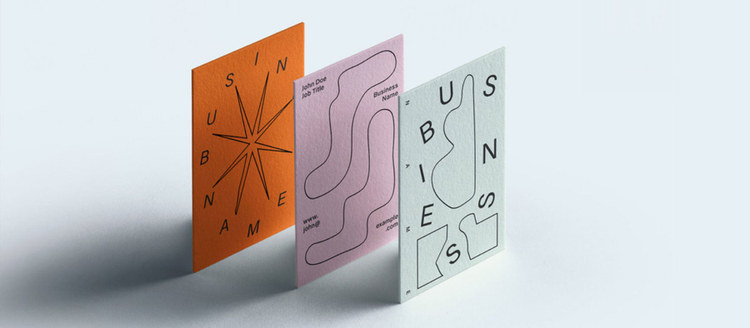
The concept of font psychology has become increasingly important over the years. As the creative world adapts to change, we are continuously learning how to understand and digest typography in various environments.
Thanks to color psychology, we know how different shapes, accents, and shades trigger certain human behaviors. Similarly, our personal relationships to type fuels identity and inspiration.
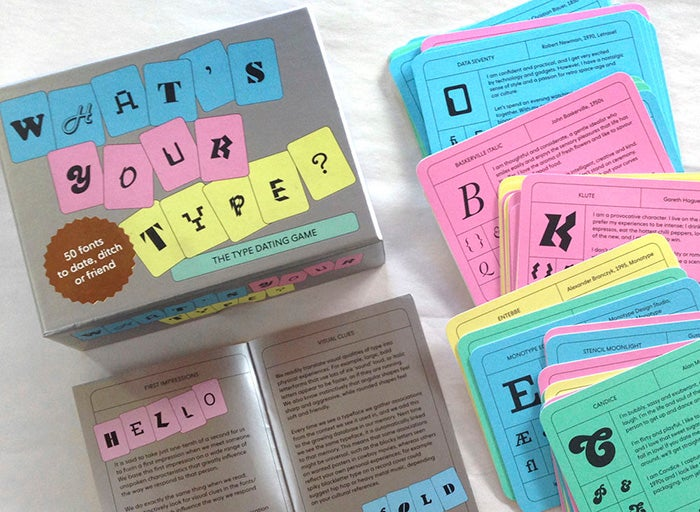
What’s Your Type? – Sara Hyndman.
Designer, writer and speaker Sara Hyndman has dedicated over 5 years of research in preaching the gospel of type. Her mission centers around the consumer experience, as well as providing resources that can inform design decisions, nudge positive behavior, and demonstrate the impact that typefaces have on our everyday lives.
So how do we begin applying font psychology to our design thinking? Tim Brown, designer, author, and Head of Typography at Adobe says, “An artist is successful when they are thought-provoking.”
Here are 4 best practices for utilizing font psychology in your design process:
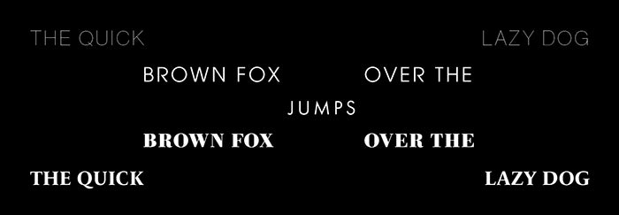
1. Make sure that what you’re making aligns with the tone of how you want people to think and feel.
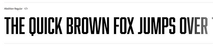
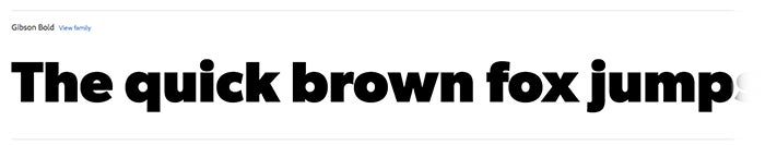
Example #1
Project: International Women’s Day email banner
Audience Tone: Loud, Powerful, Advocacy
Font Characteristics: Sans, Bold, All Caps
Font Suggestions:
Abolition Regular
Gibson Bold
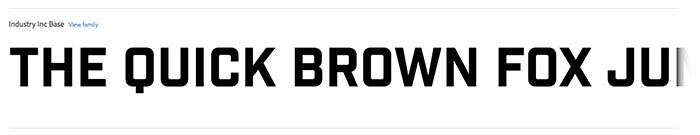
Industry Inc. Base
Want these awesome fonts and more?
Download the font pack here.
2. Find a balance between being conventional and being unique.
Example #2
Project: Zine
Audience Tone: Modern, Timeless
Font Characteristics: High-Contrast, Thin, Sleek
Font Suggestions:
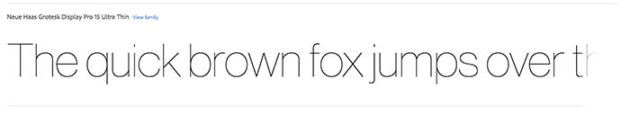
Neue Haas Grotesk Display Pro 15 Ultra Thin
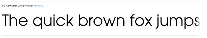
ITC Avant Garde Gothic Pro Book
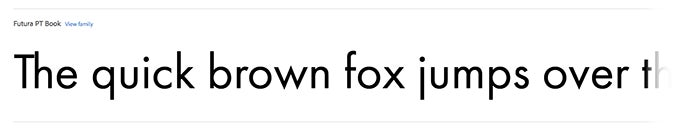
Futura PT Book
Want these awesome fonts and more?
Download the font pack here.
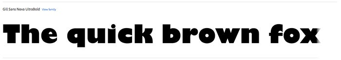
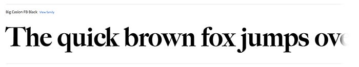
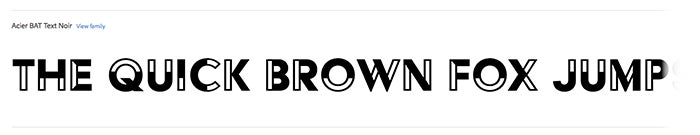
3. Balance fitting in (with what people expect) and standing out.
Example #3
Project: Brand Identity Pitch
Audience Tone: Contemporary, Playful, Vibrant
Font Characteristics: Demi-Bold, Colorful, Outlined
Font Suggestions:
Gill Sans Nova UltraBold
Big Caslon FB Black
Acier BAT Text Noir
Want these awesome fonts and more?
Download the font pack here.
4. Draw inspiration from things like the “thing” you are trying to make, and then make it stand out.
Example #4
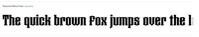
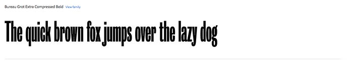
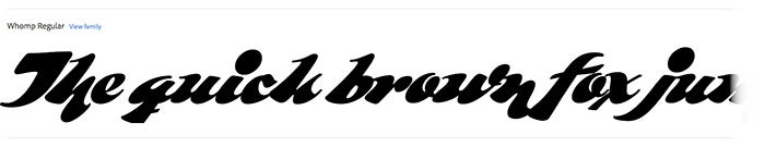
Project: Live Music Poster
Audience Tone: Music lover, Soulful, Fun
Font Characteristics: Funky, Thick, Sans
Font Suggestions:
Taurunum Ferrum Iron
Bureau Grot Extra Compressed Bold
Whomp Regular
Want these awesome fonts and more?
Download the font pack here.