Rusty Letters, Nautical Type, and More
New in Adobe Fonts.
Congratulations, you’ve made it halfway through March. For that, you’ve earned yourself more fonts! We add new fonts to the library on a regular basis, and if you’re a Creative Cloud subscriber these are available for you to try out right away. We’re excited to see these in your projects — have a look and get inspired.
New foundry partner: Meet Typetanic
Typetanic is the independent type foundry of Greg Shutters, based in Chicago. It’s our pleasure to add his fonts to our library.
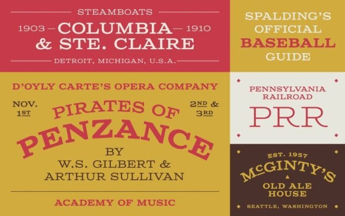
Columbia Titling from Typetanic. Artwork courtesy of Greg Shutters.
By far the most eye-catching addition is Columbia Titling, a dramatic all-caps font based on wood type of the 19th and early 20th century. You can’t go subtle when you don’t have a lowercase, so go all in and enjoy the big serif style of this one.
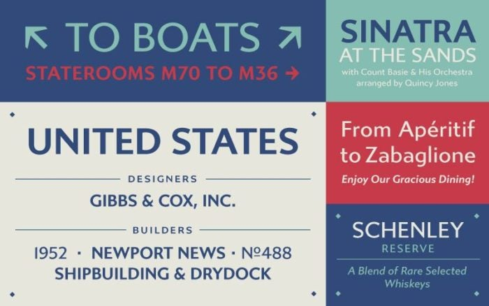
Gibbs from Typetanic. Artwork courtesy of Greg Shutters.
Typetanic fonts seem to take a lot of inspiration from nautical transit and shipping, and Gibbs is perhaps the best example of just how far Greg takes this theme. Named for shipbuilder William Francis Gibbs, this sans serif is inspired by the lettering on the ship that was perhaps the pinnacle of Gibbs’s career, the SS United States. For a fascinating history lesson (and deep dive into how type designers work with historical specimens), look no further than Greg’s specimen book for the typeface.
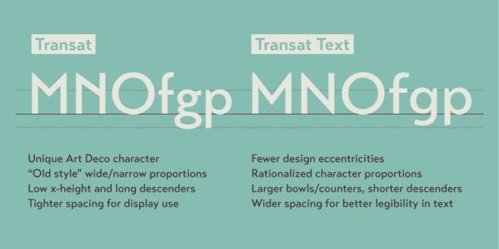
Comparison guide to using Transat and Transat Text. Artwork courtesy of Greg Shutters.
Continuing the nautical transit theme, some of the inspiration for Transat and Transat Text came from Art Deco-era transit signage, back in the age of grand ocean liners like the SS Normandie. The great thing about having two font families here is it enables you to scale up (or back) the quirk factor as you see fit.
New from Dalton Maag
Oscine from Dalton Maag. Artwork from www.daltonmaag.com.
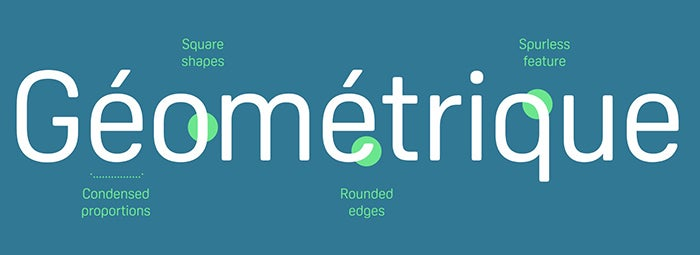
New to our library from Dalton Maag, Oscine is all smooth lines and minimal impact, a dream of a sans serif with some unusual “spurless” features in the lowercase characters that give it a unique look compared to more traditionally drawn sans serifs. In fact, try comparing this to Lemance, another Dalton Maag addition this month that takes sans serif principles in a completely different, more calligraphic direction.
Greg Thompson & More from Type Network
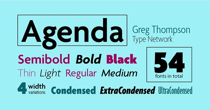
Agenda from Greg Thompson.
We’re delighted to offer all 54 styles of popular sans serif Agenda in our library — as well as four other font families from its designer Greg Thompson. The original inspiration for this dates from over a century ago, to the lettering designed by Edward Johnston for the London Underground. More about Agenda on Type Network.
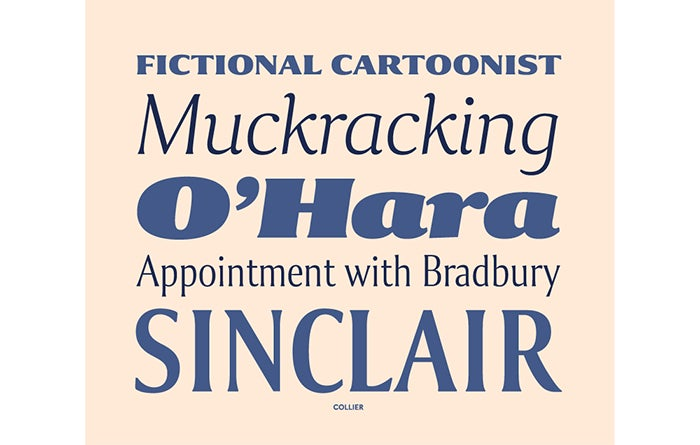
Collier from Lipton Letter Design. Artwork from typenetwork.com.
Collier is an exciting new addition to our library from Richard Lipton. It’s a serif, but barely — using gentle flared shapes instead of dramatic hard angles to define the letterforms. We’ve added all 24 weights of the normal width to the library, with additional widths available for separate purchase.
IvyMode from Ivy Foundry. Artwork from typenetwork.com.
You can’t miss IvyMode — it’s unlike a lot of fonts out there, with a striking design that’s as beautiful as it is attention grabbing. Designed by Jan Maack from Ivy Foundry, IvyMode takes inspiration from Herb Lubalin’s work but with plenty of Jan’s own experimentation lending it a unique look of its own. Read more about the design and its inspiration on Type Network.
New from Floodfonts
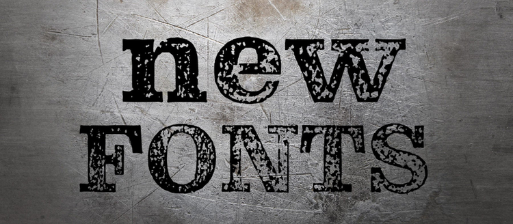
Pulpo Rust (aka Kontiki) from Flood Fonts. Artwork courtesy of Felix Braden.
Pulpo from our new foundry partner Floodfonts is incredibly fun to play with. On its own, it’s a beautiful typeface with all the best qualities of hand-carved wood type. Pulpo Rust is where things start to get fun, with four varying degrees of wear that you can scale up or down depending on how “rusty” you want your letters to look. Check out the Floodfonts website for more info about the very hands-on process Pulpo’s designer, Felix Braden, used to get that warm, handmade aesthetic. (Note that on the Flood site and elsewhere on the web, Pulpo Rust also goes by the name Kontiki.)
Adobe Handwriting
Adobe Handwriting from the Adobe Originals type foundry.
New from Adobe’s internal type foundry — we announced the release of Adobe Handwriting earlier in February, and it was an instant hit for its ease of use and lighthearted style. Look no further than Dan Rhatigan’s blog post for details about the making-of process for this font family.
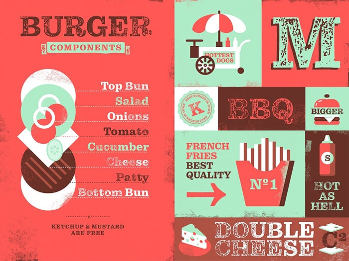
New font packs this month
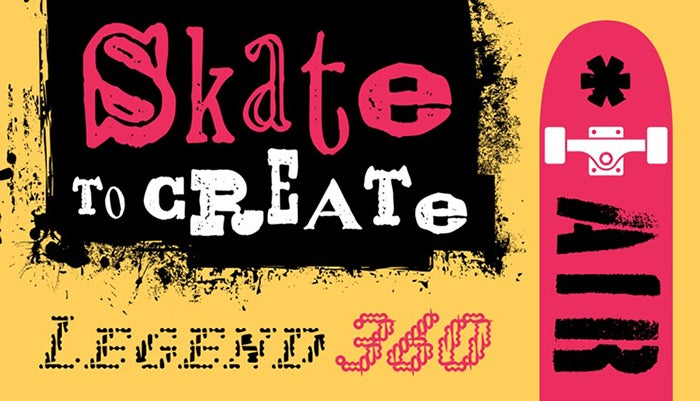
Fonts on a Half Pipe, just one of the three font packs we’ve added recently on Adobe Fonts. Artwork by Anna Eshelman.
We celebrated the release of Rad in our last roundup, and now we’d like to expand your ’90s nostalgia with Fonts on a Half Pipe, one of our newest font packs dedicated to all things grunge. Also in font packs, don’t miss Casual Lettering Looks for a more low-key handwritten approach, and Scribes of Yore for special dress-up occasions. See all our font packs for inspiration and ideas.
Fonts are included with all Creative Cloud plans. See something you like? Log in with your Adobe ID on fonts.adobe.com and activate anything you’d like to try out.
