On Colour In India: A Holi Palette
Asia-Pacific is one of the most vibrant and diverse regions on this planet, and there’s no better way to showcase this diversity than through the local community, local moments and local colour palettes.
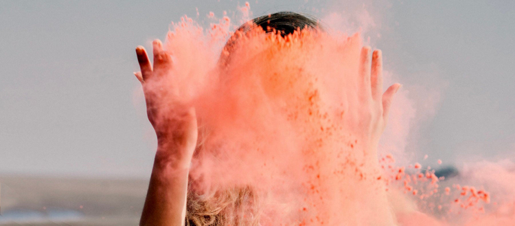
From March to May we’ll share the work of our creative community and showcase the shades and hues of Asia-Pacific. Launching with one of the biggest celebrations of colour – Holi in India – local photographer @Aawaari shares the creative process and one ‘pro tip’ behind her #adobeoncolour photo series.
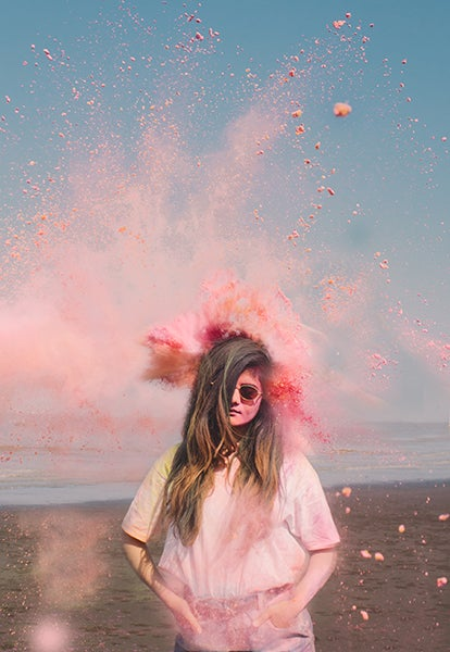
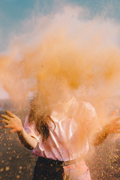
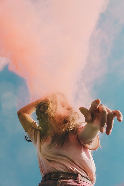
Colours play a very important role during the festival of Holi, a celebration that is incomplete without bright and joyful colours. Similarly, any pleasant creative image is incomplete without beautiful colours. When designing a concept for a photo series, I give significant importance to choosing the palette and prefer muted colours over bright highly saturated colours. Highly saturated colour may help an image pop out in the crowd, but silent colours give an image an artistic feel that’s pleasing to the eye.
Creating an image with a soulful colour palette is not only artistic but a portrayal of one’s mind and thought process. From the day I started learning and using Adobe Lightroom, I have always tried to give a subtle, artistic feel to my photos by adding a peaceful colour palette – all colours are getting the same attention in the photo yet none are popping out too much. Holi is a brilliant opportunity to paint those showering colours in your digital canvas and here I’ve done the same.
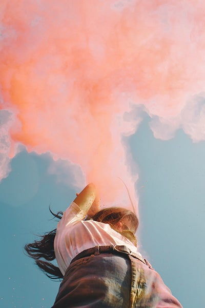
Capturing a nice composed frame doesn’t always make your photo creative, but understanding the way colours interact in your photo does. Camera calibration is the first step I choose to work on. I always prefer shooting in raw format, as a raw photo has the capability of preserving the utmost details and colours in photos. It also gives me an opportunity to work on the colour profile.
Setting the right camera profile while editing my photos will decide in which direction I take the colours and mood of the photo. Based on the time, place and lights in which photo was taken, I decide on the right colour profile to help me create the desired aesthetics.
After this I play with colour hues, saturation and luminance as this is the second most important aspect to bring out the desired colours. It’s also where I mute colours to enrich the overall aesthetics of an image. I’ll then finish off working around the highlights, shadows, darks and whites as well.
One pro tip that I’d like to share: to make colours look mute, decrease the image’s contrast 🙂****