Utility above all else: Designing for voice with Adobe XD
When designing for Voice, utility is paramount. Deloitte’s Jeremy Williams talks key principles & walks us through the process of designing a VUI.

Utility will determine the future of Voice
Just because you can build something, that doesn’t necessarily mean you should. So how should we approach designing for Voice in a way that lets us experiment with new ideas and concepts, but maximize our probability of success and minimize waste? The answer may not actually be that surprising.
First, a note on the importance of Voice. Voice assistants were one of the biggest trends of 2018, and if sales growth continues at the same rate year-over-year then smart speakers are set to be the fastest-growing connected device category worldwide in 2019. A third of U.S. consumers already use voice assistants weekly (on mobile, computer, or voice-assisted speaker). In other words, Voice is already a big deal — and we can expect it to become even bigger.
This is understandable when we think about some of the wider trends of interface design, such as accessibility playing an increasingly universal role. For example, Voice is a key channel for users with visual impairments or motor disabilities. The development of AI, machine learning, and natural language processing is also enabling Voice to become more intelligently applied to real-world scenarios. Although still relatively new, voice assistants are already making a big impact on the way we interact with technology
That’s all very well, but there’s also reason to challenge the rapid adoption of Voice. The opportunity is huge and there are countless potential use cases for it, yet let’s not forget that the majority of people who own a smartphone still don’t use the voice assistant (57 percent), and this figure increases for tablet (71 percent) and computer (81 percent). It’s likely that the popular adoption of voice-enabled technology in 2018 may have been significantly influenced by price promotions (especially, for example, around Black Friday). Many people don’t even know that their smartphones have voice recognition, and those that do use voice assistants currently prefer to use them to simplify everyday tasks such as making search queries, playing music, and making phone calls. It seems that Voice still has some way to go to meet its potential to create truly unique and valuable experiences.
This is where utility is critical
When designing for Voice, discovering and defining a useful, creative, and unique use case is the most important first step. This means following the same design process that we would use when designing for screen, underpinned by the same two general principles (in order):
- Design the right thing
- Design it the right way
The difference with Voice is in the way these principles are tested. To demonstrate this, I’ve created a prototype for Voice using Adobe XD. The Voice feature was released for XD in October 2018, and it lets you create Voice interactions quickly and simply. This is important for testing concepts early with users, primarily to establish the viability of the concept, but also to understand how to craft the conversation. Getting to know voice triggers in XD is getting to know how to structure a prompt, how to keep instructions comprehensible, how to approach diction and tone, or how to keep consistency whilst catering to a wide range of possible user needs. It’s about finding out what makes users comfortable, what makes them uncomfortable, how their surroundings affect their responses, or determining whether your product is a suitable extension of the brand’s personality. It helps ensure that you’re designing for the way people talk, not just how you want them to talk.

Designing a voice user interface
So, resulting from some brief research around the office, the concept I came up with is a voice-assisted Ikea instruction manual for Amazon Echo Show (no more fiddly page turning when you’re knee-deep in a half-built wardrobe!). The choice of device stems from the need to have a visual element as well as voice. This is one of the times when I think the combination of interfaces has particular value. The idea is also built on the hypothesis that voice assistants are generally useful when a user’s hands are busy. Other examples include when driving, holding a baby, cooking, etc. In fact, in these scenarios, the user often has needs that only Voice can meet.
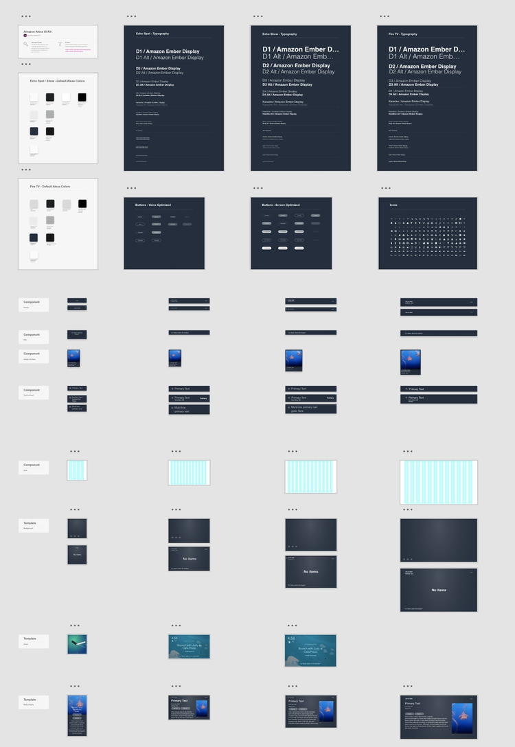
Alexa UI kit
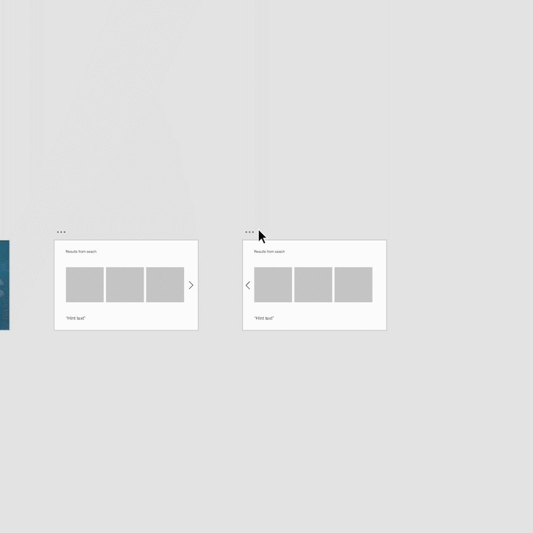
Once the basic concept was conceived, I sketched some wireframes to start testing the viability of the use case. I used the Alexa UI Kit for XD to ensure the artboard was the correct size for the Echo Show 2 and to get things off to a quick start. Then it was simply a case of creating a few screens to test.
Wireframing and prototyping

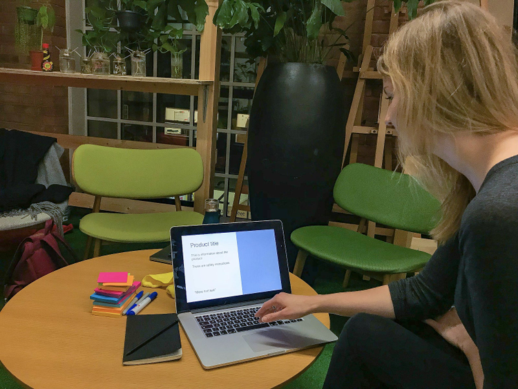
You can see how straightforward it is to mockup a Voice prototype in XD. I did some guerrilla testing and was able to make updates to the journey and voice commands on the spot, based on the user’s feedback. For example, users struggled to pronounce the names of the Ikea products themselves, so I changed the response to a number corresponding with the correct product on the screen.
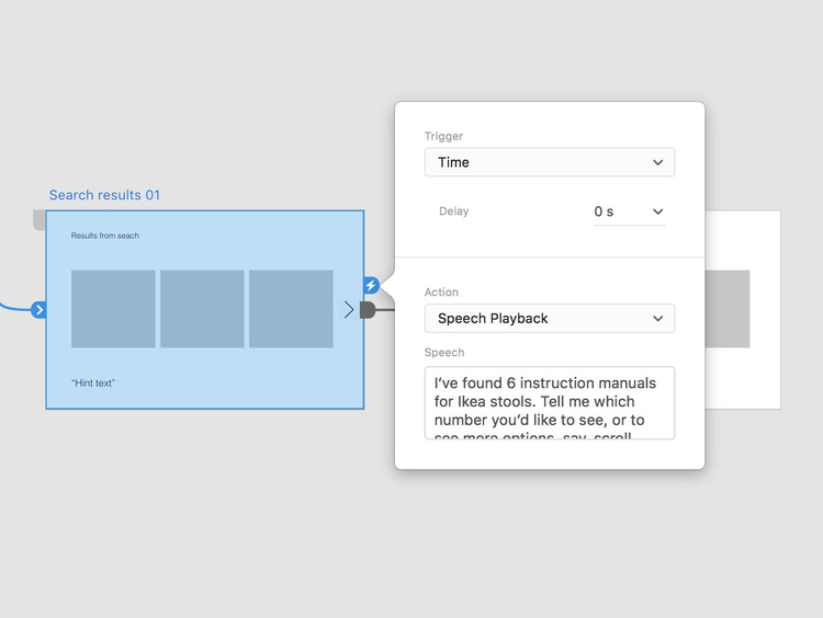
Speech playback and voice triggers

Having used voice triggers in XD a few times now, it’s always interesting to see how differently even the simplest phrases can be interpreted. The importance of well-crafted copy is already widely recognized in UX, and Voice amplifies this need through the added dimension of speech. It’s helpful to start considering these factors as early as possible in your designs, and I recommend establishing a Voice guide at the outset that informs your branding and UX decisions around your Voice experience (another piece of good practice borrowed from screen design).
The most important feedback I received, however, was about the utility of the concept itself. After testing the prototype, 95 percent of users confirmed that they would use this product in their own home. Although only an indication of a successful use case, this is a solid start to justifying the proposition. Further iterations and testing will add validity, or otherwise provide feedback for changes.
User testing

Throughout testing, I updated the user journey, voice triggers, speech playback, and UI design. This resulted in the following prototype.
To return to my key message, it’s still a common pitfall that companies wishing to improve their customer experience simply turn to a piece of trendy tech and jump on the bandwagon, without the required thinking around the context in which it might be used. Experimentation and innovation are important, but so too is the success of the final product. This is why validating the use case early on is critical, and one way to get it wrong is to neglect early and continual testing. It’s no different for Voice. Designing with XD accelerates the iterative design process for this increasingly important channel. ‘Voice of the customer’ now takes a whole new meaning.
All views expressed above are the author’s own.