Three Exemplary Typefaces for User Interfaces

With the growing popularity of type design, the sea of typefaces from which to choose gets bigger every year. I’ll be the first to admit that, at times, the waters can be difficult to navigate. There are a lot of variables one must consider when selecting type, and these can be a struggle to prioritize.
I’ve chosen a few exemplary fonts to serve as a reference for your next project. I believe each of the following three typefaces possesses the necessary qualities for distinguished employ within the realm of user interface design.
FF Meta

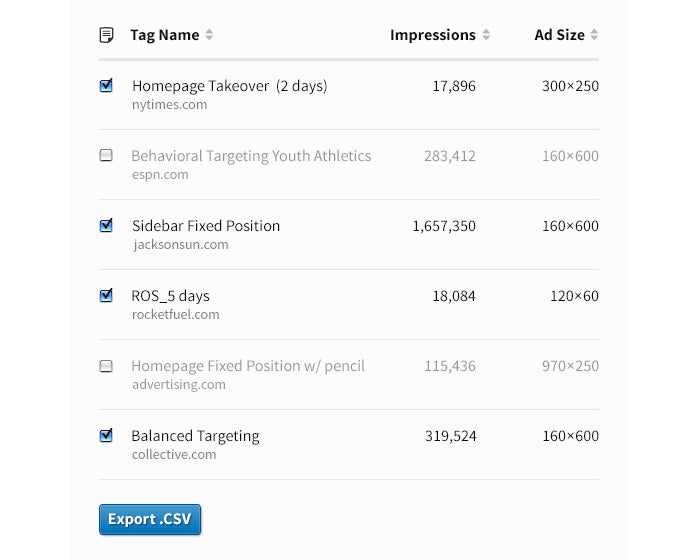
This example uses FF Meta Normal and Condensed Bold, plus Small Caps.
Originally intended for use at small sizes on low-quality paper, Erik Spiekermann designed FF Meta to be a neutral typeface that would save space while remaining easy to read. With its flared strokes, angled terminals, open apertures, and sharp intersections, it possesses highly distinguishable letterforms and an approachability that belies its ruggedness.
FF Meta’s unique charm and combination of features lends it an adaptability that is likely responsible for its widespread popularity. Over the years, an untold variety of corporations, publications, and websites have adopted it. Typographers and soccer fans alike will appreciate its prominent and tasteful use on the website for the famous EPL club Arsenal.
Adobe Fonts includes a manually hinted version of FF Meta in the library that is available in a variety of weights and styles (including true italics), making it well-suited for a design project with a variety of typographic needs.
Source Sans Pro

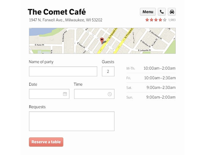
This example uses Source Sans ProRegular and Bold.
Source Sans Pro is Adobe’s first open source typeface family. Designed “primarily as a typeface for user interfaces,” Source Sans Pro features a hardworking simplicity, elegantly drawn letterforms, and a familiarity derived from allusions to the “legibility of twentieth-century American gothic typeface designs.”
With comparatively wide proportions, large x-height, and balanced upper and lowercase forms, it remains highly readable in both shorter text strings and longer passages. It became a staple of Stanford University’s identity, recommended for use in the school’s print and online communications.
Manually hinted for cross-platform consistency and available via Adobe Fonts in a whopping nine weights (with true italics), Source Sans Pro is an attractive, clinical typeface that can harmonize an interface without drawing undue attention to itself.
LFT Etica

This example uses LFT Etica Book and Bold.
LFT Etica by Andrea Braccaloni is a brilliant option when you find yourself at odds with a client who really loves Helvetica. Billed as a cure for thoughtlessly prescribed “common” and “cold” grotesque sans serifs (like, ahem, Helvetica), LFT Etica is a delightfully understated typeface. It retains the neutral appeal of Helvetica but does so in a way that is much more welcoming. It’s got an endearing, unexpected warmth.
Unfortunately, LFT Etica does suffer from a visual conflation of its capital “I” and lowercase “l” letterforms — an affliction that also befalls its austere grandfather, Helvetica. It makes up for this drawback with open counters, large apertures, generous proportions, a large x-height, and personality.
A place for typography in UI design
By some accounts, web design is 95% typography. And while I don’t intend to examine the scientific truthfulness of this sentiment, I think it is difficult to overstate the importance of good typography. It operates at a functional, almost subliminal level distinct from decidedly more ornamental concerns like graphics, texture, and color. The quality of your typesetting can support your client’s message (and their application’s functionality) — or can detract from it by drawing undue attention to itself.
Even the most tasteful color scheme or well-apportioned graphical treatment cannot make up for a site or application that is difficult to read. Simply put, poor legibility is not a mistake that’s easily forgiven or overcome. Having a solid grasp of typographic principles will do a great deal to steer you in the right direction — and it never hurts to have a few favorite fonts in mind, either.
This article originally appeared on the Typekit blog in 2013. We’re sharing it again (with a few edits) because the advice still holds up! All the fonts mentioned here are available on Adobe Fonts.