Tony Hawk Skate Jam Contest Winner’s Design Soars to New Heights in 3D
Graphic designer Dustin Knotek reveals how Dimension helped him visualize his Birdman-themed deck design in 3D for the skateboard legend’s new mobile game.

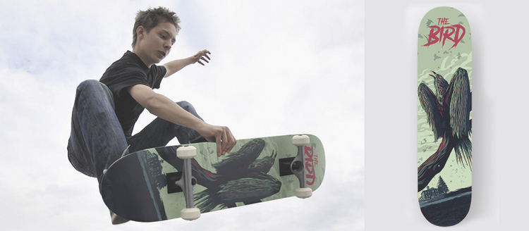
Dustin Knotek’s winning skateboard design, visualized in 3D using Adobe Dimension.
In February, Adobe partnered with skateboarding legend Tony Hawk to challenge designers worldwide to create a skateboard deck to be featured in his new game, Tony Hawk’s Skate Jam, available free on iOS and Android. More than 800 of you did so, filling the contest gallery with some amazing artwork, but the winning design belongs to Dustin Knotek. By day, Dustin is the creative director of Florida-based tubular bandana firm Hoo-Rag.
We caught up with Dustin to find out how he first created his winning design in Adobe Illustrator and mobile app Adobe Illustrator Draw, then produced a striking visualization of how the deck would look in real life using 3D compositing and rendering software Adobe Dimension.
From The Birds to a design for the Birdman
“I grew up skateboarding, so I’ve been around skate culture my whole life,” says Dustin. “We used to get the skateboard catalogs as kids and go to skate shops all the time. Tony Hawk was always the main man.”
Dustin’s winning design riffs on both Tony Hawk’s nickname, ‘Birdman,’ and classic 1963 thriller The Birds. “I wanted something associated with [Tony Hawk’s] brand, his look,” he explains. “I knew there were going to be a lot of bird designs, and I wanted to do something different, so I mashed up my love of movies and Hollywood culture to do a kind of Alfred Hitchcock spin-off.”

Line work for the skateboard deck. Dustin created the image on an iPad in Illustrator Draw.
The line work for the image – a suitably gaunt-looking crow perched on a tree branch in front of the Potter Schoolhouse, the location of one of the most iconic sequences in the movie – was created in Illustrator Draw, with Dustin developing the design on his iPad before and after work.
“[Illustrator Draw] has been awesome for me, mostly because I can work on the move,” he says. “I’ve used Wacom [pen tablets] and they’re great, but the functionality of the Apple Pencil is so close to real drawing.” Dustin then transferred the file into the desktop version of Illustrator to clean up the design and tweak the colors, and to add the text.

The finished design. Coloring and text work was done in the desktop version of Illustrator.
From 2D design to 3D visualization with Adobe Dimension
The next stage of Dustin’s design process was to create a visualization of the deck in action, which he did using Adobe Dimension and royalty-free asset library Adobe Stock.

Dustin was able to search Adobe Stock for a background photo from directly within Dimension.
“I looked around until I found an image where the bottom of the skateboard was facing the camera, grabbed it off Adobe Stock, and went from there,” he says. “The 3D skateboard was also a free resource. Dimension matches lighting and perspective automatically, so you can just drag [the model] right in, and map on your design as a .JPEG or .PNG image.”

From 2D to 3D in three easy steps: Dustin positioned the 3D skateboard in Dimension.

He then mapped a bitmap of his deck design to the underside of the board.

And, finally, Justin scaled the 2D design to match the 3D model. Job (well) done.
Once Dustin rendered the 3D skateboard in Dimension, he imported the render and the original photo into Adobe Photoshop. The only work required to complete the visualization was to create a cutout for the part of the image where the skater’s fingers overlap the board.

With the render complete, the only other task was to create a cutout for the skater’s fingers.
While Dustin estimates that he spent around eight hours creating the design, the 3D work took just 10 minutes.
“What [most impressed me about Dimension] is the rendering quality,” he says. “I’ve worked with 3D a little bit, and I know how hard it is to get the lighting right. In Dimension, you don’t have to [fiddle with] colors or lighting: it’s all done for you. It’s pretty sick.”

The finished visualization: Eight hours of work in Illustrator, but just 10 minutes in Dimension.
An “awesome” tool for graphic designers
Although Dustin had experimented with other 3D software, he says that he never got deeply into 3D because he felt daunted by the complexity of achieving the look he wanted. Now he plans to adopt Dimension as a standard part of his workflow.
“In the past, if I was mocking up packaging, I’d have to find [a 2D template] on the internet. Now I can do all of that in Dimension and have my own original composition, rather than the same mockup that everyone is using,” he says.
“Dimension is [great for] putting the finishing touches to a portfolio, or for branding design,” Dustin concludes. “For a graphic designer like me, it’s awesome!”