I’m excited to bring you the first in a new series of blog posts from the ACR team! “Adobe Camera Raw” refers to both the ACR plug-in and the imaging engine that drives the editing tools built into that plug-in and all of Lightroom. I’m Max Wendt, a Senior Computer Scientist on ACR and the lead engineer of the Texture project. I’m in my 22nd year at Adobe, and have been a member of the ACR team since 2012. You may remember me from such publications as the “Enhanced Profile Software Development Kit.” (what do you mean, you didn’t read that?!)
Kidding aside, some of my past projects include implementing the Camera Raw Filter in Photoshop, doing raw camera support, and making the Adobe Raw Profiles, including Adobe Color.
Today we are introducing a new control called “Texture” in Lightroom (on Mac, Windows, iOS, Android, and ChromeOS), Lightroom Classic, and Camera Raw. We’ll start with a bit of background of the feature, and then I’ll show you some tips and tricks to help you get the most out of Texture. Let’s dig in!
How did texture start?
In my own photography, I often do headshots and portraits. While there are no shortage of ways to do extensive retouching in Photoshop, we have had many requests for a less intense — and faster! — way to get a high quality skin smoothing result right in Lightroom and Camera Raw. Texture is the result of this request and we’re very happy with it. Photoshop may still be needed for some workflows, but we think that Texture will be great for many of your images. Better yet, it’s fully non-destructive.
Early on in the development process, “Texture” was just “Smoothing.” We wondered what would happen if we made the slider work the other way: can it be used to enhance the Texture rather than diminish it? It turned out that it could, and it worked really well. I used Texture extensively in my personal work throughout development—both to smooth and enhance details—and it quickly became a feature I could not live without.
Fun with frequencies
Before we dive into just what Texture is, it’s important to note that nothing I could write here can describe what Texture does better than just experimenting with it. To reappropriate the old saying, talking about image processing is like dancing about architecture. So: go! Play! See how it works on your own images!
You may notice that Texture shares some characteristics of other controls. One of the most common responses to positive Texture (the range from 1 to 100) is “it’s somewhere between positive Clarity and Sharpening.” Negative Texture (the range from -1 to -100) is sometimes compared to Noise Reduction. So just what is Texture doing? To understand that, let’s explore a term you may have heard before: image frequency.
Just like you can break an image into color channels (for example; red, green, and blue), an image can also be broken up into different “frequencies.” There are high frequency details, mid frequency features, and low frequency areas; together, they all make the image.
Here’s a concrete example: you’re probably already very familiar with a common high-frequency control: Sharpening. Sharpening accentuates the edges and fine details, which is really just another way of saying “high frequency components.”
For example, take a look at the shrubs here:
With some Sharpening applied, the edges are enhanced, and the shrubs get more defined:
You can see that the noise in the shadowed area starts to get a bit “enhanced” as well. That’s why there are masking tools for Sharpening! But because we’re just trying to look at the image in terms of “frequencies,” let’s go ahead and crank it up to an insane level:
The noise begins to overwhelm the actual image detail. Again, this is just an experiment: no pixels were permanently harmed!
Okay, so those are the high frequencies. Let’s reset the Sharpening, and apply Texture +100:
The noise is largely untouched, and the medium-frequency features below it are enhanced: we’ve made changes to one set of frequencies without affecting the others
This animation can help illustrate the difference between the details of the original photo, with Sharpening applied, and with Texture applied. Note how Texture doesn’t exaggerate the noise.
Next let’s explore an image where negative Texture (Texture applied with negative values, resulting in a smoothing effect) are applied.
With Texture -80 applied:
Notice how Texture just smooths out Jennifer’s skin tones without obliterating the fine details in her skin. She still looks like an actual person, and not a plastic alien. And yes, this really is the effect of just dragging that one global slider: easy!
Here I’ve zoomed in a bit to show the effect of negative Texture. Note how the eyelashes, pore details, and other natural skin characteristics remain, even as the skin is softened.
It’s not just global!
Texture is available as both a global slider and a local adjustment. We were able to get a good result in the last example with just global Texture, but let’s look at using local Texture. In this photo, we don’t want to use just negative Texture to smooth things – we definitely want to keep the texture in OD’s beard. So we’ll use two different selection brushes, the first to apply negative Texture to his skin, and the second to add Texture to his beard and lips.
This is kind of an over-the-top picture, so let’s really heighten this. I’ve started by using the adjustment brush to apply Texture -100 to OD’s head, neck and shoulders. I’ve avoided his beard, lips, and nose. This evens out areas that are smooth.
/Then, we can heighten the effect on his beard and lips by applying Texture +100 to them.
/By applying Texture selectively, we’re able to both smooth some areas while accentuating others.
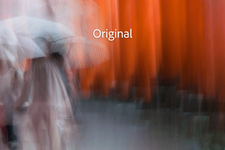
Let’s look at another example of local Texture. I often enjoy making intentional camera movement (ICM) images. While I don’t have any “rules,” I do tend to focus the lens before making the photo; I like having sharp lines among the blur.
I’m happy with this image overall, but it might be nice to have a softer feel to the blurred sections, so let’s brush on some Texture -70. The result works, but I want some areas to have even less detail in the blurred section. To accomplish that, let’s make a new brush correction and fill in some of the same areas with another Texture adjustment. Note that this second correction also uses Texture -70, which makes Texture in those areas add up to… -140? That’s right! Like most of our local corrections, you can build them up to exceed +/-100. There is a point where additional local corrections will taper off and become less and less effective, but in general, you can turn them up to 11 like this.
Finally, I used some positive Texture to enhance those sharp squiggles and bring out a bit of additional detail in the people walking through the frame.
/Watch how the red gates become progressively softer and then in the last step details are brought back out of the base of the gates and the people.
When using Texture as a local correction, make sure it doesn’t bring out unwanted image noise. Depending on your camera’s sensor and the ISO settings, sometimes the character of the noise falls into the mid-frequency range that Texture affects. In large areas of similar tonality, like skies, there isn’t really any benefit from using Texture on them. In those cases, it’s best to apply Texture where it will have an effect, and to make sure it doesn’t enhance your noise.
(…and I can tell what you’re thinking: you can use negative Texture as an alternate noise reduction tool. Overall, it’s less effective than the dedicated noise reduction tools. That said, go ahead and play with it if you’d like. I never want to discourage you from experimenting and trying new things!)
Clarity vs Texture
Clarity is a stronger control than Texture, and that’s a good thing. Texture is more subtle, and sometimes you need something stronger. Clarity can bring out changes in larger areas of tonality, and will change the luminance and saturation more than Texture. Texture and Clarity are fundamentally different tools, and they each have their own strengths.
How can you tell when to use which one? Texture is best for making subtle adjustments to those mid-frequency features. Clarity is best for making stronger adjustments to a broader frequency range, including some lower frequencies.
Times when Texture may be better:
/In this zoomed in detail section of the photo, you can see how clarity introduces some grunge while Texture enhances the details without the grunge.
Here’s an example of using negative Texture for a city photo. I was at Shibuya Crossing one night without my camera, but I was able to capture this shot with my phone:
I wanted to blur the background a bit more than my tiny phone camera/lens would. I first tried negative Clarity, but it resulted in too much of a smooth, pastel look. I then tried negative Texture and found that it preserved the quality of the city.
/Compare how the city details in the background look between the original, and the effects of negative Clarity and Texture.
You may prefer the Clarity version and that’s fine: we’re here to make tools you can use to express your own vision. Clarity isn’t going anywhere!
Here is an example when Clarity is a better choice. Texture only has an effect on the small area that is in focus, but positive Clarity can enhance this background:
Using Texture and Clarity together
Because they target different areas and make different kinds of adjustments, it is often best to use both Texture and Clarity; they work hand-in-hand.
For most of my retouching, I use both Texture and Clarity. The blog team asked me for a headshot to go along with this article, and I haven’t done one in a few years, so… new headshot time. Like most photographers I know, I hate having my picture taken, but here we are.
And if I need to have a photo, of course I’m going to use Texture on myself. As I’m sure it’s clear from the photo, I’m no model. I set this shot up in my living room, using a sharp lens set to f/8.0 to make it easier to get the focus right when shooting on my own. (full disclosure: my daughter came home while I was doing this, so she pushed the button for me.)
For better or worse, modern cameras do a great job of recording every little thing you point them at. Using a sharp lens, a reasonable aperture, and a medium-small softbox brought out a lot of detail in my face.
/To start, I added a radial selection with Texture -50 over my face, and used the brush within the radial selection to remove the effect from my eyes, eyebrows, lips, and nostrils.
This just evens out the skin tones a bit and fills in the pores a little; I still look like a real person, Texture is just giving me a bit of a hand.
This is a reasonable start, but I want to even out the shadows under my eyes a bit. This is where negative Clarity is useful. Switching to the adjustment brush, I added some Clarity -30 brush strokes under my eyes. This evens out the shadows and highlights a bit. I also added more Texture here (-50) to help with those eye bags a bit more.
I then smoothed my neck just a touch more by adding another adjustment brush stroke set to Texture -40 and Clarity -30. I used a brush Flow setting of 4 and built up only as much as I needed.
Finally, I added a touch of Texture to my eyes.
/Watch as multiple different applications of Clarity and Texture add up to greatly improve this self portrait.
I’m still not going to be getting any calls to do modeling, but with just a radial filter and a few brush strokes, I was able to make a reasonable result.
Here’s a landscape example of using both Texture and Clarity:
/Using only one or the other isn’t as effective as using both.
/This is Texture +30 and Clarity +30.
Zoom Level for Texture?
Like Sharpening, the effects of Texture are often best seen at 1:1 view. But because Texture works on mid-frequency elements, make sure to zoom out a bit, too.
If you zoom in too far, it looks like you might want to go all the to Texture +100 on this photo:
Zooming back out to 1:1 shows that Texture +100 looks a little too cooked:
/Zooming all the way back to fit view shows that Texture +100 is definitely overcooked.
/Zooming in is a good idea in order to really see what Texture is doing, but make sure to evaluate your changes at 1:1 and smaller zooms as well.
Parting thoughts
I hope you found this introduction to Texture useful, and that you enjoy using it on your own photos as much as we do!
Texture is a unique control, and while it shares similarities with Clarity, Sharpening, and even Noise Reduction, it’s not a replacement for any of them. As we’ve seen, they all work very well together, particularly Texture and Clarity.
Remember that Texture is available as both a global control and a local one. If you haven’t done much with local corrections yet, now is a perfect time to learn.
As you continue to play with Texture, please note that the numbers I gave in the examples above are NOT meant to be “the answers.” Each image and application will need a different value, and your own vision and taste will dictate that.
The best way to discover your vision is to experiment. Texture is fully non-destructive, so don’t be afraid to explore and just try things. Go too far, pull it back, go too far again. You’ll find what values work for you. It’s all about your own vision.