Climate Crisis and Creativity: How Nature Drives Design Through Color and Perspective
Adobe Stock: The Ocean Agency.
Our connection with the planet is more important than ever. The more we are constantly connected to the digital world, the more we can feel disconnected to the natural world. Consumers are now seeking engagement with brands that provide for their material and spiritual needs as they look to nature to provide sanctuary from their always-on networks and high-speed lifestyles. Adobe Stock identified this as a 2019 trend, Natural Instincts.
Innovative storytellers have taken notice and are tapping into this instinctual trend more than ever, by using color and camera perspective in nature to convey meaning and elicit emotion. This month, we partnered with Adweek to dive deeper into the power of nature & color in design, with guests from the Pantone Color Institute and The Ocean Agency.
Laurie Pressman, Vice President of Pantone Color Institute, spoke about color being the soul of a brand’s identity. It has the silent power to change behavior, drive customer loyalty and influence the way we see the world around us.
She states, “There is nothing that conveys the freedom, the fun and the ability to completely just decompress than thoughts of being in nature. Trends, of course, play a big role in color choices and this trend is all about relevancy. If you want to be part of the conversation today and connect and influence consumers, you must ensure that you stay relevant. As you look at trends in color in the summer of 2020, nature is definitely calling.”
Laurie describes this through the lens of Pantone’s 2020 color trends that embody colors and patterns found in nature, such as greens, blues, florals, raw earth and of course this year’s color of the year “Living Coral“.
We’ll be waiting with anticipation for Pantone’s 2020 Color of the year announcement on December 5th!
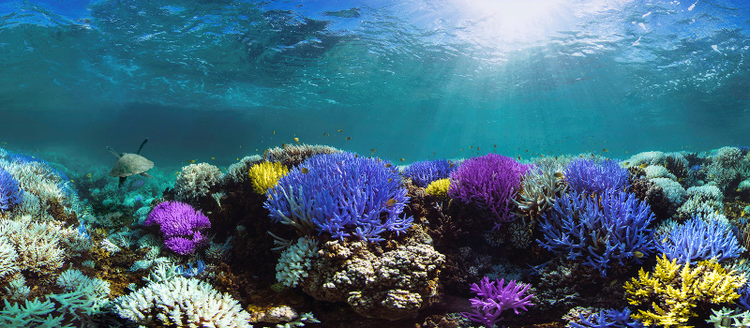
Meanwhile, Richard Vevers, CEO & Founder of The Ocean Agency spoke with us about their work using color as a catalyst for environmental change. Their mission is to use color and creativity to move the world to take environmental action. Their newest campaign “Glowing Glowing Gone“, in partnership with Pantone Color Institute and Adobe Stock, stems from a phenomenon first documented in their Emmy winning Netflix documentary Chasing Coral. When the ocean warms due to climate change, corals turn fluorescent colors in a desperate bid to survive. They are screaming in color before bleaching and ultimately dying. The Ocean Agency worked with Pantone Color Institute to identify these glowing colors through their fluorescing imagery on Adobe Stock and created a custom color palette.
Richard states, “We thought we’d take these colors that were essentially the colors of climate change and see if we can turn them into the colors of climate action… and as one of the first phases of the campaign, we’ve been challenging the creative community to use these glowing colors to create art and design that make the world take notice of the glowing corals and the urgent warnings they represent.”
There are many more phases planned for this color driven campaign, including brand & product involvement, as well as the artwork being used as a catalyst for change in key ocean conservation policy events in 2020.
Lastly, Brenda Milis, Principal of Creative Services and Visual Trends for Adobe Stock tied it all together, describing how visuals inspired by nature & natural elements connect with viewers on a deeper, more spiritual level. She spoke to this trend being the most evolved moment in the wellness movement. Additionally, she identifies one of my favorite iterations of this trend called “The Phygital”, that connects technology and nature through beautiful, mystical and creative patterns and textures created in the digital world, but inspired by the natural world.
She describes this trend element, “As Natural Instincts visuals soar in popularity and digital workflow scales along with it, we are seeing nature inspire graphic patterns and saturated color palettes in purely digitized and hyper-real visuals that are fantastical but very much aligned with patterns we find in the real world across all elements including plants, rocks, water, or air.”
Harnessing the power of color and nature in visuals connects us more deeply as viewers, creators, and consumers to a more grounded and inspired place. At Adobe Stock we’ve partnered with Pantone Color Institute, The Ocean Agency and many more contributing artists and partners who believe in the power of creativity as a catalyst for change. As a viewer, these natural visuals and colors found in nature can inspire rising and taking action… OR they can give you a moment to just catch your breath… to take a pause on the page or in your scroll – and in these quiet moments, you can make the most impact.
In fact, I think I’ll stop and take a breath right now….
Watch on-demand to learn about the Natural Instincts trend and how the design principles of color as a language — and perspective as a way of seeing — can tell a story that connects with consumers on a deeper level.