Contributor Spotlight: Roverto Castillo and Celebrating Día de los Muertos

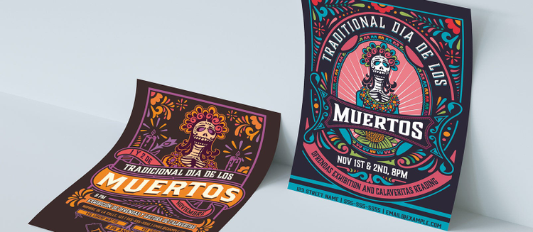
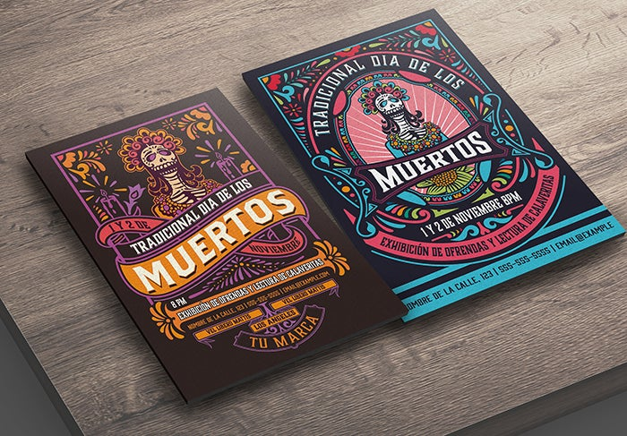
This month, we worked with Adobe Stock artist, Roverto Hartasanchez Castillo, on a new set of custom templates to celebrate Día de los Muertos, also known as the Day of the Dead. This Mexican holiday takes place on November 1st and 2nd and is a joyful remembrance of friends and family members who have died. We had a chance to interview Roverto to discuss his design style and his inspiration for these templates, including traditional elements such as papel picado (decorative cut paper), calaveras (sugar skulls), and ofrendas (altars). Read on to get an inside look at his process and how he developed these templates for Photoshop and Illustrator.
Hello Roverto! Can you tell us a little about your background and how you got started in design?
I’ve always been a creative at heart, but I studied to be a software developer and did a master’s degree in conceptual design. I worked as a computer programmer, and even had a stint as a kite designer (life takes many unexpected turns!) before I became a full-time designer. Now I can finally call myself a real illustrator!
Any tips on researching illustration inspirations?
In my case, I have always been a fan of vintage and old designs and type and my work reflects that. I like to dive into the jungle of the internet to find old ads, books, etc. Using social media platforms such as Pinterest or Instagram is a good starting point to see and collect inspiration for future works.

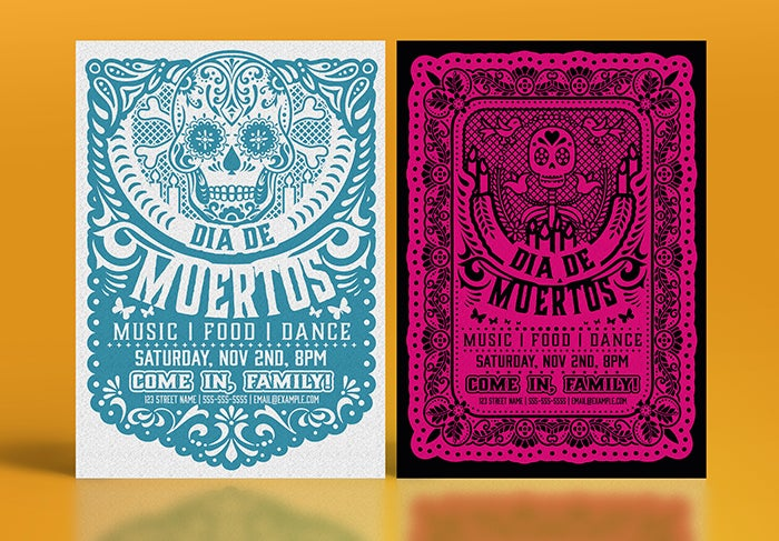
Día de los Muertos Paper Cutout Flyer Set by Roverto Castillo.
As an illustrator, did you find the transition to becoming a templates creator challenging in any way?
Well, in my case it was an easy transition – all of my microstock illustration designs are very layered and easy to edit for customers. It was a natural next step to create templates by adding editable text; and with the ease of using Adobe Fonts, it’s the perfect formula. My customers and users have easy access to fonts without having to buy new fonts and they can edit text and change colors in few minutes.
How was it working on the Día de Los Muertos templates?
You can see my style come through in these templates, but it was hard for me. I’ve never worked on a theme like “Día de los Muertos” and it was out of my comfort zone. I had to immerse myself in the culture and the meaning behind the holiday to understand the rich palette of colors and symbols that are traditionally found during this celebration.

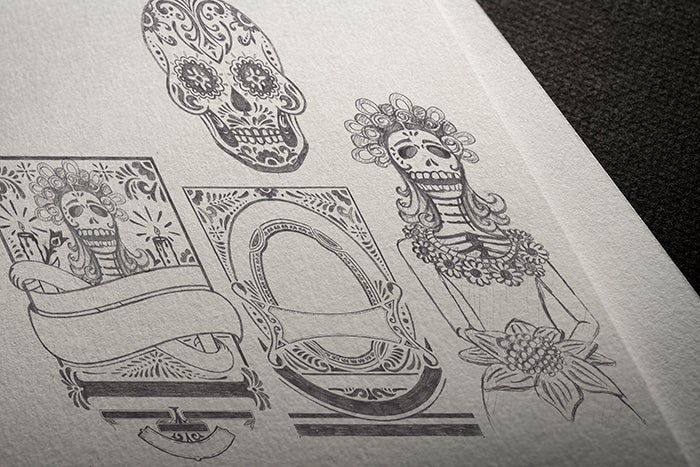
Work in progress image provided by the artist.
What was your process in creating these templates?
As always in my designs I start with fast sketches by hand – setting up frames, text zones, and blank zones for illustrations. For the Photoshop template, I made a final sketch of the overall layout design without the main illustrations. I sketched the main illustrations separately on a larger scale, so that I had more space to draw with rich details. I then joined the sketches together in Photoshop to create my final composition.
For the Illustrator template, it was a mix of vector and sketch design. The style of the “papel picado” design is a repetitive technique, so to reduce time I made much of the work digitally in Illustrator.
Were there any challenges in creating these templates?
Yes!! I’m a man of few colors (HAHA) and working on these templates with a full palette of colors was a headache. My personal work usually has a minimal color palette, but the traditional colors of Día de los Muertos are very vibrant, bright, and meaningful. I have to be honest, it was a productive challenge for me and in a way, it changed my style for future works.

Día de los Muertos Skull Flyer Set by Roverto Castillo.
What other areas would you like to explore in your work?
I am always studying new techniques to change/improve my style – watercolors, digital engraving, or custom lettering are some examples of techniques that I’m constantly investigating and exploring in my works. Expanding your knowledge is key for an increasingly demanding market.
What have you learned in the process of this project?
It was my first time creating templates for Photoshop, and while there are similar standards between designing for Illustrator and Photoshop, there were some differences I had to figure out. But I kept my focus on the end user, and by keeping in mind what would make their work easier, it also made it easier for me to work on this project and adapt to using different applications.
What is next for you and Adobe Stock?
Christmas, autumn, winter, and New Year’s templates are my focuses for the next couple of months, mixed with my classic logos and packaging templates. Works never ends.
View more of Roverto’s intricately designed templates here. And take a look at the full Adobe Stock templates collection for more creative options across all occasions.